
What is jQuery Mobile?
jQuery Mobile is a touch-optimized web framework built on jQuery. It is designed to help developers build responsive, mobile-friendly websites and web applications that provide a consistent experience across a wide variety of mobile devices, including smartphones, tablets, and desktops. jQuery Mobile is built on top of the popular jQuery library and extends its functionality, providing tools and widgets for mobile-optimized user interfaces and interactions.
The primary goal of jQuery Mobile is to simplify the process of building mobile web applications that look and feel native to the platform while ensuring broad compatibility across different devices. It provides a set of UI components, themes, and transitions, making it easier for developers to create visually appealing and user-friendly mobile web apps with minimal effort.
Some core features of jQuery Mobile:
- Cross-platform compatibility: Works on smartphones, tablets, and desktops, ensuring a consistent user experience across various screen sizes and devices.
- Touch-friendly interfaces: Optimized for touch interaction, including swipes, taps, and gestures.
- Themes and customizations: Built-in themes allow developers to customize the appearance of their app, ensuring it looks great on mobile devices.
- HTML5 and CSS3: Leverages modern web standards like HTML5 and CSS3 to ensure clean, responsive layouts.
- Seamless transitions: Provides smooth page transitions and animations, improving the app’s feel and usability.
What are the Major Use Cases of jQuery Mobile?
jQuery Mobile has been widely used for building mobile-first web applications and responsive websites. Below are some of the major use cases of jQuery Mobile:
1. Responsive Mobile Websites
One of the primary use cases of jQuery Mobile is creating responsive websites that work seamlessly across a variety of mobile devices and desktop screens. jQuery Mobile enables developers to design websites that automatically adjust their layout and design based on the screen size of the device, ensuring an optimal user experience.
Example:
- Restaurant websites: A restaurant may use jQuery Mobile to design a mobile-friendly website where users can view the menu, make reservations, and read reviews on their smartphones, tablets, or desktops.
2. Mobile Web Applications
jQuery Mobile is widely used to build web applications that are optimized for mobile devices. These applications can offer a native app-like experience, with features such as form submissions, data handling, and interactive UI components, without the need for native app development.
Example:
- Task management apps: A task management app built with jQuery Mobile could be used by teams to organize and track tasks in a user-friendly interface that works well on both mobile and desktop devices.
3. Single Page Web Applications (SPA)
jQuery Mobile allows developers to build Single Page Applications (SPA) that load content dynamically without refreshing the page. This can improve the speed and performance of mobile applications, offering a smoother experience to users.
Example:
- News websites: A news website built as a SPA using jQuery Mobile might allow users to swipe between articles, scroll through categories, and see real-time updates—all without reloading the page.
4. E-commerce Platforms
jQuery Mobile is often used in e-commerce websites to build mobile-friendly stores where users can browse products, add them to the cart, and complete transactions on their mobile devices.
Example:
- Online retail stores: An e-commerce platform built with jQuery Mobile enables users to browse products, add items to the cart, and check out, all in an optimized, mobile-friendly interface.
5. Content Management Systems (CMS)
For content-heavy websites or apps, jQuery Mobile can be used to build mobile-optimized content management systems that allow users to manage content on the go, from their smartphones or tablets.
Example:
- Blog platforms: A CMS like WordPress could be optimized using jQuery Mobile to create a mobile app for users to manage their blogs and view posts easily from any device.
How jQuery Mobile Works Along with Architecture?
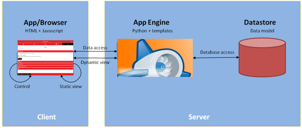
jQuery Mobile works by providing a set of UI components, widgets, and themes that are designed to work seamlessly on mobile devices. It uses the jQuery library to handle interactions, animations, and AJAX requests, enabling developers to build interactive and dynamic mobile web apps.
Here’s how jQuery Mobile fits into the architecture of web applications:
1. HTML5 and CSS3 for Layout and Design
At the core of jQuery Mobile is HTML5 and CSS3 for creating the structure and style of mobile pages. jQuery Mobile automatically applies styles and layouts that adapt to different screen sizes, creating a responsive design that works across devices.
- HTML5: Used to define the page structure and elements, such as headers, navigation, content sections, and forms.
- CSS3: Provides responsive styles and animations to make the web application look visually appealing on all screen sizes.
2. jQuery Mobile Framework
The jQuery Mobile framework provides a set of JavaScript functions, widgets, and themes to enhance user experience and create mobile-friendly websites. It uses AJAX to load content without refreshing the page, offering smooth transitions between pages.
- Widgets: jQuery Mobile offers pre-built widgets, such as buttons, sliders, checkboxes, and dialogs, that are optimized for mobile use.
- Transitions: Built-in page transitions and animations help create a fluid, dynamic experience for users navigating the app.
- Touch Events: jQuery Mobile provides functions for handling touch events, such as tap, swipe, pinch, and drag.
3. Data Handling with AJAX
jQuery Mobile supports AJAX-based navigation, where content can be dynamically loaded into the page without performing a full page reload. This helps in building single-page applications (SPAs), reducing the time spent on reloading or navigating between pages.
Example:
- A user can click on a product in an online store, and the details will load dynamically within the same page, providing a smoother browsing experience.
4. Theming and Customization
jQuery Mobile comes with pre-built themes that provide consistent styles for buttons, navigation bars, and other elements. Developers can customize the look of the application by modifying the theme, adjusting colors, fonts, and sizes.
- ThemeRoller: jQuery Mobile offers a ThemeRoller tool that allows developers to create custom themes, adjusting the appearance of elements to match the branding and design guidelines of the app.
Basic Workflow of jQuery Mobile
The basic workflow of creating a mobile web application with jQuery Mobile involves several steps:
1. Create the HTML Structure
- Begin by defining the basic structure of the web page using HTML. This includes setting up containers, headers, footers, and any other elements necessary for the layout.
2. Apply jQuery Mobile Widgets
- Add jQuery Mobile widgets to the HTML elements. Widgets include interactive components like buttons, forms, sliders, and dialogs.Use data-role attributes to specify how elements should behave and which widgets should be applied.
<div data-role="page">
  <div data-role="header">
    <h1>Welcome to My App</h1>
  </div>
  <div data-role="content">
    <a href="#page2" data-role="button">Next Page</a>
  </div>
</div>
3. Apply CSS for Custom Styles
- While jQuery Mobile comes with built-in themes, you can customize the appearance of your app by using CSS3. This ensures that your app fits the branding and design requirements.
4. Handle User Interactions
- Use jQuery Mobile and jQuery to handle user interactions such as clicks, swipes, and form submissions. These interactions can be used to trigger AJAX requests, navigate between pages, or update the content dynamically.
5. AJAX for Dynamic Content Loading
- Use AJAX to load content into the page without performing a full page refresh. This helps create a seamless, app-like experience where users can interact with content without waiting for a page reload.
6. Test and Optimize
- After building the app, test it across various devices to ensure it functions properly on mobile and tablet screens.
- Use tools like Chrome DevTools or Device Mode to simulate different devices and screen sizes during development.
Step-by-Step Getting Started Guide for jQuery Mobile
Step 1: Set Up Your Development Environment
- Install a text editor like VS Code, Sublime Text, or Atom for writing HTML, CSS, and JavaScript.
- Download the jQuery Mobile framework from the official website.
- Set up a local server if you plan to load external resources via AJAX or need to test functionality that requires server-side interactions.
Step 2: Create Your HTML Structure
- Start by creating a basic HTML file and define the
<!DOCTYPE html>declaration andhtml,head, andbodysections. - Add the required jQuery Mobile CSS and JS files in the
<head>section of your HTML.
<link rel="stylesheet" href="https://code.jquery.com/mobile/1.4.5/jquery.mobile-1.4.5.min.css" />
<script src="https://code.jquery.com/jquery-3.6.0.min.js"></script>
<script src="https://code.jquery.com/mobile/1.4.5/jquery.mobile-1.4.5.min.js"></script>
Step 3: Design the User Interface
- Use XHTML (or HTML5) to structure your app’s layout, defining elements like headers, footers, navigation, and content.
- Add jQuery Mobile widgets using the
data-roleattributes (e.g.,data-role="button",data-role="page").
Step 4: Implement Interactivity and AJAX
- Use jQuery Mobile’s AJAX support to load content dynamically. For example, link multiple pages without page refreshes.
<a href="#page2" data-role="button">Go to Page 2</a>
- Implement JavaScript for handling form submissions, button clicks, or page transitions.
Step 5: Customize Styles and Themes
- Use the ThemeRoller tool or write custom CSS to style your app.
- Modify the look of buttons, navigation bars, and other UI elements to match your branding.
Step 6: Test Your Application
- Test your application on various devices (desktop, mobile, tablet) to ensure it is responsive.
- Use developer tools in your browser to simulate mobile screens and test interactivity.
Conclusion
jQuery Mobile provides a powerful framework for building responsive, touch-optimized web applications that work seamlessly across mobile and desktop devices. With its rich set of features like touch events, AJAX-based navigation, and custom widgets, jQuery Mobile makes it easy for developers to create mobile-friendly websites and apps. Whether you are building a simple mobile site or a complex application, jQuery Mobile offers the tools needed to deliver a high-quality user experience.
