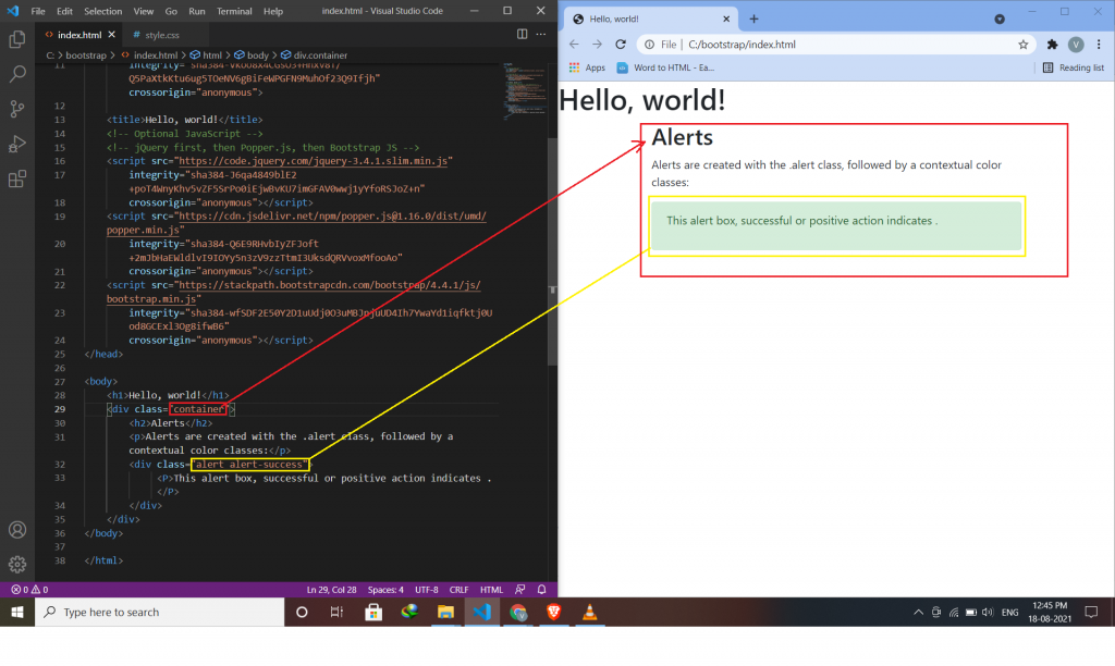
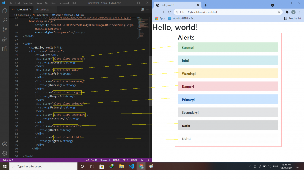
Alerts:-
Alerts are created with the .alert class, followed by one of the contextual classes .alert-success, .alert-info, .alert-warning, .alert-danger, .alert-primary, .alert-secondary, .alert-light or .alert-dark.
Syntax:-
<div class="alert alert -success">
<p> inside paragraph alert success component use </p>
</div>
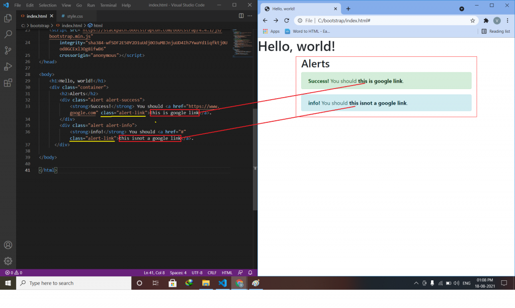
Alert Links:-
Add the alert-link class to any links inside the alert box to create “matching colored links”.
syntax:-
<div class="alert alert-success">
  Alert link use <a href="#" class="alert-link">this is a link</a>.
</div>
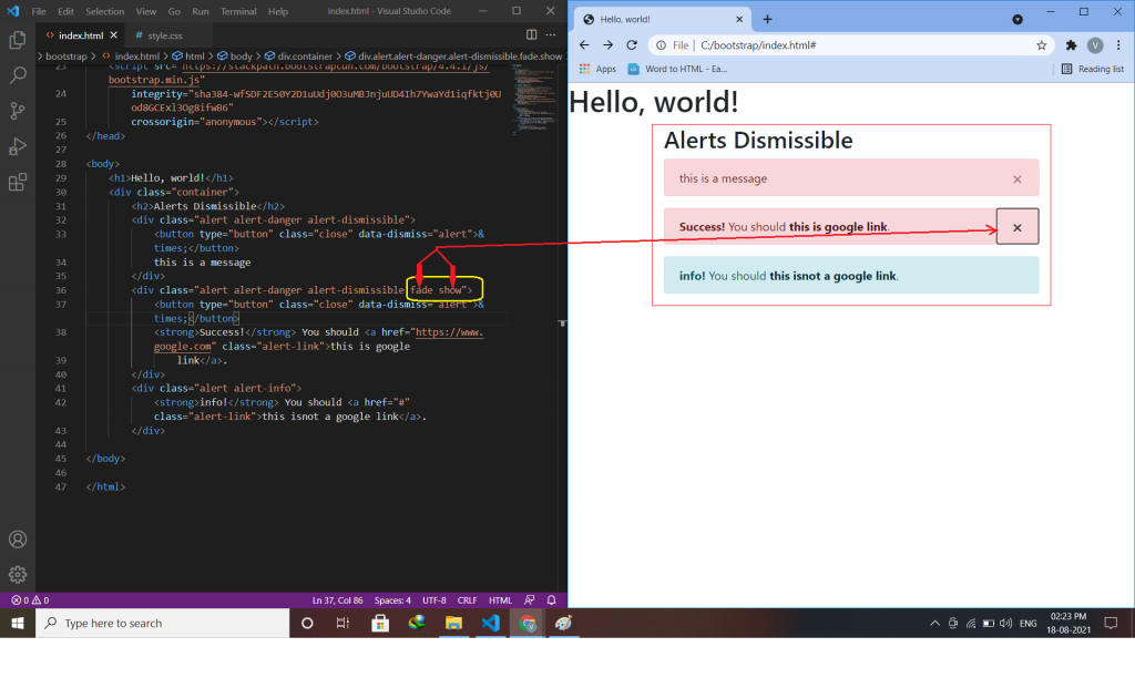
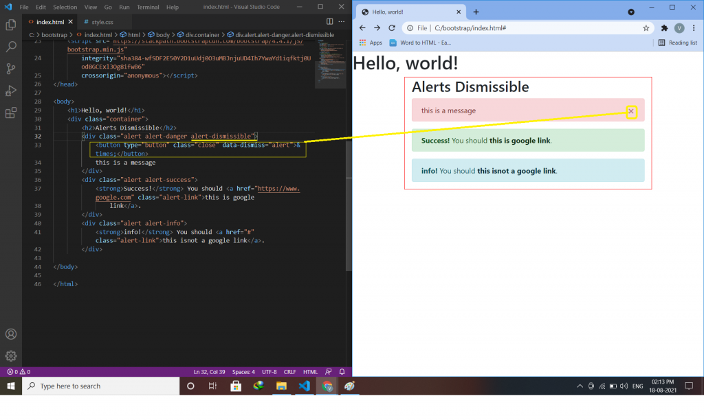
Closing Alerts:-
To close the alert message, add a .alert-dismissible class to the alert container. for creating alert messages we have to create a button or link, inside button or link adds class=”close” and data-dismiss=”alert”.
syntax:-
<div class="alert alert-success alert-dismissible">
<button type="button" class="close" data-dismiss="alert">×</button>
this is a message.
</div>
Animated Alerts:-
The .fade and .show classes add a fading effect when closing the alert message.
this class is use to delete anything(text,div,message-box).
Syntax:-
<div class="alert alert-danger alert-dismissible fade show">