- What is Bootstrap?
A) A programming language
B) A framework for web development
C) A database management tool
D) None of the above
Answer: B
- What is the latest version of Bootstrap?
A) 2.0
B) 3.0
C) 4.0
D) 5.0
Answer: D
- What is the standard grid system in Bootstrap based on?
A) 6 columns
B) 8 columns
C) 10 columns
D) 12 columns
Answer: D
- Which class is used for creating a responsive navbar in Bootstrap?
A) .navbar-default
B) .navbar-inverse
C) .navbar-responsive
D) .navbar-collapse
Answer: D
- Which class is used for creating a responsive image in Bootstrap?
A) .img-responsive
B) .img-fluid
C) .img-scale
D) .img-flex
Answer: A
- Which class is used for creating a modal in Bootstrap?
A) .modal-container
B) .modal-dialog
C) .modal-content
D) .modal-window
Answer: B
- What is the CSS preprocessor used in Bootstrap?
A) Less
B) Sass
C) Stylus
D) All of the above
Answer: B
- Which class is used for creating a progress bar in Bootstrap?
A) .progress-tracker
B) .progress-bar
C) .progress-graph
D) .progressbar
Answer: B
- Which class is used for creating a carousel in Bootstrap?
A) .carousel
B) .slider
C) .scroll-pane
D) .carousel-gallery
Answer: A
- What is the default font-family in Bootstrap?
A) Times New Roman
B) Arial
C) Verdana
D) Helvetica Neue
Answer: D
- Which class is used for creating a jumbotron in Bootstrap?
A) .jumbotron
B) .hero-unit
C) .big-banner
D) .mega-header
Answer: A
- What is the difference between container and container-fluid in Bootstrap?
A) container-fluid has a fixed width
B) container-fluid has a fluid width
C) container has a fixed width
D) Both A and C
Answer: B
- Which class is used for creating a label in Bootstrap?
A) .label
B) .badge
C) .tag
D) .marker
Answer: A
- Which class is used for creating a dropdown menu in Bootstrap?
A) .dropdown
B) .options
C) .select-menu
D) .drop-menu
Answer: A
- What is the difference between button and input[type=”submit”] in Bootstrap?
A) They are used for the same purpose
B) button can contain HTML content and input[type=”submit”] cannot
C) input[type=”submit”] is preferred for forms
D) Both B and C
Answer: D
- Which class is used for creating a list group in Bootstrap?
A) .list-group
B) .group-list
C) .list-item
D) .item-list
Answer: A
- How can you customize the color palette in Bootstrap?
A) By using the customize page on the Bootstrap website
B) By editing the variables in the variables.less file
C) By adding new classes in the custom.less file
D) By using CSS overrides
Answer: B
- Which class is used for creating a navbar brand/logo in Bootstrap?
A) .navbar-brand
B) .navbar-logo
C) .brand-logo
D) .header-brand
Answer: A
- What is the default button style in Bootstrap?
A) Primary
B) Secondary
C) Success
D) Default
Answer: D
- Which class is used for creating a breadcrumb in Bootstrap?
A) .breadcrumb
B) .path
C) .trail
D) .way
Answer: A
- Which class is used for creating a tooltip in Bootstrap?
A) .tooltip
B) .hover-tip
C) .pop-tip
D) .click-tip
Answer: A
- Which class is used for creating a card in Bootstrap?
A) .card
B) .panel
C) .box
D) .container
Answer: A
- What is the difference between col-md-* and col-lg-* in Bootstrap?
A) col-md-* is for medium screens and col-lg-* is for large screens
B) col-lg-* has a wider width than col-md-*
C) col-md-* is for small screens and col-lg-* is for large screens
D) There is no difference
Answer: A
- Which class is used for creating a popover in Bootstrap?
A) .popover
B) .pop-up
C) .popup-window
D) .tip-box
Answer: A
- What is the difference between offset-* and push-* in Bootstrap?
A) They are used for the same purpose
B) offset-* moves the column to the right, while push-* moves the column to the left
C) push-* moves the column to the right, while offset-* moves the column to the left
D) There is no difference
Answer: C
- Which class is used for creating a form group in Bootstrap?
A) .form-group
B) .fieldset
C) .input-group
D) .form-unit
Answer: A
- What is the difference between .navbar-static-top and .navbar-fixed-top in Bootstrap?
A) There is no difference
B) .navbar-static-top is always at the top of the page, while .navbar-fixed-top is fixed to the top of the viewport
C) .navbar-fixed-top is always at the top of the page, while .navbar-static-top is fixed to the top of the viewport
D) Both A and C
Answer: B
- Which class is used for creating a pagination in Bootstrap?
A) .pagination
B) .paginator
C) .page-list
D) .paging
Answer: A
- What is the purpose of the Bootstrap grid system?
A) To create responsive layouts
B) To create fixed layouts
C) To create fluid layouts
D) Both B and C
Answer: A
- Which class is used for creating a progress spinner in Bootstrap?
A) .spinner
B) .progress-spinner
C) .loading-bar
D) .spinner-bar
Answer: A
- What is the difference between .container and .container-fluid in Bootstrap?
A) .container has a fixed width, while .container-fluid has a fluid width
B) .container-fluid has a fixed width, while .container has a fluid width
C) They are used for the same purpose
D) Both B and C
Answer: A
- Which class is used for creating a well in Bootstrap?
A) .well
B) .panel
C) .card
D) .container
Answer: A
- What is the purpose of the responsive utilities in Bootstrap?
A) To modify the layout based on screen size
B) To modify the font-size based on screen size
C) To modify the background-color based on screen size
D) To modify the padding based on screen size
Answer: A
- Which class is used for creating a form control in Bootstrap?
A) .form-control
B) .input-control
C) .field-control
D) .form-field
Answer: A
- What is the difference between .dropdown-menu and .dropdown-submenu in Bootstrap?
A) .dropdown-menu is a single-level menu, while .dropdown-submenu is a multi-level menu
B) .dropdown-submenu is a single-level menu, while .dropdown-menu is a multi-level menu
C) They are used for the same purpose
D) Both A and B
Answer: A
- Which class is used for creating a thumbnail in Bootstrap?
A) .thumbnail
B) .media
C) .image-box
D) .thumb-box
Answer: A
- What is the difference between .lead and .text-large in Bootstrap?
A) They are used for the same purpose
B) .lead is larger than .text-large
C) .text-large is larger than .lead
D) Both A and B
Answer: A
- Which class is used for creating a blockquote in Bootstrap?
A) .blockquote
B) .quote
C) .text-quote
D) .quotation
Answer: A
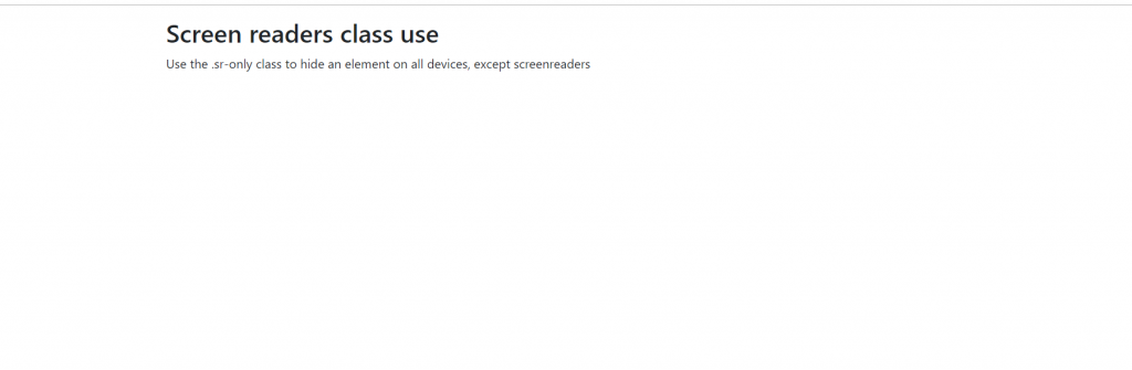
- What is the purpose of the .sr-only class in Bootstrap?
A) To hide content visually, but still make it available to screen-readers
B) To remove the content from the DOM
C) To apply a style without showing the content
D) None of the above
Answer: A
- Which class is used for creating a table in Bootstrap?
A) .table
B) .data-table
C) .tabular
D) .table-data
Answer: A
- What is the purpose of the .btn-group class in Bootstrap?
A) To group buttons together
B) To group form elements together
C) To group links together
D) To group images together
Answer: A
- Which class is used for creating a well with a border in Bootstrap?
A) .well
B) .panel
C) .card
D) .jumbotron
Answer: B
- What is the purpose of the .blockquote-reverse class in Bootstrap?
A) To reverse the order of the blockquote and the citation
B) To make the blockquote stand out
C) To change the font of the blockquote
D) To add a border around the blockquote
Answer: A
- Which class is used for creating a responsive embed in Bootstrap?
A) .embed-responsive
B) .responsive-video
C) .flex-embed
D) .video-embed
Answer: A
- What is the purpose of the .text-muted class in Bootstrap?
A) To make the text gray
B) To make the text italicized
C) To make the text smaller
D) To make the text unimportant
Answer: D
- Which class is used for creating a responsive utility class for display property in Bootstrap?
A) .d-none
B) .d-sm-none
C) .d-md-none
D) .d-lg-none
Answer: B
- What is the purpose of the .text-danger class in Bootstrap?
A) To make the text red
B) To make the text bold
C) To make the text uppercase
D) To make the text blink
Answer: A
- Which class is used for creating a responsive utility class for margin property in Bootstrap?
A) .m-0
B) .m-sm-0
C) .m-md-0
D) .m-lg-0
Answer: B
- What is the purpose of the .blockquote-footer class in Bootstrap?
A) To add a footer to the blockquote
B) To add a header to the blockquote
C) To change the font-size of the blockquote
D) To change the color of the blockquote
Answer: A
- Which class is used for creating a responsive utility class for padding property in Bootstrap?
A) .p-0
B) .p-sm-0
C) .p-md-0
D) .p-lg-0