Bootstrap : Default Text Sizes

Bootstrap’s font sizes are calculated off of the body font size by using rem values. If you change
the body font size all styles will be increased/decreased automatically. Rem stands for “root em”
because it calculates the size based on the size of the root of the document or body tag.

Tag / ClassDefault Font size
body16px; line-height: 1.5;
font-family: “Helvetica Neue”, Helvetica, Arial,
sans-serif;
p, li1rem / 16px
h12.5rem / 40px
h1 small80% / 32px
h22rem / 32px
h2 small80% / 25.6px
h31.75rem / 28px
h3 small80% / 22.4px
h41.5rem / 24px
h4 small80% / 24px
h51.25rem / 20px
h5 small80% / 16px
h61rem / 16px
h6 small80% / 12.8px
.display-16rem / 90px
.display-25.5rem / 82.5px
.display-34.5rem / 67.5px
.display-43.5rem / 52.5px
Tagged : / / / / / / / / / / / / /

Bootstrap Utilities : “Visibility”

With visibility utilities you have control the visibility, without modifying the display, of elements.

Tagged : / / / / / / / / / / / / / / / /

Bootstrap utilities : “Vertical align”

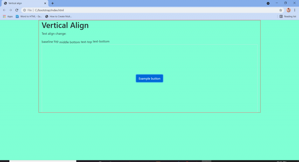
Easily change the vertical alignment of inline, inline-block, inline-table, and table cell elements.

Change the alignment of elements with the vertical-alignment utilities.

These are the classes:- .align-baseline, .align-top.align-middle.align-bottom.align-text-bottom, and .align-text-top as needed.

Tagged : / / / / / / / / / / / / / / / / /

Bootstrap Utilities : Spacing

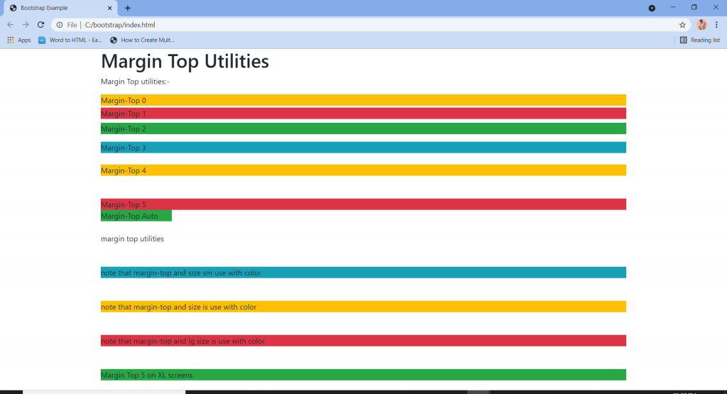
Spacing helpers are useful for modifying the padding and margin of an element.

Where property is one of:

  1. msets margin
  2. p-sets padding

Sides is one of:-

  • t-sets margin-padding “top
  • b-sets margin-padding “bottom
  • l-sets margin-padding “left
  • r-sets margin-padding “right
  • x-sets padding left|right or margin left|right
  • y-sets padding top|bottom or margin top|bottom
  • blank-sets margin padding on all sides of the element

Size is one of:-

  • 0-sets m|p to 0
  • 1-sets m|p to .25rem
  • 2-sets m|p to .5rem
  • 3-sets m|p to 1rem
  • 4-sets m|p to 1.5rem
  • 5-sets m|p to 3rem
  • auto-sets margin to auto

Negative margin :-

  • n1-sets margin to -.25rem
  • n2-sets margin to -.5rem
  • n3-sets margin to -1rem
  • n4-sets margin to -1.5rem
  • n5-sets margin to -3rem
Tagged : / / / / / / / / / / / / / / /

Bootstrap utilities : “Position”

Arrange the elements easily with the positioning utilities.

  • .fixed-top class is use to fix the element in the top position of the page.
  • .fixed-bottom class is use to fix the element in the bottom position of the page.
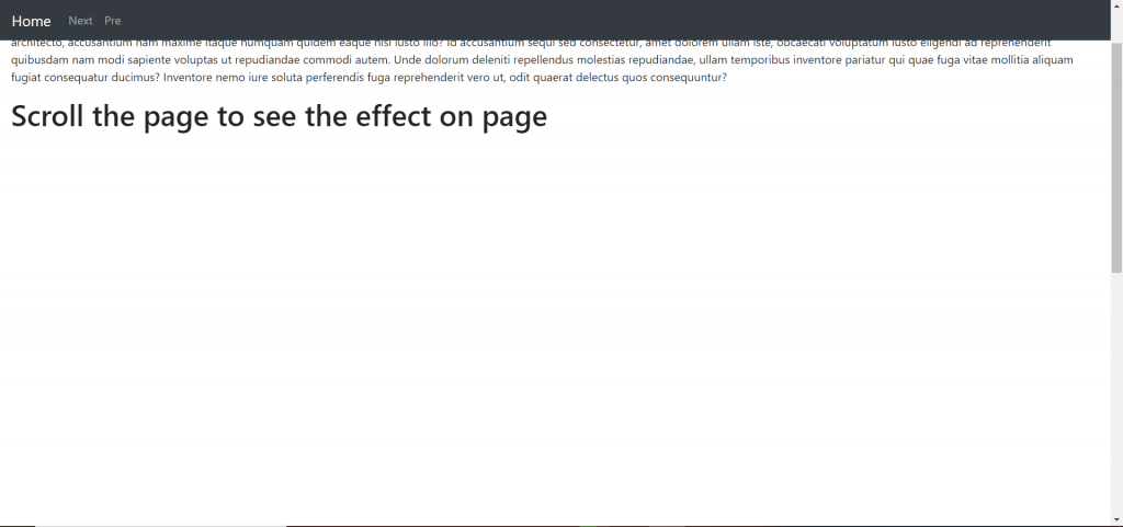
  • .sticky-top class is use to stick the element at the top of the page when you scroll past it.
Tagged : / / / / / / / / / /

Bootstrap:-Component “Progress”

Progress Bar in Bootstrap 4 is mainly used to indicate to the user, how much progress of the process is done. progress bars featuring support for stacked bars, animated backgrounds, and text labels. Use utility classes for the background (bg-success, bg- info, bg-light, bg-dark, bg-danger, bg-warning) for creating a progress bar with a different color.

Where to use Progress Bar:-

  • Progress Bar With Label by placing text within the .progress-bar.
  • Progress Bar With Height.
  • Colored Progress Bar by using .progress-bar-sucess|info|warning|danger.
  • Striped Progress Bar by using .progress-bar-striped class.
  • Animated Progress Bar by using .active class.
  • Stacked Progress Bars by using <div class=”progress”>.
Tagged : / / / / / / / / / / /

Bootstrap:-Component “Navigation bar”

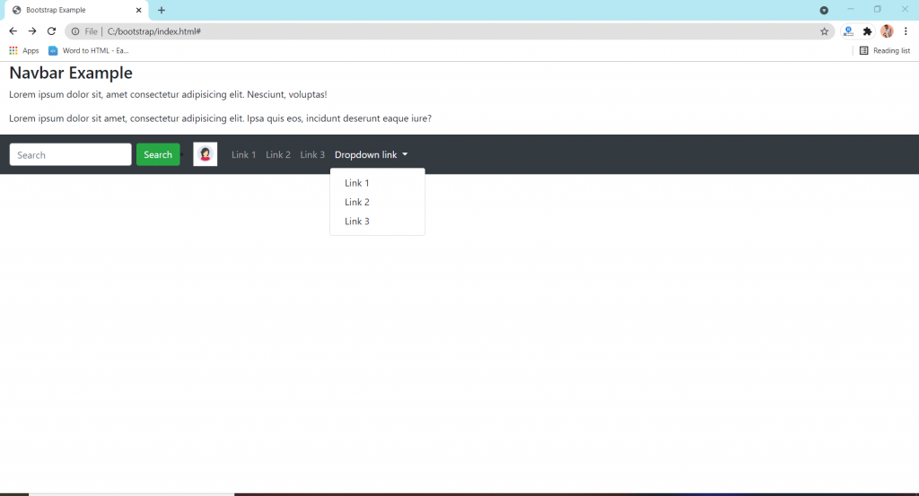
The navbar is one of the prominent features of Bootstrap sites. A navigation bar is a navigation header that is placed at the top of the page. the navigation bar can extend or collapse, depending on the screen size. A standard navigation bar is created with the .navbar class.

Format of nav bar:-

  • Vertical Navbar by using class=”navbar-nav”.
  • Centered Navbar by using .justify-content-center class to center the navigation bar.
  • Colored Navbar by using any of the .bg-color classes to change the background color of navbar.
  • Brand/Logo by using .navbar-brand class is used to highlight the brand/logo/project name of your page.
  • Collapsing The navbar  To create a collapsible navigation bar, use a button with class=”navbar-toggler”, data-toggle=”collapse” and data-target=”#thetarget”.
  • Navbar With Dropdown.
  • Navbar Froms and Buttons Add a <form> element with class=”form-inline” to group inputs and buttons side-by-side.
  • Nevbar Text use .navbar-text class to vertically align any elements inside the navbar that are not links.
  • Fixed Navbar by using .fixed-top or .fixed-bottom class to make the navbar fixed.
  • Sticky navbar use the .sticky-top class to make the navbar fixed/stay at the thop of the page.
Tagged : / / / / / / / / / / / / /

Bootstrap:-Components “Media Object”

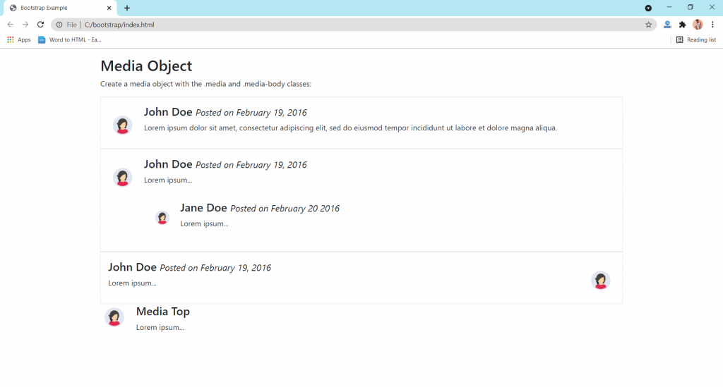
Bootstrap provides an easy way to align media objects (like images or videos) together with content. Media objects are often used to display blog comments, tweets, and so on.

  • Basic media Object :- class=media class to a container element and place media content inside a child container with class=media-body.
  • Nested Media Object :- Media object can also be nested(media object inside media).
  • Right-Aligned Media Image :- to right-aligned media image class=media-body.
  • Top, Middle or Bottom Alignment :- Use the flex utilities, class=align-self-(start/center/end) classes to place the media object on the top, middle or at the bottom.
Tagged : / / / / / / / / /

Bootstrap:-Component “List group”

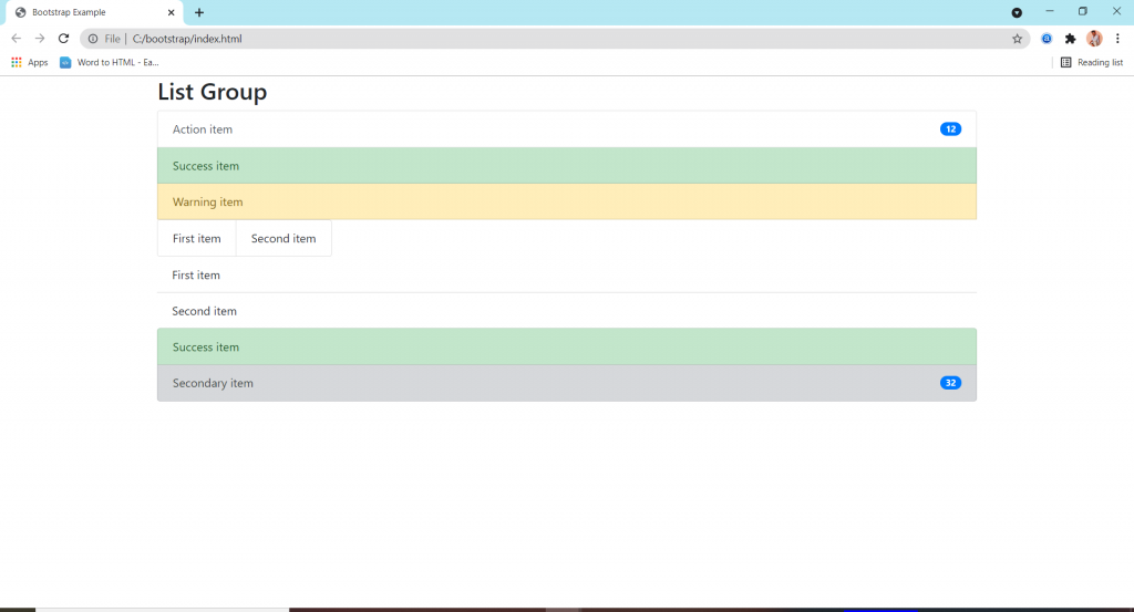
List groups are a flexible and powerful component for displaying a series of content.

features:-

  • Basic items simply making for list.
  • Active items used for showing it’s an active mode.
  • Disabled items used for just reading that message.
  • Links and buttons are used to create actionable list group items with hover.
  • Flush / Remove Borders are used to remove some borders and rounded corners to render list group items edge-to-edge in a parent container (card).
  • Horizontal to change the layout of list group items from vertical to horizontal across all breakpoints.
  • Contextual classes to style list items with a stateful backgrond and color.
  • With badges to show unread counts, activity .
  • Custom content by the help of flexbox utilities.
  • JavaScript behavior to create tabbable panes of local content.
  • Using data attributes use for activate a list group navigation without writing any javaScript by simply specifying data-toggle=”list” or on an element.
Tagged : / / / / / / / / / / / /

Bootstrap:-Component “Input group”

Input group:-

Easily extend form controls by adding text, buttons, or button groups on either side of textual inputs, custom selects, and custom file inputs.

Functions:-

  • Sizing classes to the .input-group itself and contains within will automatically resize for each element.
  • Checkboxes and radios options within an input group’s addon instead of text.
  • Multiple inputs are only available for input gropus with a single inpute.
  • Multiple addons are supported and can be mixed with checkbox and radio input versions and many more others things as well.
  • Button addons are supported and can be mixed with multiple buttons and input text.
  • Buttons with dropdowns are needed within a single line inpute.
  • Segmented buttons means button and then inside button a dropdown menu and text area there.
  • Customer forms button area and an option area.
  • Customer file input are most important for uploading a file or image etc.
Tagged : / / / / / / / / / / / / / /