Introduction
Data Visualization Tools are specialized software applications designed to represent information and data graphically. by using visual elements like charts, graphs, maps, and dashboards, these tools provide an accessible way to see and understand trends, outliers, and patterns in data. While basic spreadsheets offer simple charting, dedicated visualization platforms go much further, providing interactive capabilities, real-time data streaming, and advanced aesthetic controls that can handle billions of rows of information.
Why It Matters
The human brain processes visual information significantly faster than text or numbers. Data visualization is important because it allows stakeholders at all levels of an organization—from the technical engineer to the non-technical executive—to identify correlations and root causes that would otherwise remain hidden. It democratizes information, ensuring that decisions are based on empirical evidence rather than subjective intuition.
Key Real-World Use Cases
- Executive Dashboards: Monitoring Key Performance Indicators (KPIs) like revenue, churn, and growth in a single, high-level view.
- Geospatial Analysis: Visualizing logistics, supply chain routes, or regional sales performance on interactive maps.
- Scientific Research: Plotting complex biological or astronomical data to identify experimental anomalies.
- Public Reporting: Using infographics and interactive charts to communicate social or economic trends to the general public.
What to Look For
When evaluating these tools, look for ease of use, customization depth, data connectivity (how easily it connects to your existing databases), and collaborative features.
Best for: Data analysts, business intelligence professionals, researchers, and marketing teams in organizations ranging from small startups to global enterprises. It is essential for any industry that relies on data to track performance, such as Finance, Healthcare, and E-commerce.
Not ideal for: Pure data storage needs or organizations with very static, simple data that does not change over time. If your “analysis” is limited to a single 10-row table once a year, a standard word processor or basic spreadsheet is likely more cost-effective.
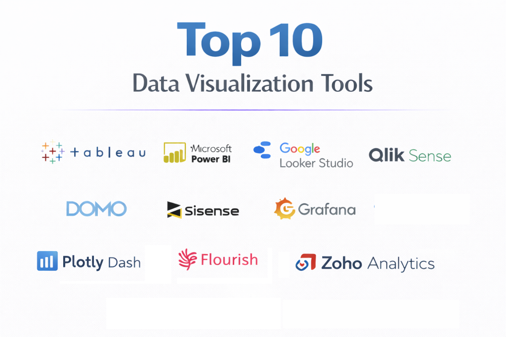
Top 10 Data Visualization Tools
1 — Tableau
Tableau is widely recognized as the gold standard in the data visualization industry. Now owned by Salesforce, it is designed for deep analytical exploration and the creation of highly complex, interactive dashboards.
- Key features:
- VizQL Technology: A patented system that translates drag-and-drop actions into data queries.
- Live & In-Memory Data: Allows users to switch between a live connection for real-time data or an in-memory engine for faster performance.
- Extensive Mapping: Powerful geospatial capabilities that support custom territories and layers.
- Advanced Analytics: Built-in support for trend lines, forecasting, and clustering.
- Collaboration Tools: Easy sharing through Tableau Cloud or Tableau Server with granular permissions.
- Pros:
- Unmatched flexibility in visual design; you can create almost any type of chart imaginable.
- Large community of “Tableau Visionaries” who share templates and advice.
- Cons:
- Significant learning curve for beginners due to the depth of features.
- High total cost of ownership compared to simpler, cloud-native tools.
- Security & compliance: SOC 2, SOC 3, ISO 27001, HIPAA, GDPR, and FedRAMP (for government versions).
- Support & community: Extensive documentation, “Tableau Public” for community sharing, 24/7 enterprise support, and global user groups.
2 — Microsoft Power BI
Power BI is a powerhouse for organizations already integrated into the Microsoft ecosystem. It blends ease of use with powerful data modeling capabilities, making it a favorite for business intelligence.
- Key features:
- Natural Language Q&A: Users can ask questions about their data using conversational language.
- Power Query: A robust data transformation engine for cleaning and shaping data.
- Excel Integration: Seamlessly move data and models between Excel and Power BI.
- AI Insights: Automated tools for detecting trends and anomalies in datasets.
- Mobile Accessibility: Top-tier mobile apps for viewing dashboards on the go.
- Pros:
- Extremely cost-effective for teams already using Microsoft 365.
- Very easy for beginners to pick up if they are already familiar with Excel.
- Cons:
- The desktop version is limited to Windows, which can be difficult for Mac-heavy teams.
- Can become sluggish when handling extremely large, complex local data models.
- Security & compliance: SOC 1/2/3, ISO 27001, HIPAA, GDPR, and Microsoft Entra ID (formerly Azure AD) integration.
- Support & community: Massive online community, extensive Microsoft Learn documentation, and global partner support.
3 — Google Looker Studio
Formerly known as Data Studio, Looker Studio is a free, web-based tool designed for marketers and small-to-mid-sized businesses that need to turn data into pretty, shareable reports.
- Key features:
- Native Google Ecosystem Connections: One-click integration with Google Analytics, Ads, and Sheets.
- Dynamic Controls: Viewers can filter data and change date ranges on live reports.
- Reusable Templates: A wide gallery of pre-built reports for common marketing use cases.
- Collaborative Editing: Works just like Google Docs, allowing multiple people to edit a report simultaneously.
- Embedded Reports: Easily embed visualizations into websites or internal portals.
- Pros:
- Completely free for the standard version, making it the most accessible tool on the list.
- Extremely low barrier to entry; you can create a report in minutes.
- Cons:
- Lacks the deep analytical and statistical power of Tableau or Power BI.
- Limited to roughly 50 charts per page, which can be restrictive for complex needs.
- Security & compliance: GDPR, Google Cloud Security standards, and SSO via Google Workspace.
- Support & community: Peer-to-peer community forums and Google Help Center documentation.
4 — Qlik Sense
Qlik Sense is known for its “Associative Engine,” which allows users to explore data in any direction rather than following pre-defined paths. It is geared toward intuitive data discovery.
- Key features:
- Associative Discovery: Highlights relationships between data points that aren’t immediately obvious.
- Augmented Analytics: AI-generated insights and automated chart suggestions.
- Multi-Cloud Architecture: Deployment options for on-premise, private cloud, or public cloud.
- Interactive Dashboards: High levels of interactivity with responsive design.
- Hybrid Data Delivery: Combines real-time data with historical records.
- Pros:
- The “search-like” experience makes it very easy for non-technical users to find “hidden” insights.
- Powerful data integration (ETL) features are built directly into the platform.
- Cons:
- Advanced customization requires learning Qlik’s proprietary scripting language.
- Pricing can be opaque and expensive for smaller implementations.
- Security & compliance: SOC 2, SOC 3, ISO 27001, GDPR, and HIPAA.
- Support & community: Strong partner network, “Qlik Community” forums, and a dedicated training academy.
5 — Domo
Domo is a cloud-native, mobile-first platform that focuses on executive-level business management and real-time data sharing across the entire company.
- Key features:
- Magic ETL: A drag-and-drop tool for cleaning and combining data sources without code.
- Appstore: Over 1,000 pre-built connectors for popular SaaS tools like Salesforce and Zendesk.
- Buzz: Integrated social collaboration and chat features directly on dashboards.
- Alerting Engine: Real-time notifications when metrics cross specific thresholds.
- Domo Everywhere: Advanced embedding for sharing data with external clients and partners.
- Pros:
- Excellent for C-suite executives who need to see “the whole business” on their phones.
- Very fast implementation compared to traditional on-premise BI tools.
- Cons:
- One of the most expensive tools on the market, often requiring a significant annual commitment.
- Not ideal for researchers who need high-level statistical programming.
- Security & compliance: SOC 1/2, HIPAA, GDPR, ISO 27001, and PCI DSS.
- Support & community: High-touch customer success, “Domo University,” and annual user conferences.
6 — Sisense
Sisense is a versatile platform known for its “API-first” approach and its ability to handle “messy” data from multiple disparate sources. It is often used for embedded analytics.
- Key features:
- In-Chip Technology: Uses the CPU cache for faster data processing than traditional in-memory tools.
- Elasticube: A proprietary analytical database that handles high-performance queries.
- BloX: A framework for creating highly customized, “app-like” interactive dashboards.
- Infusion Apps: View data insights directly inside Slack, Teams, or Salesforce.
- White-Labeling: Comprehensive options for branding the platform as your own.
- Pros:
- Best-in-class for software companies looking to build a data portal for their own customers.
- Can combine data from dozens of different sources without a separate data warehouse.
- Cons:
- Requires more technical expertise (SQL/Javascript) to unlock its full potential.
- Administration of the platform can be complex for small teams.
- Security & compliance: SOC 2 Type II, ISO 27001, HIPAA, and GDPR.
- Support & community: Strong developer documentation, specialized professional services, and a dedicated community portal.
7 — Grafana
Grafana is the industry leader for monitoring and visualizing “time-series” data. It is primarily used by DevOps and IT teams to track system health and infrastructure.
- Key features:
- Dynamic Dashboards: Real-time updates for monitoring servers, applications, and IoT devices.
- Mixed Data Sources: Display data from multiple databases (like Prometheus and MySQL) on a single chart.
- Alerting: Robust notification system that integrates with PagerDuty and Slack.
- Plugin Architecture: Hundreds of community-built plugins for new data sources and visuals.
- Annotations: Mark specific events on graphs to provide context for spikes or drops.
- Pros:
- The best tool for real-time monitoring and operational dashboards.
- Extremely powerful open-source version available for free.
- Cons:
- Not designed for “Business Intelligence” (like calculating profit margins or customer churn).
- The interface is utilitarian and lacks the “polished” look of Tableau or Domo.
- Security & compliance: SOC 2, GDPR, SSO support (OAuth/SAML), and enterprise-grade auditing.
- Support & community: Massive open-source community, extensive GitHub presence, and “Grafana Cloud” for managed support.
8 — Flourish (by Canva)
Flourish is a web-based tool that focuses on “storytelling.” It is a favorite among journalists and researchers who need to create beautiful, animated visualizations for the web.
- Key features:
- Racing Bar Charts: Famous for its easy-to-create animated charts that show change over time.
- Interactive Maps: Stunning, web-optimized maps for regional data.
- Mobile-Responsive: Every visual automatically resizes for mobile phones.
- Presentation Mode: Allows users to create “data stories” similar to a slide deck but with live data.
- No-Code Interface: Everything is handled through a spreadsheet-like web interface.
- Pros:
- Creates the most “beautiful” and engaging animations without any coding.
- Deeply integrated with Canva, making it great for marketing and PR teams.
- Cons:
- Not suitable for complex data modeling or connecting to live enterprise SQL databases.
- The free version requires your data to be public.
- Security & compliance: GDPR and standard web encryption. Enterprise plans offer more security.
- Support & community: Good library of tutorial videos and email-based customer support.
9 — Plotly (Dash)
Plotly is a high-level tool for data scientists and developers who want to build custom, web-based analytical applications using Python, R, or Julia.
- Key features:
- Dash Framework: A Python framework for building analytical web apps without Javascript.
- Scientific Charting: Supports 3D plots, ternary plots, and complex contour maps.
- Interactive Legends: Users can toggle data series on and off directly on the graph.
- Jupyter Integration: Works seamlessly inside data science notebooks.
- Enterprise Deployment: Managed platforms for hosting and securing Dash apps at scale.
- Pros:
- Unrivaled for scientific and technical data that requires high precision.
- Full control over every aspect of the visualization via code.
- Cons:
- Requires programming knowledge (Python/R); not a “drag-and-drop” tool for business users.
- Can be time-consuming to build a simple dashboard from scratch.
- Security & compliance: SOC 2, HIPAA (Enterprise), and GDPR.
- Support & community: Huge GitHub community, robust documentation, and professional support for enterprise customers.
10 — Zoho Analytics
Zoho Analytics is a robust, self-service BI and data visualization tool that is particularly effective for small-to-mid-market businesses already in the Zoho ecosystem.
- Key features:
- Unified Business Insights: Connects data from finance, sales, and HR apps automatically.
- Zia (AI Assistant): An AI bot that helps generate charts based on natural language questions.
- White Labeling: Host the tool on your own domain with your company’s branding.
- Pivot Tables: Powerful spreadsheet-like data manipulation within the platform.
- Collaboration: Threaded comments and shared folders for team projects.
- Pros:
- Very affordable pricing for smaller teams.
- Excellent “out-of-the-box” reports for common business apps like QuickBooks and CRM.
- Cons:
- The interface can feel a bit cluttered compared to modern tools like Metabase or Flourish.
- Customizing complex visualizations is not as flexible as Tableau.
- Security & compliance: SOC 2, HIPAA, GDPR, ISO 27001, and PCI DSS.
- Support & community: Extensive knowledge base, responsive email support, and a solid network of Zoho partners.
Comparison Table
| Tool Name | Best For | Platform(s) Supported | Standout Feature | Rating (Gartner) |
| Tableau | Visual Depth/Enterprise | Web, Win, Mac | VizQL Engine | 4.4 / 5.0 |
| Power BI | Business Intelligence | Web, Win, Mobile | Microsoft Ecosystem | 4.4 / 5.0 |
| Looker Studio | Marketing Reports | Web (SaaS) | Completely Free | 4.2 / 5.0 |
| Qlik Sense | Data Discovery | Web, Win, Cloud | Associative Engine | 4.4 / 5.0 |
| Domo | Executive/Mobile | Web, Mobile | Mobile-First UI | 4.3 / 5.0 |
| Sisense | Embedded Analytics | Web, Linux | In-Chip Processing | 4.4 / 5.0 |
| Grafana | Real-time Monitoring | Web, Self-Hosted | Time-Series Focus | N/A |
| Flourish | Storytelling/PR | Web (SaaS) | Animations/Bar Racing | N/A |
| Plotly | Data Scientists | Python, R, Web | Scientific Precision | N/A |
| Zoho Analytics | SMBs / Zoho Users | Web, Mobile | Zoho Integration | 4.3 / 5.0 |
Evaluation & Scoring of Data Visualization Tools
To choose the right tool, we suggest using a weighted scoring rubric. This ensures you don’t get distracted by “flashy” features that don’t actually serve your business goals.
| Category | Weight | Evaluation Criteria |
| Core Features | 25% | Variety of charts, interactivity, and mapping capabilities. |
| Ease of Use | 15% | Learning curve for non-technical users and UI design. |
| Integrations | 15% | Native connectors for databases and SaaS platforms. |
| Security & Compliance | 10% | SSO, encryption, and regulatory certifications. |
| Performance | 10% | Handling of large datasets and real-time refresh speed. |
| Support & Community | 10% | Availability of training, documentation, and expert help. |
| Price / Value | 15% | Total cost of ownership vs. the ROI provided. |
Which Data Visualization Tool Is Right for You?
Selecting a tool often depends on your technical background and the scale of your organization.
Solo Users vs SMB vs Mid-Market vs Enterprise
- Solo/Freelance: Google Looker Studio or Flourish are ideal. They require zero infrastructure and are either free or low-cost.
- SMB: Zoho Analytics or Power BI provide the best balance of professional features and affordability.
- Enterprise: Tableau, Qlik Sense, or Domo are built for the governance and scale required by large corporations.
Budget-Conscious vs Premium Solutions
- Budget: If cost is the main driver, Looker Studio (Free) and Grafana (Open Source) are the winners.
- Premium: Tableau and Domo are premium investments. They are expensive but provide a level of sophistication and support that cheaper tools cannot match.
Feature Depth vs Ease of Use
If you need Ease of Use, stick with Looker Studio or Flourish. If you need Feature Depth—meaning you want to analyze statistical outliers or create complex “drill-down” paths—Tableau and Sisense are your primary choices.
Integration and Scalability Needs
If your data lives in a Microsoft SQL Server or Azure, Power BI is the logical choice. If your goal is to build a custom data app for your own users, Plotly or Sisense are the best for developers.
Frequently Asked Questions (FAQs)
1. Is Data Visualization the same as Business Intelligence (BI)?
No, but they are closely related. Data visualization is the technique of representing data graphically. BI is the broader field that includes data storage, data mining, and visualization to drive business decisions.
2. Do I need to know how to code to use these tools?
For most (like Tableau, Power BI, and Looker Studio), no coding is required. However, for tools like Plotly or for advanced custom functions in Sisense, knowledge of Python or SQL is necessary.
3. Can these tools handle real-time data?
Yes. Tools like Grafana and Domo are specifically designed for real-time monitoring. Tableau and Power BI can also handle it, though they often require more configuration.
4. What is the most popular tool in the industry?
Currently, Tableau and Power BI share the majority of the market share, with Power BI growing rapidly due to its integration with Microsoft 365.
5. Is my data safe in the cloud?
Most reputable tools use enterprise-grade encryption (TLS/SSL) and have SOC 2 or ISO certifications. If security is a massive concern, look for tools that offer on-premise hosting like Qlik Sense or Grafana.
6. Can I use these tools on my phone?
Yes, most modern visualization platforms like Domo, Power BI, and Tableau have dedicated mobile apps optimized for touchscreens.
7. How much do these tools usually cost?
It ranges from free (Looker Studio) to $70–$100 per user per month (Tableau/Domo). Large enterprises often negotiate custom bulk pricing.
8. What is “Drill-Down” capability?
Drill-down is a feature that allows a user to click on a broad data point (like “Sales in Europe”) and instantly see the underlying data (like “Sales in France, Germany, and Italy”).
9. Do I need a Data Warehouse to use these tools?
Not necessarily. Many can connect directly to spreadsheets or small databases. However, for large organizations, a warehouse (like Snowflake or BigQuery) makes visualization much faster and more reliable.
10. What is a Racing Bar Chart?
It is an animated visualization where bars “race” each other horizontally as their values change over time. It is a popular way to show how rankings (like top companies or countries) change over years.
Conclusion
The “best” Data Visualization Tool is not a universal winner; it is the one that aligns with your specific technical skills and business goals.
If you are a marketing professional looking for a quick report, Google Looker Studio is your friend. If you are a corporate analyst seeking deep, granular insights, Tableau is the gold standard. For the DevOps engineer monitoring servers, Grafana is indispensable, and for the data scientist building custom apps, Plotly is the top choice.
Ultimately, data visualization is about clarity. The goal is to take a mountain of noise and turn it into a single, clear signal. Choose a tool that doesn’t just look good, but one that helps your team make better, faster decisions.

- Top 10 Email Deliverability Tools: Features, Pros, Cons & Comparison - September 6, 2026
- Top 10 Pharmacovigilance Software: Features, Pros, Cons & Comparison - September 6, 2026
- Top 10 Manufacturing Execution Systems (MES) - July 30, 2026