This property is used to define visual effects like blur and brightness to an element.
Ex:-
img { filter: blur(10px);}
Syntax-
- none – Default value. Specifies no effects
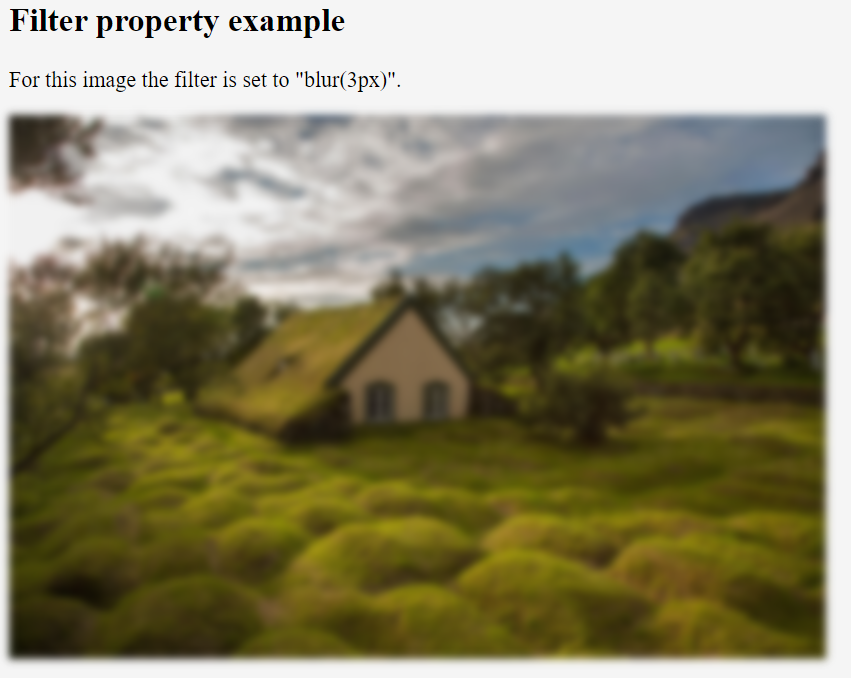
- blur(px) – This is used to apply blur effect to the image. A larger value will create more blur.
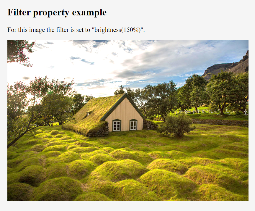
- brightness(%) – This is used to adjust the brightness of the image. 0% will make the image completely black. 100% is default and represents the original image. Values over 100% will provide brighter results.
- contrast(%) – This is used to adjust the contrast of the image. 0% will make the image completely black. 100% is default and represents the original image. Values over 100% will provide results with less contrast.
- grayscale(%) – This is used to convert the image to grayscale. 0% is default and represents the original image. 100% will make the image completely gray. Negative values are not allowed.
- hue-rotate(deg) – This is used to specify a hue rotation on the image. 0deg is default, and represents the original image. Maximum value is 360deg.
- invert(%) – This is used to invert the samples in the image. 0% is default and represents the original image. 100% will make the image completely inverted. Negative values are not allowed.
- opacity(%) – This is used to set the opacity level for the image. This is similar to the opacity property. 0% is completely transparent. 100% is default and represents the original image. Negative values are not allowed.
- saturate(%) – This is used to saturate the image. 0% will make the image completely un-saturated. 100% is default and represents the original image. Values over 100% provides higher-saturated results. Negative values are not allowed.
- sepia(%) – This is used to convert the image to sepia. 0% is default and represents the original image. 100% will make the image completely sepia. Negative values are not allowed.
- url() – The url() function takes the location of an XML file that specifies an SVG filter, and may include an anchor to a specific filter element. filter: url(svg-url#element-id)