In this tutorial, I am using HTMO, CSS, and Javascript and create a Responsive Navigation Bar. So, first create page with “.html” extension and write code as below-
And Below CSS code which is using in this navigation bar-
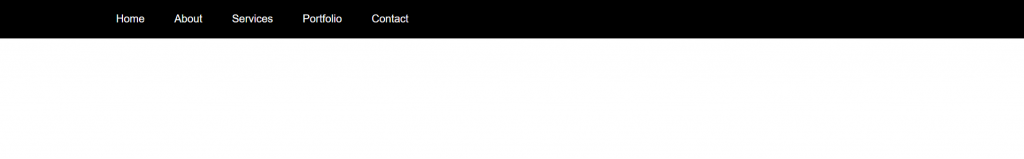
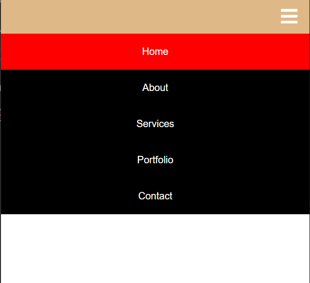
After that complete a Responsive Navigation bar as below –
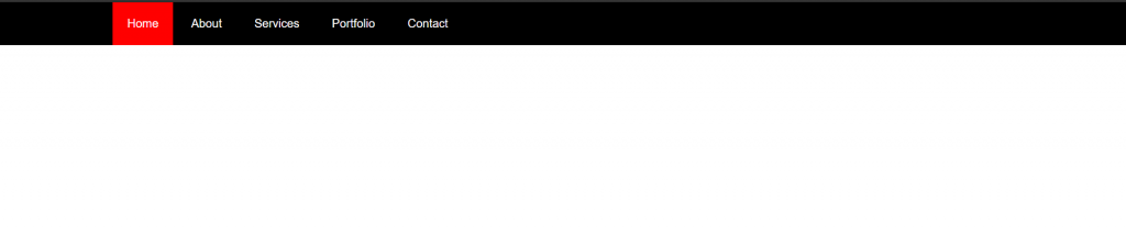
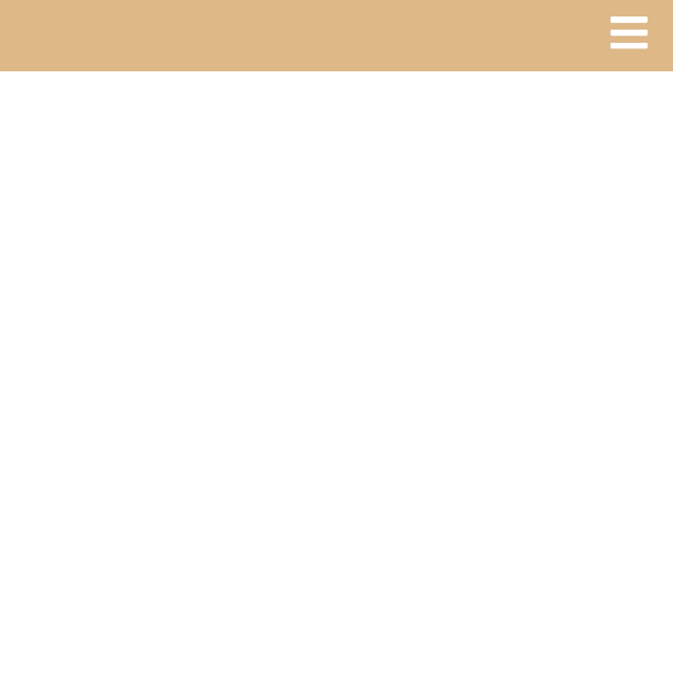
When using a cursor on navbar link then uses “:hover” css function In this Mobile showing as view responsive with “toggle” fa fa iconWhen Click “toggle” fa fa-icon then show this type of navigation bar.
The flex-direction property accepts 4 different values:
Property
Description
row (default)
same as text direction.
row-reverse
opposite to text direction.
column
same as row but top to bottom.
column-reverse
same as row-reverse top to bottom.
What are the background properties?
All CSS Background Properties Property Description
Property
Description
background-image
Sets the background image for an element
background-origin
Specifies where the background image(s) is/are positioned
background-position
Sets the starting position of a background image
background-repeat
Sets how a background image will be repeated
How do you change position in CSS?
You can use two values top and left along with the position property to move an HTML element anywhere in the HTML document.
Property
Description
Move Left
Use a negative value for left.
Move Right
Use a positive value for left.
Move Up
Use a negative value for top
Move Down
Use a positive value for top.
What is Z-index in CSS?
The z-index CSS property sets the z-order of a positioned element and its descendants or flex items. Overlapping elements with a larger z-index cover those with a smaller one. If you want to create a custom stacking order, you can use the z-index property on a positioned element. The z-index property can be specified with an integer value (positive, zero, or negative), which represents the position of the element along the z-axis.
How do I fix Z-index in CSS?
To sum up, most issues with z-index can be solved by following these two guidelines: Check that the elements have their position set and z-index numbers in the correct order. Make sure that you don’t have parent elements limiting the z-index level of their children.
How do you use sticky position in CSS?
CSS Demo: position
To see the effect of sticky positioning, select the position: sticky option and scroll this container. The element will scroll along with its container, until it is at the top of the container (or reaches the offset specified in top ), and will then stop scrolling, so it stays visible.