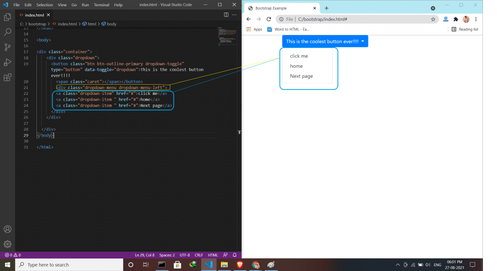
Dropdown menu is a toggleable menu that allows users to choose one value from a predefined list. Sometimes it helps the users to same time for finding some particular things.
For creating a dropdown menu
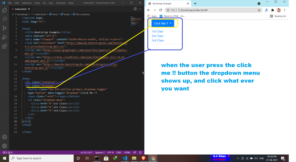
- The class dropdown indicates a dropdown menu.
- To open the dropdown menu, use a button or a link with a class of .dropdown-toggle and the data-toggle=”dropdown” attribute.
- arrow icon () used inside button .caret class in span tag.
- And then .dropdown-menu class inside <ul> or <ol> element to actually build the dropdown menu.
Styles for using the dropdown to look fabulous:-
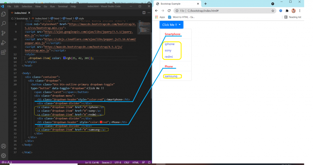
- Dropdown Divider (This class is used to separate links inside the dropdown menu with a thin horizontal borde)
- Dropdown Header (This class is used to add headers inside the dropdown menu)
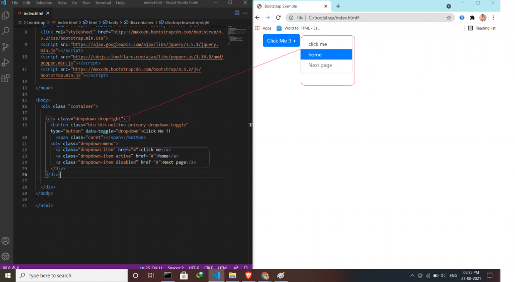
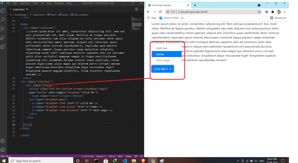
- Disable and Active items (This class is used to Highlight a specific dropdown item)
- Dropdown Position (This class is used to adjust the dropdown on the left or right side)
- Dropup (This class is used to the dropdown menu to expand upward direction)
- Dropdown Menu Right/left (This class is used to adjust the menu whether its place is right or left )
The simple way to create a dropdown
Divider & header use:-
Disable and Active items & Dropdown Position use:-
Dropup
Dropdown Menu Right use:-
Latest posts by vikashdev k (see all)
- PHP OOP: Traits - October 25, 2021
- PHP OOP: Late Static Binding - October 25, 2021
- PHP OOP : Static Members - October 23, 2021