Bootstrap utility display changes the value of the property with our responsive display utility classes. We purposely support only a subset of all possible values for display. Classes can be combined for various effects as you need.
| Screen Size | Class |
| Hidden an element | .d-none |
| Hides an element on a specific screen size | .d-*-none |
| Hidden only on xs | .d-none .d-sm-block |
| Hidden only on sm | .d-sm-none .d-md-block |
| Hidden only on md | .d-md-none .d-lg-block |
| Hidden only on lg | .d-lg-none .d-xl-block |
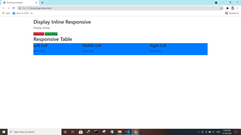
| An element inline | .d-inline |
| An element inline on a specific screen size | .d-*-inline |
| An element inline-block | .d-inline-block |
| An element inline-block on a specific screen size | .d-*-inline-block |
| An Element display as a table | .d-table |
| An element display as a table on a specific screen size | .d-*-table |
| An element display as a table cell | .d-table-cell |
| An element display as a table cell on a specific screen size | .d-*-table-cell |
| An element display as a table row | .d-table-row |
| An element display as a table row on a specific screen size | .d-*-table-row |
| Creates a flexbox container and transforms direct children into flex items | .d-flex |
| Creates a flexbox container on a specific screen size | .d-*-flex |
| Creates an inline flexbox container | .d-inline-flex |
| Creates an inline flexbox container on a specific screen size | .d-*-inline-flex |
Syntax:-
<div class="container mt-4">
  <h2>Display Inline Block</h2>
  <p>Use the d-inline-block class.</p>
  <div class="d-inline-block">Inline block DIV.</div>
  <div class="d-inline-block">Inline block DIV.</div>
</div>