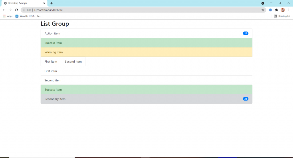
List groups are a flexible and powerful component for displaying a series of content.
features:-
- Basic items simply making for list.
- Active items used for showing it’s an active mode.
- Disabled items used for just reading that message.
- Links and buttons are used to create actionable list group items with hover.
- Flush / Remove Borders are used to remove some borders and rounded corners to render list group items edge-to-edge in a parent container (card).
- Horizontal to change the layout of list group items from vertical to horizontal across all breakpoints.
- Contextual classes to style list items with a stateful backgrond and color.
- With badges to show unread counts, activity .
- Custom content by the help of flexbox utilities.
- JavaScript behavior to create tabbable panes of local content.
- Using data attributes use for activate a list group navigation without writing any javaScript by simply specifying data-toggle=”list” or on an element.