JavaScript : Where to use javaScript code

JavaScript code use in following :

  1. Between the body tag of html
  2. Between the head tag of html
  3. In .js file (external javaScript)

1. JavaScript use between html body tag :

Example of javaScript using inside html between body tag.

Output :- Hello World

2. JavaScript use between head tag in html :

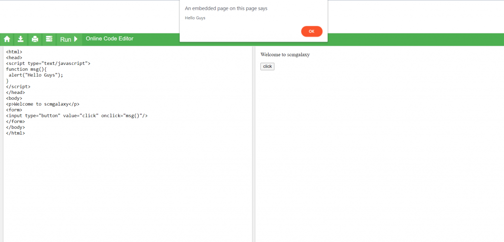
Example to use javaScript between head tag in html.

Output :

3. External JavaScript file :

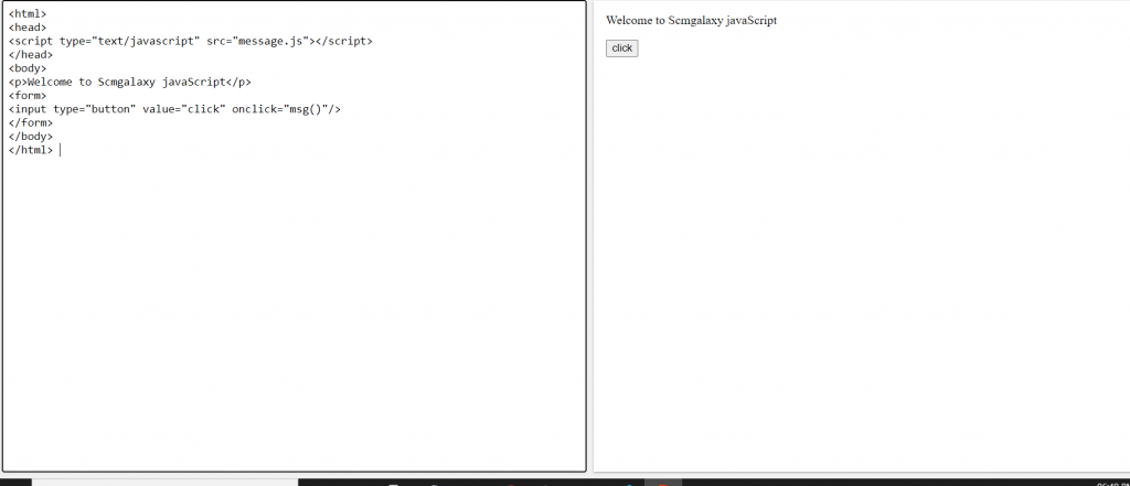
We can create external JavaScript file and embed it in many html page. If you want to run the same JavaScript on several pages in a web site, you should create an external JavaScript file, instead of writing the same script over and over again.

message.js

index.html

Tagged : / / / / / / / / / / /

JavaScript : Introduction

JavaScript :

  • JavaScript is used to create client-side dynamic pages.
  • JavaScript (js) is a light-weight object-oriented programming language.
  • JavaScript is not a compiled language, but it is a translated language.
  • The JavaScript Translator (embedded in the browser) is responsible for translating the JavaScript code for the web browser.
  •  JavaScript, users can build modern web applications to interact directly without reloading the page every time.
  • databases such as CouchDB and MongoDB uses JavaScript as their scripting and query language.

Features of JavaScript :

There are following features of js :-

  • Object-Centered Script Language
  • Light Weight and delicate
  • Interpreted language
  • Case Sensitive format/language
  • Ability to perform In Built Function
  • Statements Looping
  • Client edge Technology
  • Validation of User’s Input
  • Else and If Statement
  • It uses prototypes rather than using classes for inheritance.
  • It is supportable in several operating systems including, Windows, macOS, etc.
  • It provides good control to the users over the web browsers.

Application of JavaScript

JavaScript is used to create interactive websites. It is mainly used for:

  • Client-side validation
  • Manipulating HTML Pages
  • User Notifications
  • Dynamic drop-down menus
  • Displaying date and time
  • Displaying pop-up windows 
  • Alert dialog box
  • Confirm dialog box
  • Prompt dialog box
  • Back-end Data Loading
  • Presentations
  • Server Applications
  • Displaying clocks etc.

JavaScript Example :

Output :-

Welcome to JavaScript

Hello JavaScript by JavaScript

Tagged : / / / / / / / / / / / / / /

Bootstrap : Default Text Sizes

Bootstrap’s font sizes are calculated off of the body font size by using rem values. If you change
the body font size all styles will be increased/decreased automatically. Rem stands for “root em”
because it calculates the size based on the size of the root of the document or body tag.

Tag / ClassDefault Font size
body16px; line-height: 1.5;
font-family: “Helvetica Neue”, Helvetica, Arial,
sans-serif;
p, li1rem / 16px
h12.5rem / 40px
h1 small80% / 32px
h22rem / 32px
h2 small80% / 25.6px
h31.75rem / 28px
h3 small80% / 22.4px
h41.5rem / 24px
h4 small80% / 24px
h51.25rem / 20px
h5 small80% / 16px
h61rem / 16px
h6 small80% / 12.8px
.display-16rem / 90px
.display-25.5rem / 82.5px
.display-34.5rem / 67.5px
.display-43.5rem / 52.5px
Tagged : / / / / / / / / / / / / /

Bootstrap Utilities : “Visibility”

With visibility utilities you have control the visibility, without modifying the display, of elements.

Tagged : / / / / / / / / / / / / / / / /

Bootstrap Utilities : Text

Text Utilities classes, contains various text properties, such as, text alignment, text wrapping, text overflow, text transformation, font weight, italics, monospace, resetting color of text, removing text decorations.

1. Text alignment :

  • .class text-justify
  • .class text-left
  • .class text-center
  • .class text-right
  • .class text-sm|md|lg|xl-left

2. Text wrapping and overflow :

  • .class text-wrap
  • .class text-nowrap
  • .class text-truncate

3. Word break :

  • .class text-break

4. Text transform :

  • .class text-lowercase
  • .class text-uppercase
  • .class text-capitalize

5. Font weight and italics :

  • .class font-weight-bold
  • .class font-weight-bolder
  • .class font-weight-normal
  • .class font-weight-light
  • .class font-weight-lighter
  • .class font-italic

6. Monospace :

  • .class text-monospace

7. Reset color :

  • .class text-muted

8. Text decoration

  • .class text-decoration-none
Tagged : / / / / / / / / / / / / /

Bootstrap Utilities : Spacing

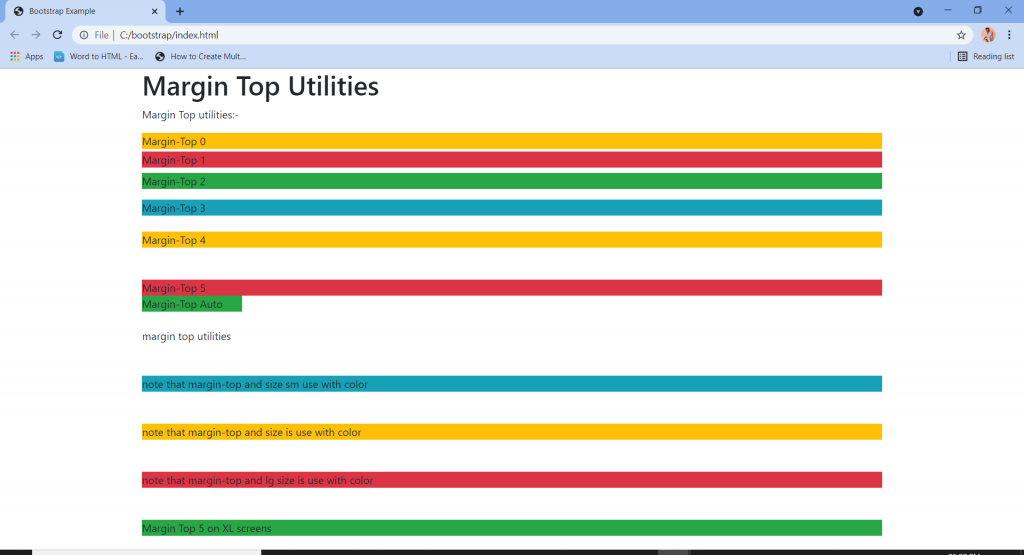
Spacing helpers are useful for modifying the padding and margin of an element.

Where property is one of:

  1. msets margin
  2. p-sets padding

Sides is one of:-

  • t-sets margin-padding “top
  • b-sets margin-padding “bottom
  • l-sets margin-padding “left
  • r-sets margin-padding “right
  • x-sets padding left|right or margin left|right
  • y-sets padding top|bottom or margin top|bottom
  • blank-sets margin padding on all sides of the element

Size is one of:-

  • 0-sets m|p to 0
  • 1-sets m|p to .25rem
  • 2-sets m|p to .5rem
  • 3-sets m|p to 1rem
  • 4-sets m|p to 1.5rem
  • 5-sets m|p to 3rem
  • auto-sets margin to auto

Negative margin :-

  • n1-sets margin to -.25rem
  • n2-sets margin to -.5rem
  • n3-sets margin to -1rem
  • n4-sets margin to -1.5rem
  • n5-sets margin to -3rem
Tagged : / / / / / / / / / / / / / / /

Bootstrap Utilities : “Screenreaders”

.sr-only class is used to hide an element in all device except screenreader.

Tagged : / / / / / / / / / / / /

Bootstrap utilities : “Position”

Arrange the elements easily with the positioning utilities.

  • .fixed-top class is use to fix the element in the top position of the page.
  • .fixed-bottom class is use to fix the element in the bottom position of the page.
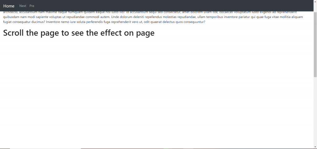
  • .sticky-top class is use to stick the element at the top of the page when you scroll past it.
Tagged : / / / / / / / / / /

Bootstrap: Utilities “Image replacement”

Bootstrap 4 image replacement is used to replace an element text content with a background image.

<h1 class="text-hide">Text declare </h1>  
<h1 class="text-hide" style="background-image: url('image link'); 
         background-repeat: no-repeat; 
         width: 500px; height: 500px; ">
    google
  </h1>
Tagged : / / / / / / / /

Bootstrap: Utilities “Flex”

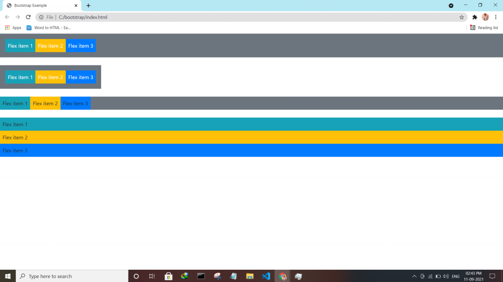
Bootstrap utilities Flex utility can be used to manage the layout, alignment, grid columns, navigation, and other components of the page.

All flex classes come with additional responsive classes, which makes it easy to set a specific flex class on specific screen size.

The * the symbol can be replaced with sm, md, lg or xl, which represents small, medium, large or xlarge screens.

Class Description
.d-*-flexCreates a flexbox container for different screens
.d-*-inline-flexCreates an inline flexbox container for different screens
.flex-*-rowDisplay flex items horizontally on different screens
.flex-*-row-reverseDisplay flex items horizontally, and right-aligned, on different screens
.flex-*-columnDisplay flex items vertically on different screens
.flex-*-column-reverseDisplay flex items vertically, with reversed order, on different screens screens
.justify-content-*-startDisplay flex items from the start (left-aligned) on different screens
.justify-content-*-endDisplay flex items at the end (right-aligned) on different screens
.justify-content-*-centerDisplay flex items in the center of a flex container on different screens
.justify-content-*-betweenDisplay flex items in “between” on different screens
.justify-content-*-aroundDisplay flex items “around” on different screens
.flex-*-fillForce flex items into equal widths on different screens
.flex-*-grow-0Don’t make the items grow on different screens
.flex-*-grow-1Make items grow on different screens
.flex-*-shrink-0Don’t make the items shrink on different screens
.flex-*-shrink-1Make items shrink on different screens
.order-*-0-12Change the order from 0 to 12 on small screens
.flex-*-nowrapDon’t wrap items on different screens
.flex-*-wrapWrap items on different screens
.flex-*-wrap-reverseReverse the wrapping of items on different screens
.align-content-*-startAlign gathered items from the start on different screens
.align-content-*-endAlign gathered items at the end on different screens
.align-content-*-centerAlign gathered items in the center on different screens
.align-content-*-aroundAlign gathered items “around” on different screens
.align-content-*-stretchStretch gathered items on different screens
.align-items-*-startAlign single rows of items from the start on different screens
.align-items-*-endAlign single rows of items at the end on different screens
.align-items-*-centerAlign single rows of items in the center on different screens
.align-items-*-baselineAlign single rows of items on the baseline on different screens
.align-items-*-stretchStretch single rows of items on different screens
.align-self-*-startAlign a flex item from the start on different screens
.align-self-*-endAlign a flex item at the end on different screens
.align-self-*-centerAlign a flex item in the center on different screens
.align-self-*-baselineAlign a flex item on the baseline on different screens
.align-self-*-stretchStretch a flex item on different screens
Tagged : / / / / / / / /