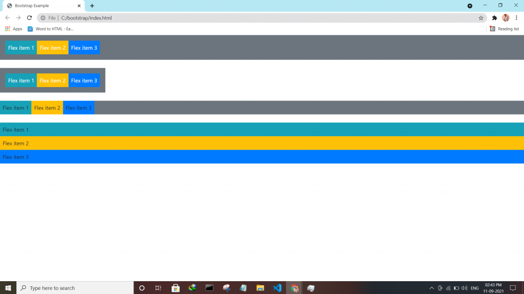
Bootstrap utilities Flex utility can be used to manage the layout, alignment, grid columns, navigation, and other components of the page.
All flex classes come with additional responsive classes, which makes it easy to set a specific flex class on specific screen size.
The * the symbol can be replaced with sm, md, lg or xl, which represents small, medium, large or xlarge screens.
| Class | Description |
| .d-*-flex | Creates a flexbox container for different screens |
| .d-*-inline-flex | Creates an inline flexbox container for different screens |
| .flex-*-row | Display flex items horizontally on different screens |
| .flex-*-row-reverse | Display flex items horizontally, and right-aligned, on different screens |
| .flex-*-column | Display flex items vertically on different screens |
| .flex-*-column-reverse | Display flex items vertically, with reversed order, on different screens screens |
| .justify-content-*-start | Display flex items from the start (left-aligned) on different screens |
| .justify-content-*-end | Display flex items at the end (right-aligned) on different screens |
| .justify-content-*-center | Display flex items in the center of a flex container on different screens |
| .justify-content-*-between | Display flex items in “between” on different screens |
| .justify-content-*-around | Display flex items “around” on different screens |
| .flex-*-fill | Force flex items into equal widths on different screens |
| .flex-*-grow-0 | Don’t make the items grow on different screens |
| .flex-*-grow-1 | Make items grow on different screens |
| .flex-*-shrink-0 | Don’t make the items shrink on different screens |
| .flex-*-shrink-1 | Make items shrink on different screens |
| .order-*-0-12 | Change the order from 0 to 12 on small screens |
| .flex-*-nowrap | Don’t wrap items on different screens |
| .flex-*-wrap | Wrap items on different screens |
| .flex-*-wrap-reverse | Reverse the wrapping of items on different screens |
| .align-content-*-start | Align gathered items from the start on different screens |
| .align-content-*-end | Align gathered items at the end on different screens |
| .align-content-*-center | Align gathered items in the center on different screens |
| .align-content-*-around | Align gathered items “around” on different screens |
| .align-content-*-stretch | Stretch gathered items on different screens |
| .align-items-*-start | Align single rows of items from the start on different screens |
| .align-items-*-end | Align single rows of items at the end on different screens |
| .align-items-*-center | Align single rows of items in the center on different screens |
| .align-items-*-baseline | Align single rows of items on the baseline on different screens |
| .align-items-*-stretch | Stretch single rows of items on different screens |
| .align-self-*-start | Align a flex item from the start on different screens |
| .align-self-*-end | Align a flex item at the end on different screens |
| .align-self-*-center | Align a flex item in the center on different screens |
| .align-self-*-baseline | Align a flex item on the baseline on different screens |
| .align-self-*-stretch | Stretch a flex item on different screens |

Latest posts by vikashdev k (see all)
- PHP OOP: Traits - October 25, 2021
- PHP OOP: Late Static Binding - October 25, 2021
- PHP OOP : Static Members - October 23, 2021