Bootstrap embeds is a utility that helps you insert video or slideshow in the page keeping width of the parent and scales on any device.
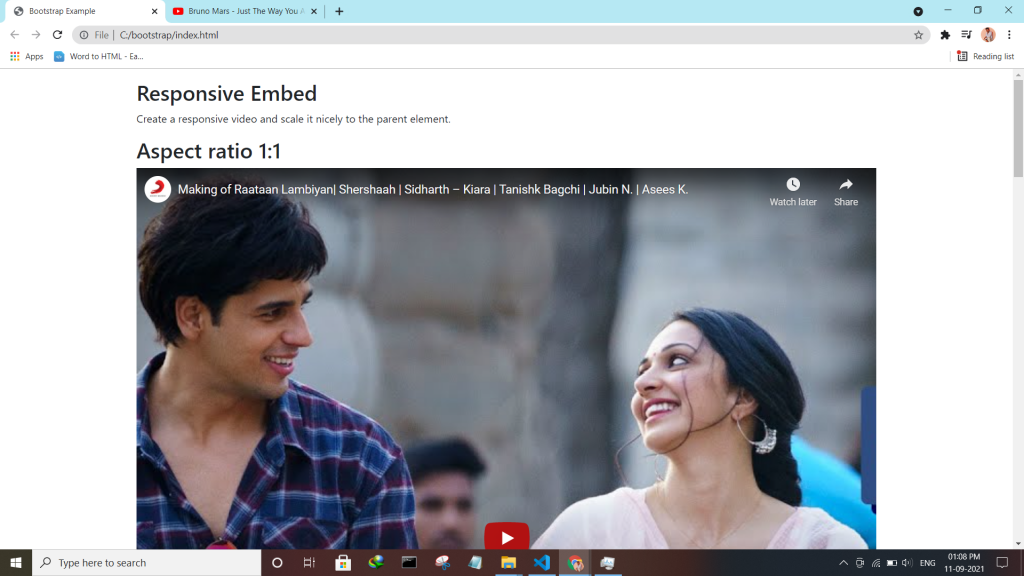
Bootstrap embeds is a utility that helps you insert video or slideshow in the page keeping width of the parent and scales on any device.
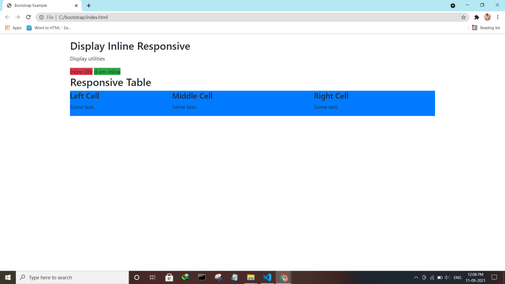
Bootstrap utility display changes the value of the property with our responsive display utility classes. We purposely support only a subset of all possible values for display. Classes can be combined for various effects as you need.
| Screen Size | Class |
| Hidden an element | .d-none |
| Hides an element on a specific screen size | .d-*-none |
| Hidden only on xs | .d-none .d-sm-block |
| Hidden only on sm | .d-sm-none .d-md-block |
| Hidden only on md | .d-md-none .d-lg-block |
| Hidden only on lg | .d-lg-none .d-xl-block |
| An element inline | .d-inline |
| An element inline on a specific screen size | .d-*-inline |
| An element inline-block | .d-inline-block |
| An element inline-block on a specific screen size | .d-*-inline-block |
| An Element display as a table | .d-table |
| An element display as a table on a specific screen size | .d-*-table |
| An element display as a table cell | .d-table-cell |
| An element display as a table cell on a specific screen size | .d-*-table-cell |
| An element display as a table row | .d-table-row |
| An element display as a table row on a specific screen size | .d-*-table-row |
| Creates a flexbox container and transforms direct children into flex items | .d-flex |
| Creates a flexbox container on a specific screen size | .d-*-flex |
| Creates an inline flexbox container | .d-inline-flex |
| Creates an inline flexbox container on a specific screen size | .d-*-inline-flex |
<div class="container mt-4">
  <h2>Display Inline Block</h2>
  <p>Use the d-inline-block class.</p>
  <div class="d-inline-block">Inline block DIV.</div>
  <div class="d-inline-block">Inline block DIV.</div>
</div>
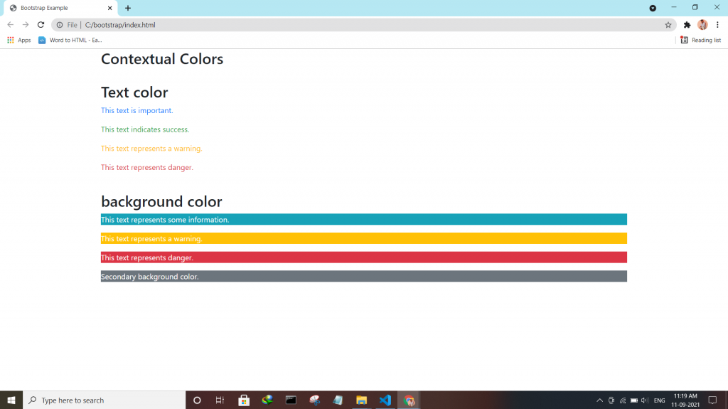
Check the enhanced Bootstrap 4 Text colors — Convey meaning through color with a handful of color utility classes.
:- .text-muted, .text-primary, .text-success, .text-info, .text-warning, .text-danger, .text-secondary, .text-white, .text-dark, .text-body (default body color/often black) and .text-light.
:- .bg-primary, .bg-success, .bg-info, .bg-warning, .bg-danger, .bg-secondary, .bg-dark and .bg-light.
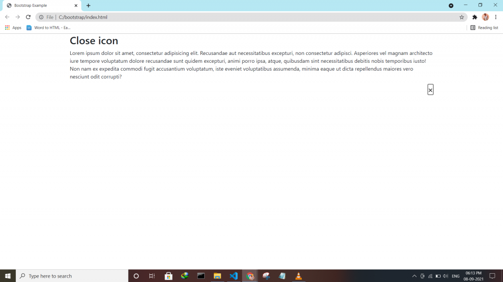
Bootstrap 4 has a lot of utility/helper classes to quickly style elements without using any CSS code. Use the .close class to style a close icon.
<div class="clearfix">
<button type="button" class="close">×</button>
</div>
Bootstrap 4 has a lot of utility classes to quickly style elements. With no using CSS code.
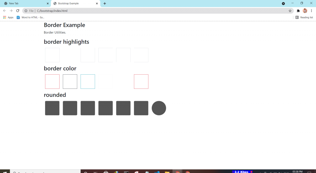
This class adds a border all around the element.
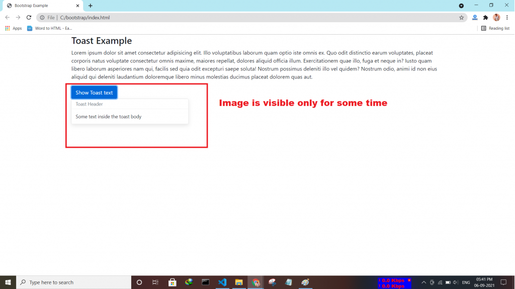
The toast component is used for showing a couple of seconds of a message when something happens. It works the same as an alert box.
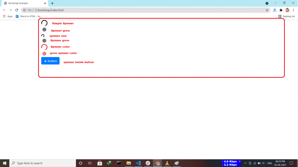
Bootstrap “spinners” is used to display the loading state in your projects.
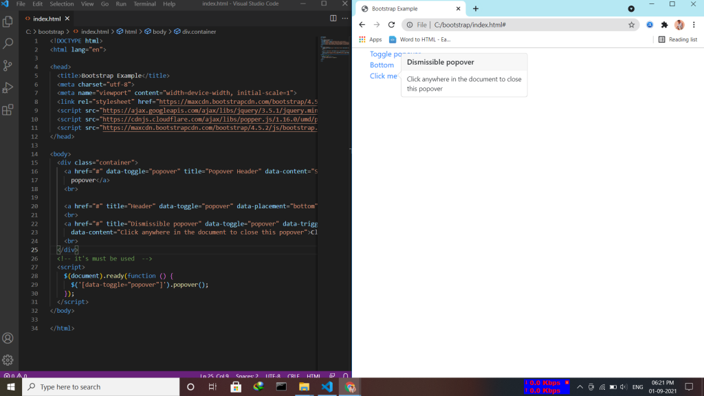
A popover is similar to the tooltip, offering an extended view complete with a heading. Popovers are generally used to display additional information about any element and are displayed on click of mouse pointer over that element. Note:- Popovers must be initialized with jQuery.
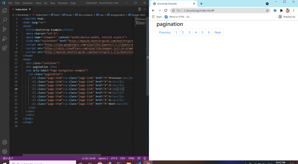
Pagination is a component in bootstrap that is used to enable navigation between pages in a website. It is a method of dividing web content into discrete pages, thus presenting content in a limited and digestible manner.