Bootstrap 4 provides users with different styles of buttons.
- Button Color.
- Button Outline.
- Button Size.
- Block level Buttons.
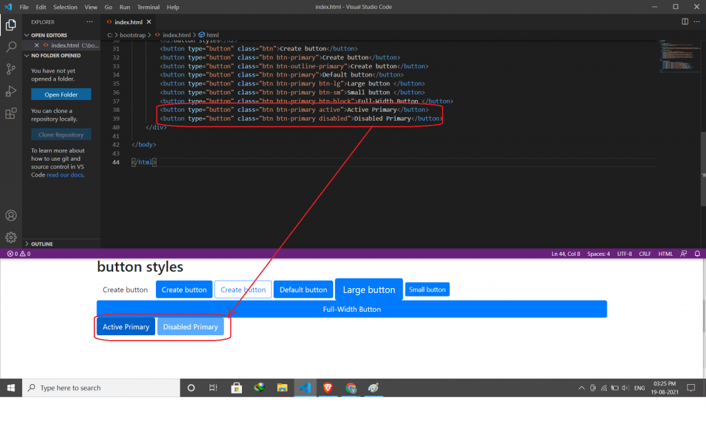
- Active/Disabled Buttons.
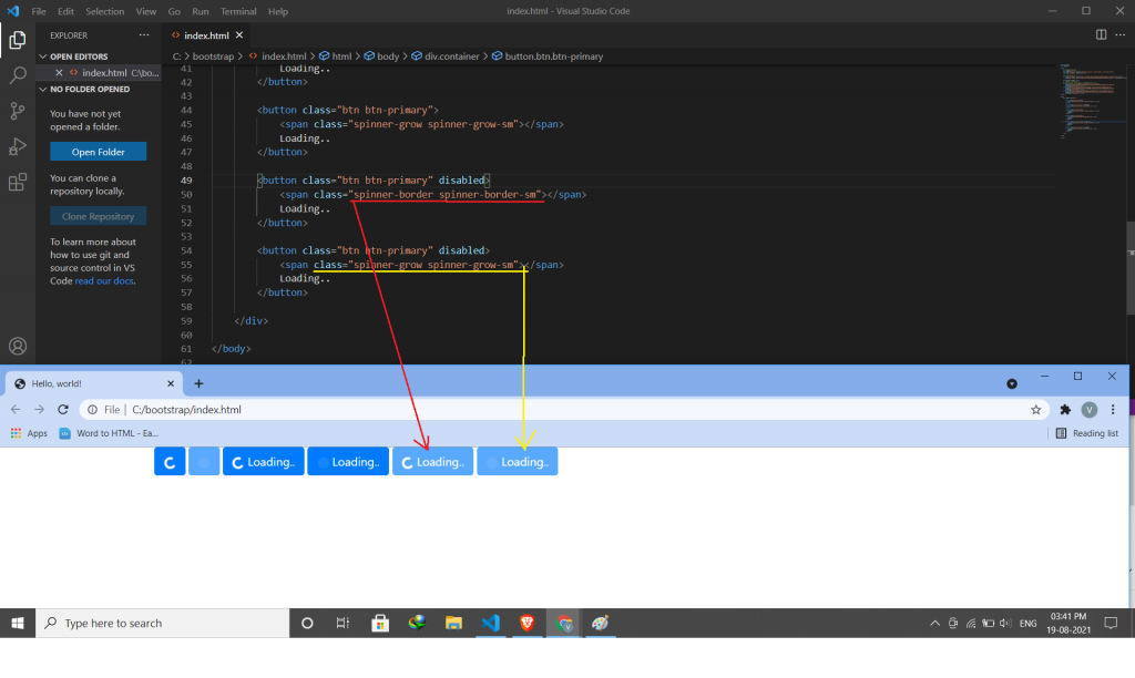
- Spinner Buttons.
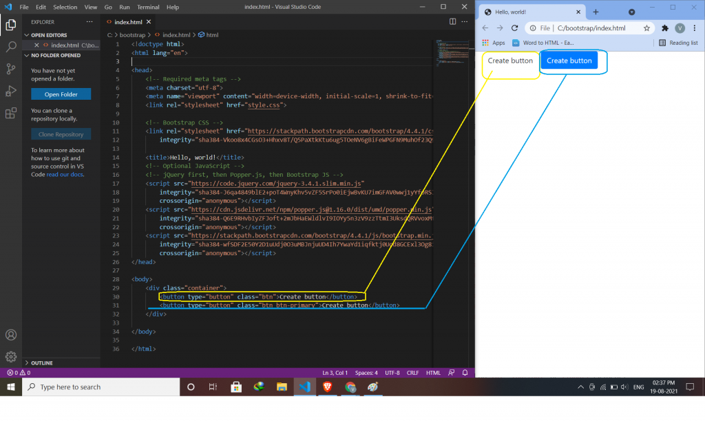
Button color:
Use the background-color property to change the background color of a button.
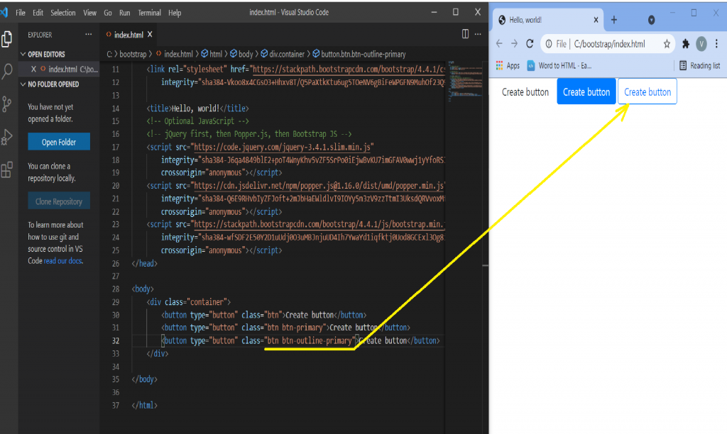
Button Outline:
The button outline style removes all background images or colors from a button and gives it a lighter look.
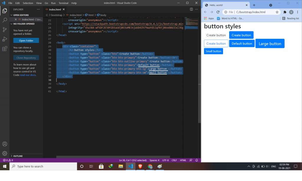
Button Sizes:
This will indicate to you the size of the button.
- Default
- Large (btn-lg)
- Small (btn-sm)
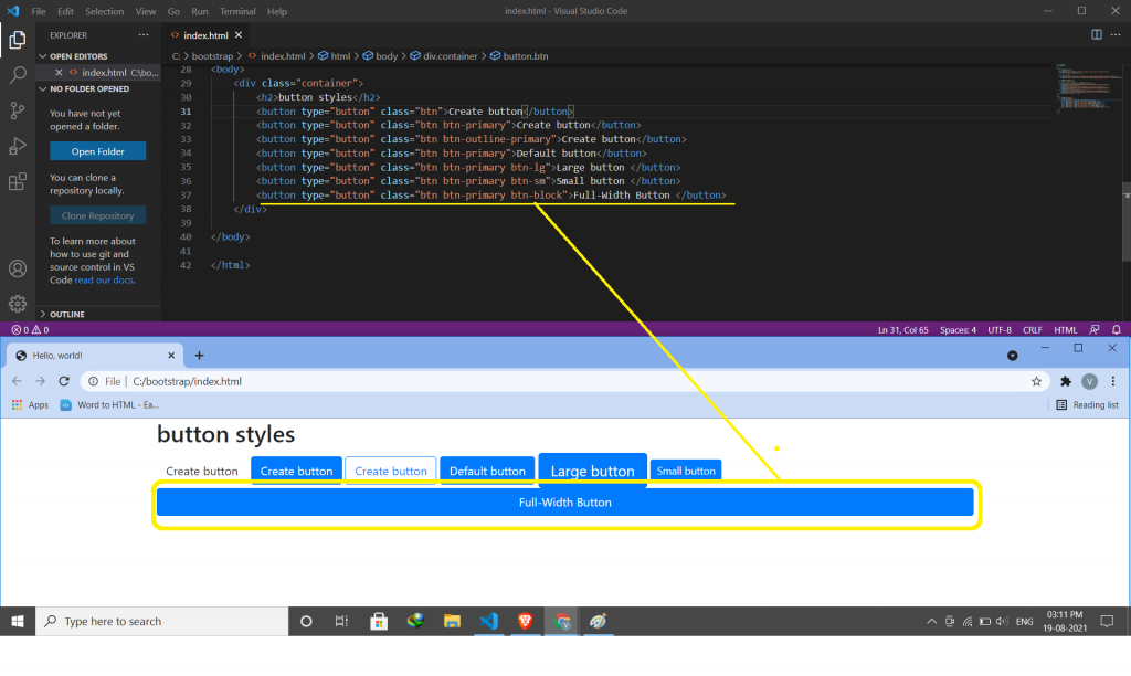
Block Level Buttons:
The .btn-block class is used to create a block-level button that spans the entire width of the parent elements.
Active/Disabled Buttons:
A button can be set to an active (clickable) or a disabled (unclickable) state.
Spinner Buttons:
You can also add “spinners” to a button.

Latest posts by vikashdev k (see all)
- PHP OOP: Traits - October 25, 2021
- PHP OOP: Late Static Binding - October 25, 2021
- PHP OOP : Static Members - October 23, 2021