A media query consists of an optional media type and zero or more expressions that limit the style sheets’ scope by using media features, such as width, height, and color.
Syntax: –
@media not|only mediatype and (expressions/ media features) { CSS; }
Ex: –
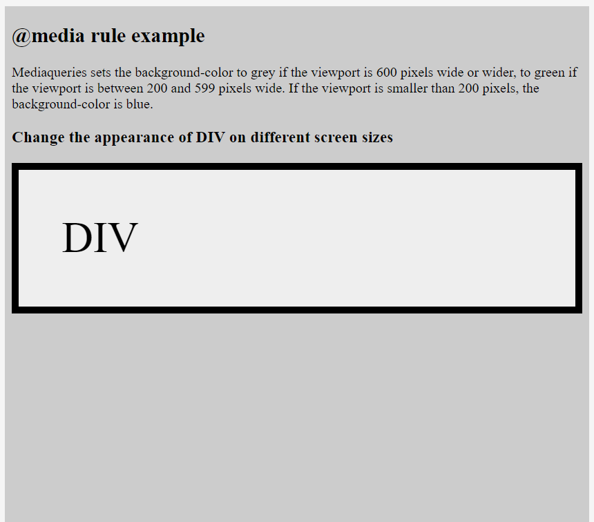
@media screen and (min-width: 480px) {
body {
background-color: lightgreen; }
}
@media (min-width: 480px) {
body {
background-color: lightgreen; }
}
- all – Used for all media type devices
- print – Used for printers
- screen – Used for computer screens, tablets, smart-phones etc.
- speech – Used for screenreaders that “reads” the page out loud
If you use the not or only operators, you must specify an explicit media type.
And-
- @media (min-width: 800px) { CSS }
- @media (min-width: 800px) and (orientation: landscape) { CSS }
- @media screen and (min-width: 800px) and (orientation: landscape) { CSS }
Or (Comma , )-
- @media (min-width: 800px), (orientation: landscape) { CSS }
Not-
- @media not all and (min-width: 800px) { CSS }
- @media not (all and (min-width: 800px)) { CSS }
- @media (not all) and (min-width: 800px) { CSS }
- @media not screen and (color), print and (color) { CSS }
- @media (not (screen and (color))), print and (color) { CSS }


Latest posts by rajeshkumar (see all)