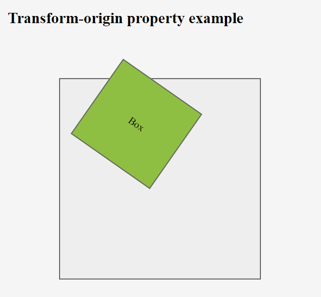
This property is used to change the position of transformed elements. This property must be used together with the transform property. We can set this property to x, y and z axis.
2D transformations can change the x and y axis of an element.
3D transformations can change the x, y and z axis of an element.
Syntax: –
Selector { transform-origin: x-axis y-axis z-axis; }
Ex: –
div { transform-origin: 10% 20% 30% ; }
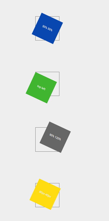
x-axis–
This is used to define where the view is placed at the x-axis.
- left
- center
- right
- length (px, cm, em, %)
y-axis-
This is used to define where the view is placed at the y-axis.
- top
- center
- bottom
- length (px, cm, em, %)
z-axis-
This is used to define where the view is placed at the z-axis.
- length (px, cm, em, %)
transform-style-
This property is used to specify how nested elements are rendered in 3D space. This property must be used together with the transform property. We can set this property to flat (default) and preserve-3d.
Ex: –
div { transform-style: preserve-3d ; }
Note – child elements will preserve its 3D position
- How to get Blackduck Trial version? - December 3, 2023
- PHP ionCube Error: cannot be decoded by this version of the ionCube Loader - December 2, 2023
- Cloudbees CD/RO Error: ectool - November 24, 2023