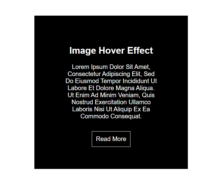
In this blog, I am creating careative CSS pop up effect & image hover effect clip path property using HTML & CSS. So, Let’s create an index.html & style.css below-
In this blog, I am creating careative CSS pop up effect & image hover effect clip path property using HTML & CSS. So, Let’s create an index.html & style.css below-
In this blog, I am creating creative menu effects using the transition-delay property using HTML & CSS. So, Let’s create an index.html & style.css below-


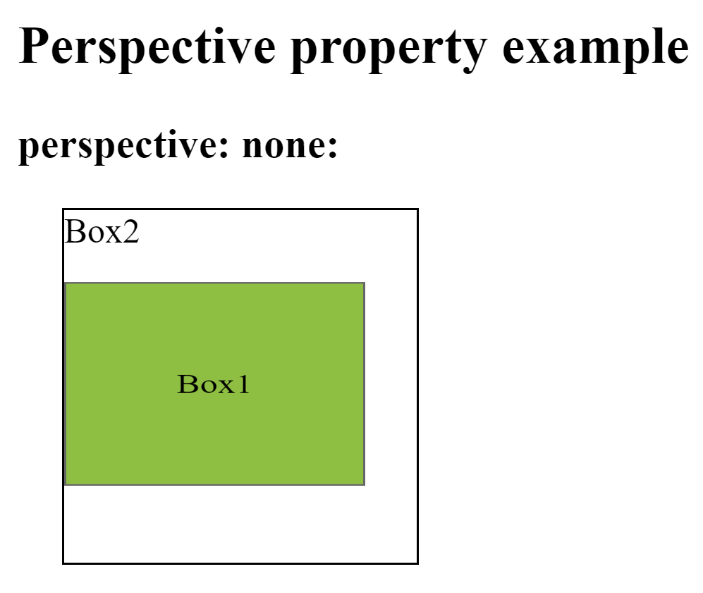
This property is used to define how many pixels a 3D element is placed from the view. This property allows you to change the perspective on how 3D elements are viewed. This will only effect on 3D transformed elements.
Whenever we define the perspective property for an element, it is the child elements that get the perspective view, not the element itself.
We can set this property to none (default) and length
Ex: –
div { perspective: 50px ; }
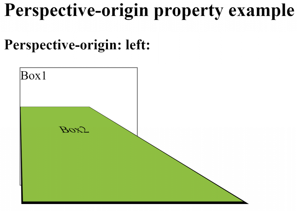
This property is used to define where a 3D element is based in the x- and the y-axis. This property allows you to change the bottom position of 3D elements. This will only effect on 3D transformed elements. We can set this property to x (default 50%) and y axis (default 50%).
Whenever we define the perspective-origin property for an element, it is the child elements that are positioned, not the element itself.
Ex: –
div { perspective-origin: 20% 20% ; }
This property is used to define whether or not an element should be visible when not facing the screen. This property is useful when an element is rotated, and you do not want to see its backside. We can set this property to visible (default) and hidden.
Ex: –
div { backface-visibility: hidden; }
Cookies are exposed as the cookie property of the Document object. This property is both readable and writeable.
You can see Cookies in Google Chrome by following chrome://settings/content/cookies
When you assign a string to document.cookie, the browser parses it as a cookie and adds it to its list of cookies. There are several parts to each cookies, many of them optional.
document.cookie = “name=value”;
document.cookie = “name=value; expires=date; domain=domain; path=path; secure”;
document.cookie = “name=value; max-age=inSecond; domain=domain; path=path; secure”;
Optional Cookies Attribute:-
max-age
expires
domain
path
secure
Whenever you omit the optional cookie fields, the browser fills them in automatically with reasonable defaults.
It is used to create persistent cookies. It is supported by all modern browsers except IE.
Type of cookies: –
It is used to create persistent cookies.
Ex:-
document.cookie = “username=devops; expires=Monday, 3-Sep-2018 09:00:00 UTC”;
It specifies the domain for which the cookie is valid. If not specified, this defaults to the host portion of the current document location. If a domain is specified, subdomains are always included.
Ex: –
Path can be / (root) or /mydir (directory). If not specified, defaults to the current path of the current document location, as well as its descendants.
Ex: – document.cookie = “username=devops; path=/”;
Ex: – document.cookie = “username=devops; path=/home”;
Cookie to only be transmitted over secure protocol as https. Before Chrome 52, this flag could appear with cookies from http domains.
Ex: – document.cookie = “username=devops; secure”;
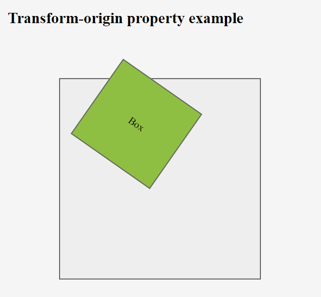
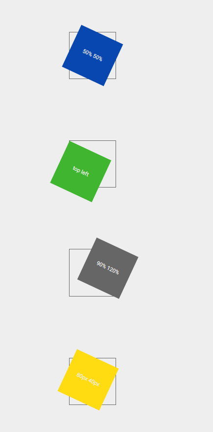
This property is used to change the position of transformed elements. This property must be used together with the transform property. We can set this property to x, y and z axis.
2D transformations can change the x and y axis of an element.
3D transformations can change the x, y and z axis of an element.
Syntax: –
Selector { transform-origin: x-axis y-axis z-axis; }
Ex: –
div { transform-origin: 10% 20% 30% ; }
This is used to define where the view is placed at the x-axis.
This is used to define where the view is placed at the y-axis.
This is used to define where the view is placed at the z-axis.
This property is used to specify how nested elements are rendered in 3D space. This property must be used together with the transform property. We can set this property to flat (default) and preserve-3d.
Ex: –
div { transform-style: preserve-3d ; }
Note – child elements will preserve its 3D position
The History object is a read-only array of URL strings that shows where the user has been recently.
Syntax: –
window.history.property
window.history.method
This is used to access the current location (URL) of the window. The Location object can be both read and replaced, so it is possible to update the location of a page through scripting. Location object is a property of Window.
Syntax:-
window.location.property
window.location.method
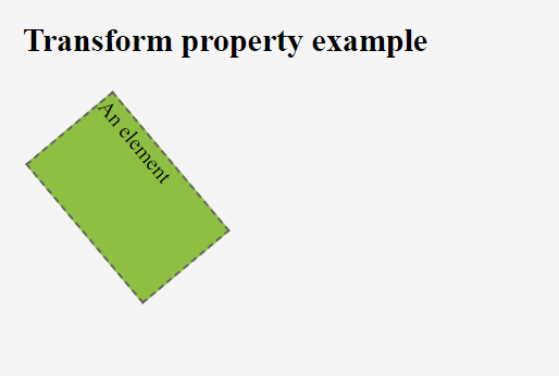
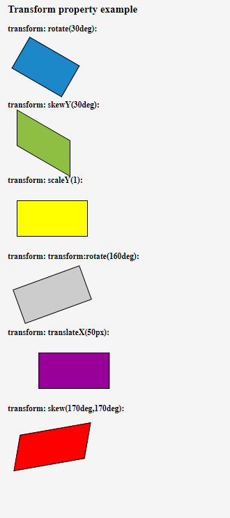
This property is used to apply a 2D or 3D transformation to an element. We can set below values: –
Ex:-
div { transform: rotate(20deg); }
This method is used to move an element from its current position.
Syntax: –
transform: translateX(px)
transform: translateY(px)
transform: translate(Xpx, Ypx)
Ex: –
transform: translateX(10px)
transform: translateY(5px)
transform: translate(10px, 5px)
This method is used to rotate an element clockwise or anti-clockwise according to a given degree.
Using negative values will rotate the element anti-clockwise.
Syntax: –
transform: rotate(ndeg)
Ex: –
transform: rotate(50deg)
transform: rotate(-40deg)
This method is used to increases or decreases the size of an element
Syntax: –
transform: scaleX(width)
transform: scaleY(height)
transform: scale(width, height)
Ex: –
transform: scaleX(3)
transform: scaleY(4)
transform: scale(3, 4)
This method is used to skews an element along the X and Y-axis by the given angles.
Syntax: –
transform: skewX(deg)
transform: skewY(deg)
transform: skew(Xdeg, Ydeg)
Ex: –
transform: skewX(30deg)
transform: skewY(40deg)
transform: skew(30deg, 40deg)
transform: skew(30deg)
This method is used to combines all the 2D transform methods into one.
The matrix() method take six parameters, containing mathematic functions, which allows you to rotate, scale, move (translate), and skew elements.
The parameters are as follow:
matrix(scaleX(),skewY(),skewX(),scaleY(),translateX(),translateY())
Syntax: –
transform:
Ex: –
transform:
No transform
Ex: –
transform: none;
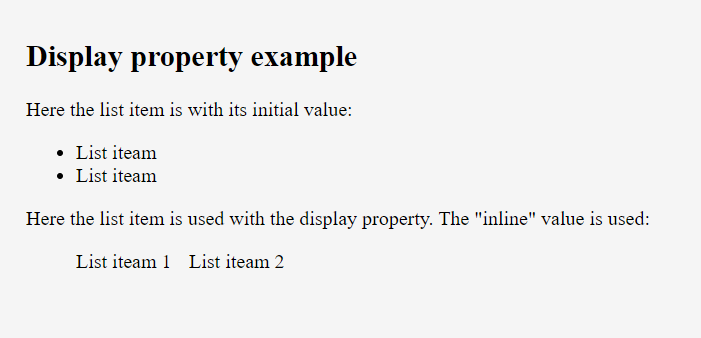
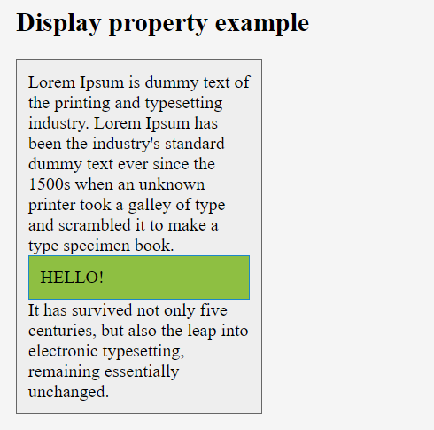
This property is used to define how an element should display. Every HTML element has a default display value depending on what type of element it is. The default display value for most elements is block or inline.
display properties use below –
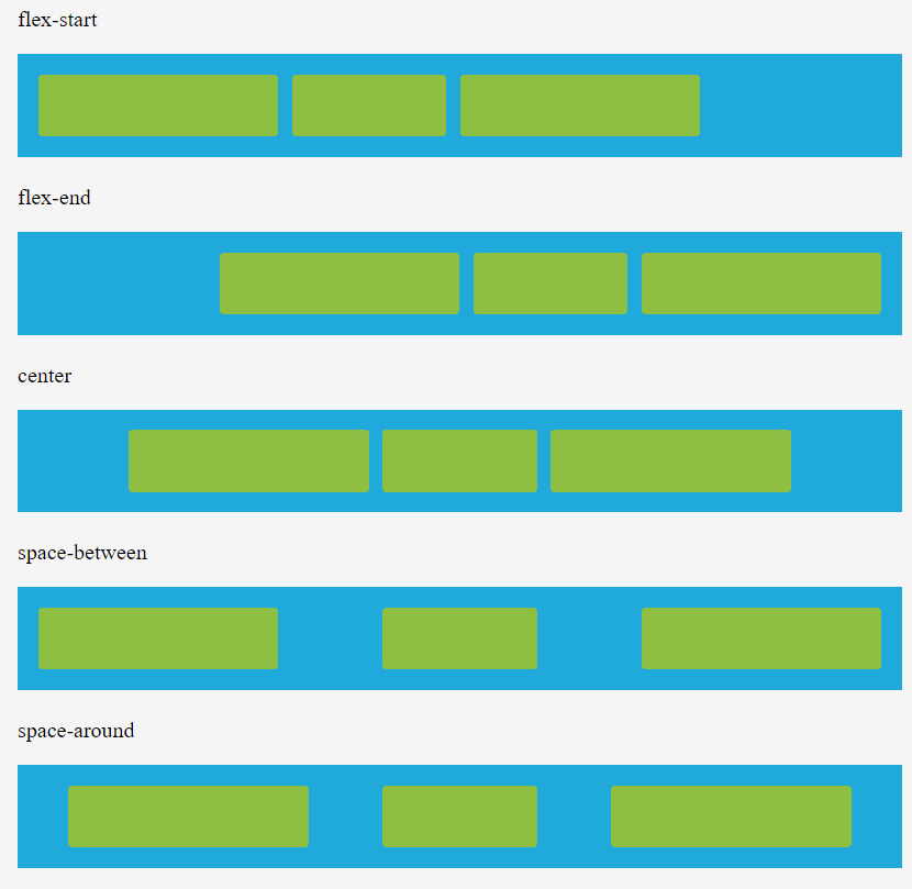
This property is used to align the flexible container’s items when the items do not use all available space on the main-axis (horizontally). We can set this property to flex-start (default), flex-end, center, space-between, space-around.
Ex: –
div { justify-content: center; }
This property is used to specify the default alignment for items inside the container. This property can be override using align-self property for each item. We can set this property to stretch (default), center, flex-start, flex-end, baseline.
Ex: –
div { align-items: center; }
This property is used to modify the behavior of the flex-wrap property. It is similar to align-items, but instead of aligning flex items, it aligns flex lines. There must be multiple lines of items for this property to have any effect. We can set this property to stretch (default), center, flex-start, flex-end, space-between, space-around.
Ex: –
This property is used to specify the order of a flexible item relative to the rest of the flexible items inside the same container. If the element is not a flexible item, the order property has no effect. We can set this property to number (default 0).
Ex: –
div {order: 1}
This property is used to specify the alignment for the selected item inside the flexible container. The align-self property overrides the flexible container’s align-items property. We can set this property to auto (default), stretch, center, flex-start, flex-end, baseline.
Ex: –
This property is used to specify the length of the item, relative to the rest of the flexible items inside the same container. If the element is not a flexible item, the flex property has no effect.
The flex property is a shorthand for the flex-grow, flex-shrink, and flex-basis properties.
Syntax: –
Selector { flex: flex-grow flex-shrink flex-basis}
Ex: –
div { flex: 2 3;}
–Its Layout mode a CSS 3 concept
–It helps to create responsive web pages
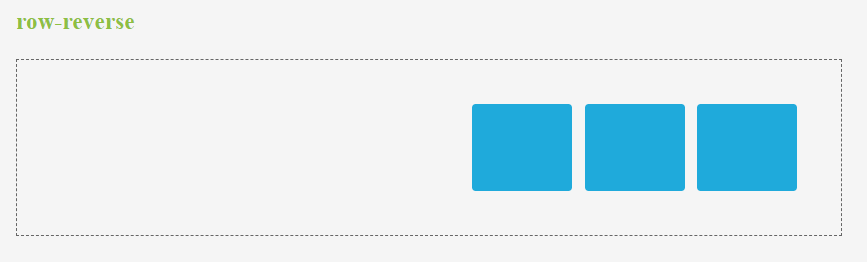
This property is used to set the direction of flexible items. If the element is not a flexible item, the flex-direction property has no effect. We can set this property to row (default), row-reverse, column, column-reverse.
Ex: –
div { flex-direction: column-reverse; }
This property is used to specify whether the flexible items should wrap or not. If the elements are not flexible items, the flex-wrap property has no effect. We can set this property to nowrap (default), wrap and wrap-reverse.
Ex: –
div { flex-wrap: wrap; }
It is a shorthand property for the flex-direction and the flex-wrap properties. If the elements are not flexible items, the flex-flow property has no effect.
Syntax: –
Selector { flex-flow: flex-direction flex-wrap;}
Ex: –
div { flex-flow: row-reverse wrap;}
This property is used to specify how much the item will grow relative to the rest of the flexible items inside the same container. If the element is not a flexible item, the flex-grow property has no effect. We can set this property to number (default 0).
Ex: –
div {flex-grow: 1;}
This property is used to specify how the item will shrink relative to the rest of the flexible items inside the same container. If the element is not a flexible item, the flex-shrink property has no effect. We can set this property to number (default 1).
Ex: –
div {flex-shrink: 2;}
This property is used to specify the initial length of a flexible item. If the element is not a flexible item, the flex-basis property has no effect. We can set this property to number and auto (default).
Ex:–
div {flex-basis: 3;}
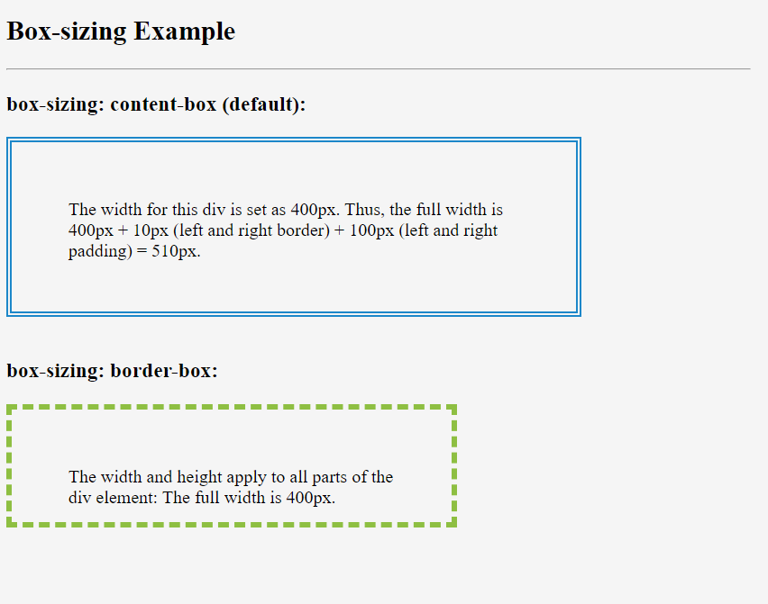
The box-sizing property tells the browser what the sizing properties should include. We can set this property to content-box (default) or border-box.
The box-sizing property is used to include the padding and border in an element’s total width and height.
Ex:-
div { box-sizing: border-box;}
The width and height properties (and min/max properties) include only the content. Border, padding, or margin are not included.
The width and height properties (and min/max properties) include content, padding, and border, but not the margin.
box-size property usually uses in cards, images & fonts.