How to use display property in CSS?

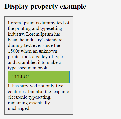
This property is used to define how an element should display. Every HTML element has a default display value depending on what type of element it is. The default display value for most elements is block or inline.

display properties use below –

  • inline
  • block
  • flex
  • inline-block
  • inline-flex
  • inline-table
  • list-item
  • run-in
  • table
  • table-row-group
  • table-caption
  • table-column-group
  • table-header-group
  • table-footer-group
  • table-cell
  • table-column
  • table-row none

Display

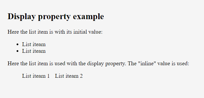
  • inline – When we set this value, the element does not start on a new line and only takes up as much width as necessary (we can’t set width/height it won’t work)
  • block – When we set this value, element always starts on a new line and takes up the full width available (we can set width/height)
  • inline-block – It is combination of inline and block value. It doesn’t start on new line but we can set width and height.
  • none – The element will not be displayed at all (has no effect on layout)
  • flex – Displays an element as a block-level flex container.
  • inline-flex – Displays an element as an inline-level flex container.
  • inline-table – The element is displayed as an inline-level table
  • run-in – Displays an element as either block or inline, depending on context
  • table – It works like a element
  • table-caption – It works like a element
  • table-header-group – It works like a element
  • table-footer-group – It works like a element
  • table-row-group – It works like a element
  • table-cell – It works like a element
  • table-row – It works like a element
  • list-item – It works like a element
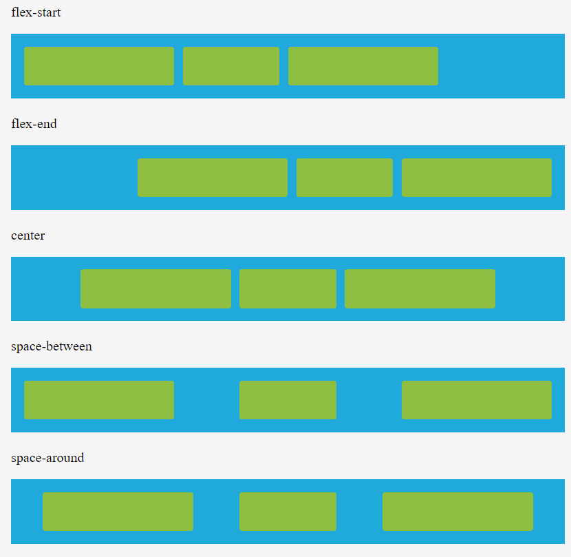
justify-content

This property is used to align the flexible container’s items when the items do not use all available space on the main-axis (horizontally). We can set this property to flex-start (default), flex-end, center, space-between, space-around.

Ex: –

div { justify-content: center; }

  • flex-start – This is used to position the item at the beginning of the container
  • flex-end – This is used to position the item at the end of the container
  • center – This is used to position the item at the center of the container
  • space-between – This is used to position the item with space between the lines
  • space-around – This is used to position the item with space before, between, and after the lines

align-items

This property is used to specify the default alignment for items inside the container. This property can be override using align-self property for each item. We can set this property to stretch (default), center, flex-start, flex-end, baseline.

Ex: –

div { align-items: center; }

  • stretch – This is used to stretch the item to fit the container
  • center – This is used to position the item at the center of the container
  • flex-start – This is used to position the item at the beginning of the container
  • flex-end – This is used to position the item at the end of the container
  • baseline – This is used to position the item at the baseline of the container

align-content

This property is used to modify the behavior of the flex-wrap property. It is similar to align-items, but instead of aligning flex items, it aligns flex lines. There must be multiple lines of items for this property to have any effect. We can set this property to stretch (default), center, flex-start, flex-end, space-between, space-around.

Ex: –

  • div { align-content: center; }
  • stretch – Lines stretch to take up the remaining space
  • center – Lines are packed toward the center of the flex container
  • flex-start – Lines are packed toward the start of the flex container
  • flex-end – Lines are packed toward the end of the flex container
  • space-between – Lines are evenly distributed in the flex container
  • space-around – Lines are evenly distributed in the flex container, with half-size spaces on either end

order

This property is used to specify the order of a flexible item relative to the rest of the flexible items inside the same container. If the element is not a flexible item, the order property has no effect. We can set this property to number (default 0).

Ex:

div {order: 1}

align-self

This property is used to specify the alignment for the selected item inside the flexible container. The align-self property overrides the flexible container’s align-items property. We can set this property to auto (default), stretch, center, flex-start, flex-end, baseline.

Ex:

  • div {align-self: center;}
  • auto – The element inherits its parent container’s align-items property, or “stretch” if it has no parent container
  • stretch – This is used to position the element to fit the container
  • center – This is used to position the element at the center of the container 
  • flex-start – This is used to position the element at the beginning of the container
  • flex-end – This is used to position the element at the end of the container
  • baseline – This is used to position the element at the baseline of the container
Display-block property

Tagged : / / / / / / /

How to use Flex property in CSS?

This property is used to specify the length of the item, relative to the rest of the flexible items inside the same container. If the element is not a flexible item, the flex property has no effect.

The flex property is a shorthand for the flex-grow, flex-shrink, and flex-basis properties.

Syntax: –

Selector { flex: flex-grow flex-shrink flex-basis}

Ex: –

div { flex: 2 3;}

FlexBox or Flexible Box

What is it ?

–Its Layout mode a CSS 3 concept

Why we need it ?

–It helps to create responsive web pages

Flexbox Properties

  • flex-direction
  • flex-wrap
  • align-content
  • flex-flow
  • flow-grow
  • flow-shrink
  • flow-basis
  • flex

flex-direction

This property is used to set the direction of flexible items. If the element is not a flexible item, the flex-direction property has no effect. We can set this property to row (default), row-reverse, column, column-reverse.

Ex: –

div { flex-direction: column-reverse; }

  • row – This is used to display the flexible items horizontally as row
  • row-reverse – This is used to display the flexible items same as row, but in reverse order
  • column – This is used to display the flexible items vertically as column
  • column-reverse – This is used to display the flexible items same as column, but in reverse order

flex-wrap

This property is used to specify whether the flexible items should wrap or not. If the elements are not flexible items, the flex-wrap property has no effect. We can set this property to nowrap (default), wrap and wrap-reverse.

Ex: –

div { flex-wrap: wrap; }

  • nowrap – It specifies that the flexible items will not wrap
  • wrap – It specifies that the flexible items will wrap if necessary
  • wrap-reverse – It specifies that the flexible items will wrap, if necessary, in reverse order

flex-flow

It is a shorthand property for the flex-direction and the flex-wrap properties. If the elements are not flexible items, the flex-flow property has no effect.

Syntax: –

Selector { flex-flow: flex-direction flex-wrap;}

Ex: –

div { flex-flow: row-reverse wrap;}

  • Flex-direction values:
  • row (default)
  • row-reverse
  • Column
  • column-reverse.
  • Flex-wrap values:
  • nowrap (default)
  • wrap
  • wrap-reverse

flex-grow

This property is used to specify how much the item will grow relative to the rest of the flexible items inside the same container. If the element is not a flexible item, the flex-grow property has no effect. We can set this property to number (default 0).

Ex: –

div {flex-grow: 1;}

flex-shrink

This property is used to specify how the item will shrink relative to the rest of the flexible items inside the same container. If the element is not a flexible item, the flex-shrink property has no effect. We can set this property to number (default 1).

Ex: –

div {flex-shrink: 2;}

flex-basis

This property is used to specify the initial length of a flexible item. If the element is not a flexible item, the flex-basis property has no effect. We can set this property to number and auto (default).

Ex:

div {flex-basis: 3;}

  • number – A length unit, or percentage, specifying the initial length of the flexible item(s)
  • auto – The length is equal to the length of the flexible item. If the item has no length specified, the length will be according to its content
Tagged : / / / /

How to use box-sizing property in CSS?

The box-sizing property tells the browser what the sizing properties should include. We can set this property to content-box (default) or border-box.

The box-sizing property is used to include the padding and border in an element’s total width and height.

Ex:-

div { box-sizing: border-box;}

content-box-

The width and height properties (and min/max properties) include only the content. Border, padding, or margin are not included.

border-box-

The width and height properties (and min/max properties) include content, padding, and border, but not the margin.

box-size property usually uses in cards, images & fonts.

Tagged : / / / /

Top 51 Linux commands for daily use

These are the top 51 Linux commands for daily use

1. ip – from Iproute2, a collection of utilities for controlling TCP/IP networking and traffic control in Linux.
2. ls – list directory contents.
3. df – display disk space usage.
4. du – estimate file space usage.
5. free – display memory usage.
6. scp – securely Copy Files Using SCP, with examples.
7. find – locates files based on some user-specified criteria.
8. ncdu – a disk utility for Unix systems.
9. pstree – display a tree of processes.
10. last – show a listing of last logged-in users.
11. w – show a list of currently logged-in user sessions.
12. grep – Search a file for a pattern of characters, then display all matching lines. 13. uptime – shows system uptime and load average.
14. top – shows an overall system view.
15. vmstat – shows system memory, processes, interrupts, paging, block I/O, and CPU info.
16. htop – interactive process viewer and manager.
17. dstat – view processes, memory, paging, I/O, CPU, etc., in real-time. All-in-one for vmstat, iostat, netstat, and ifstat.
18. iftop – network traffic viewer.
19. nethogs – network traffic analyzer.
20. iotop – interactive I/O viewer. Get an overview of storage r/w activity.
21. iostat – for storage I/O statistics.
22. netstat – for network statistics.
23. ss – utility to investigate sockets.
24. atop – For Linux server performance analysis.
25. Glances and nmon – htop and top Alternatives:
26. ssh – secure command-line access to remote Linux systems.
27. sudo – execute commands with administrative privilege.
28. cd – directory navigation.
29. pwd – shows your current directory location.
30. cp – copying files and folders.
31. mv – moving files and folders.
32. rm – removing files and folders.
33. mkdir – create or make new directories.
34. touch – used to update the access date and/or modification date of a computer file or directory.
35. man – for reading system reference manuals.
36. apropos – Search man page names and descriptions. 37. rsync – remote file transfers and syncing.
38. tar – an archiving utility.
39. gzip – file compression and decompression.
40. b2zip – similar to gzip. It uses a different compression algorithm.
41. zip – for packaging and compressing (to archive) files.
42. locate – search files in Linux.
43. ps – information about the currently running processes.
44. Making use of Bash scripts. Example: ./bashscript.sh
45. cron – set up scheduled tasks to run.
46. nmcli – network management.
47. ping – send ICMP ECHO_REQUEST to network hosts.
48. traceroute – check the route packets take to a specified host.
49. mtr – network diagnostic tool.
50. nslookup – query Internet name servers (NS) interactively.
51. host – perform DNS lookups in Linux.

Tagged : / / /

HTML: Option Tag

The <option>…</option> tags inside the <select>….</select> element define an option in the drop-down list.

<select>
	<option>………..</option>
	<option>………..</option>
</select>
AttributeValueDescription
disableddisabledSpecifies that an option should be disabled
labeltextSpecifies a shorter label for an option
selectedselectedSpecifies that an option should be pre-selected when the page loads
valuetextSpecifies the value to be sent to a server

Tagged : / / / / /

XAMPP: Another web server is already running

Error

root@ip-172-31-3-238:/home/ubuntu# /opt/lampp/lampp start
Starting XAMPP for Linux 7.4.13-0...
XAMPP: Starting Apache...fail.
XAMPP:  Another web server is already running.
XAMPP: Starting MySQL...ok.
XAMPP: Starting ProFTPD...ok.

Solution 1

$ /opt/lampp/lampp stop
$ ps -eaf | grep lampp
$ ps -eaf | grep httpd
$ ps -eaf | grep apache
$ kill -9 500 5347 5386
$ /opt/lampp/lampp start

Or Solution 2

$ sudo service apache2 stop
$ ps -eaf | grep apache2
$ ps -eaf | grep httpd
$ sudo service apache2 status
$ sudo service mysql status
$ sudo service mysqld status
$ /opt/lampp/lampp start
$ /opt/lampp/lampp stop
$ /opt/lampp/lampp start