Bootstrap: Utilities “Close icon”

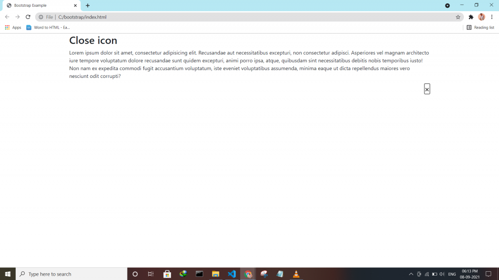
Bootstrap 4 has a lot of utility/helper classes to quickly style elements without using any CSS code. Use the .close class to style a close icon.

 <div class="clearfix">
      <button type="button" class="close">&times;</button>
    </div>
Tagged : / / / / / / / /

Bootstrap: Utilities “Clearfix”

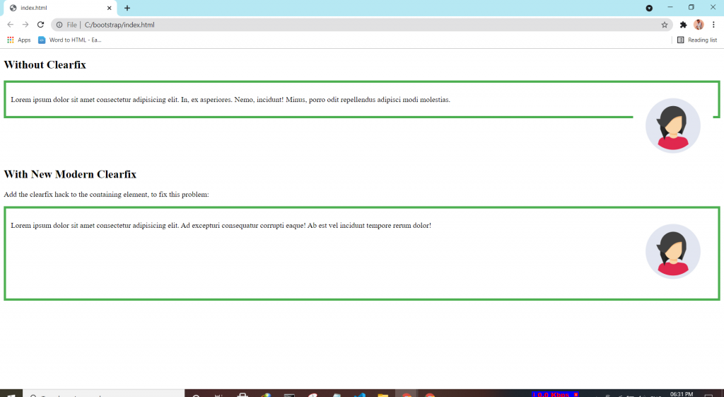
If an element is bigger than the element containing it, and it is floated, it will overflow outside of its container. Then we can add overflow: auto to the containing element to fix this problem.

.clearfix {
  overflow: auto;
}
Tagged : / / / / / / /

Bootstrap: Utilities “Borders”

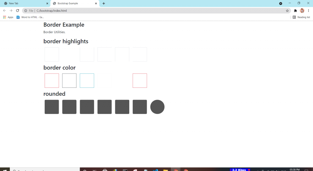
Bootstrap 4 has a lot of utility classes to quickly style elements. With no using CSS code.

Borders:-

This class adds a border all around the element.

  • Borders by using the border classes to add or remove borders from an elements.
  • Border Color by using border border-colorname to and color to the borders.
  • Border Radius by using rounded classes to rounded the corners.
Tagged : / / / / / / / /

Bootstrap:-Component “Tooltips”

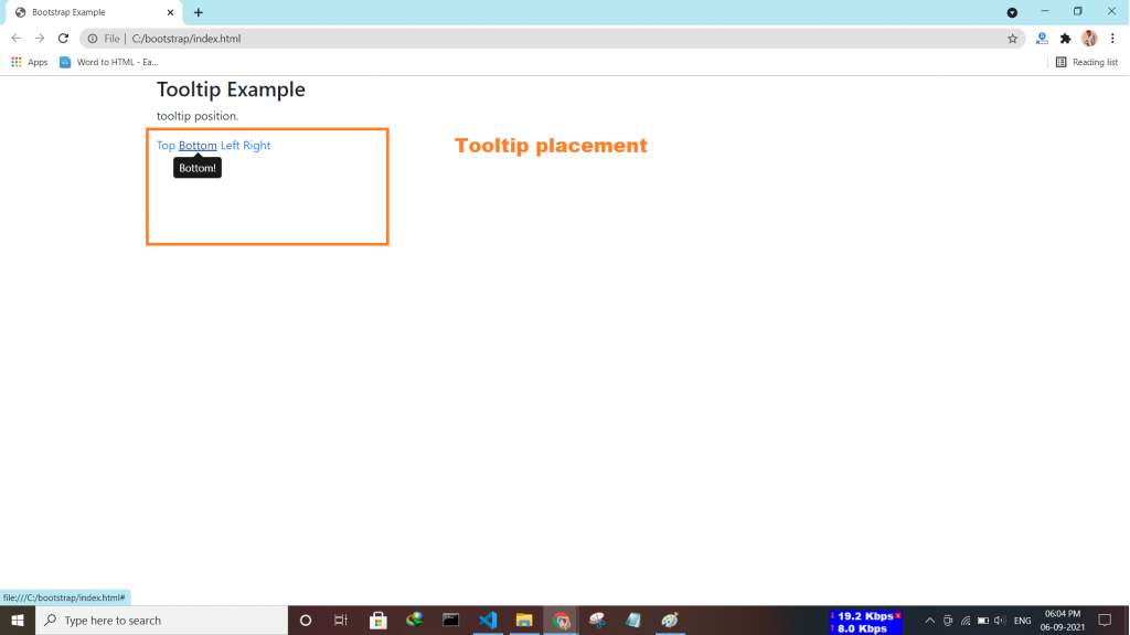
Tooltip is a component that is used for displaying small pop-up messages in a small box that appears when the user moves the mouse pointer over an element.

How to Create a Tooltip

  • Inside a tag data-toggle=”tooltip” attribute to an element.
  • Use title attribute to specify the text that should be displayed inside the tooltip.
  • Note: Tooltips must be initialized with jQuery:
<script>
$(document).ready(function(){
  $('[data-toggle="tooltip"]').tooltip();
});
</script>
Tagged : / / / / / / / /

Bootstrap:-Component “Toast”

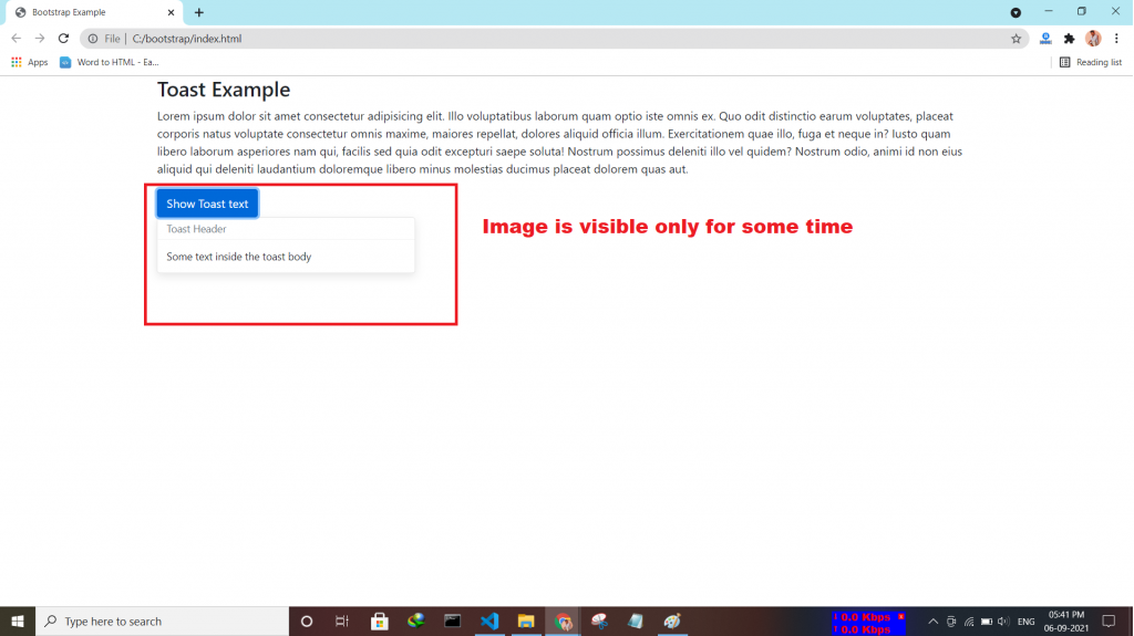
The toast component is used for showing a couple of seconds of a message when something happens. It works the same as an alert box.

How To Create a Toast:-

  • first use toast class
  • Then, add a toast-header class
  • And finally use toast-body class inside it type text declare.
  • Use the data-autohide=”false” attribute to show it by default toasts.
Tagged : / / / / / / / /

Bootstrap:-Component “Spinners”

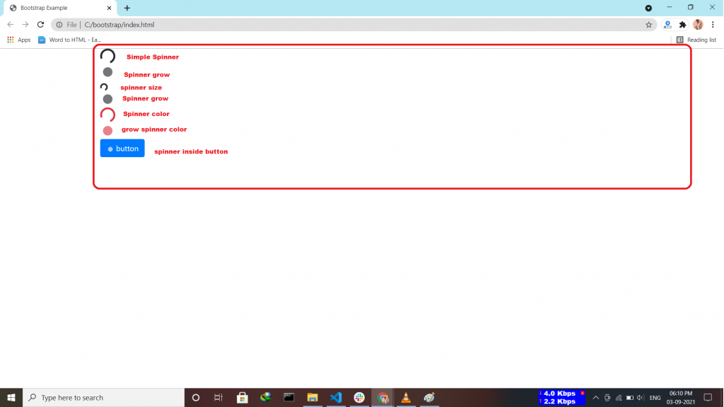
Bootstrap “spinners” is used to display the loading state in your projects.

How can a spinner be:-

  • Colored Spinners by using <div class=”spinner-border text-primary”></div>.
  • Growing Spinners by using <div class=”spinner-grow text-danger”></div>.
  • Spinner Size by using <div class=”spinner-border spinner-border-sm”></div>.
  • Spinner Buttons by using inside button tag <span class=”spinner-border spinner-border-sm”></span>.
Tagged : / / / / / / / / / /

Bootstrap:-Component “Scrollspy”

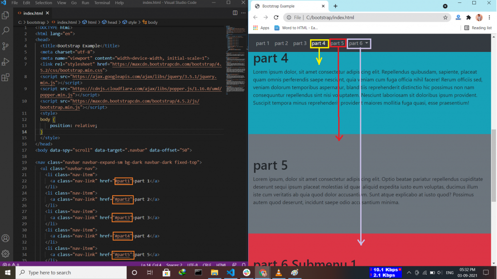
The Bootstrap 4 scrollspy is a navigation mechanism that automatically highlights the nav links based on the scroll position to indicate the visitor where they are currently on the page.

How to create Scrollspy:-

  • use nav component or list group.
  • Scrollspy requires position: relative; inside style section.
  • Add data-spy=”scroll” to the element that should be used as the scrollable area(inside body tag).
  • Add data-target with value id|class (.navbar). this is important to make sure that the navbar is connected with the scrollable area.
  • inside <div id=”name” > matches link with the nav item <a href=”#name”>.
  • Add data-offset =”30″ specifies the number of pixels to offset from top when calculating the position of scroll.
Tagged : / / / / / / / / /

Bootstrap:-Component “Progress”

Progress Bar in Bootstrap 4 is mainly used to indicate to the user, how much progress of the process is done. progress bars featuring support for stacked bars, animated backgrounds, and text labels. Use utility classes for the background (bg-success, bg- info, bg-light, bg-dark, bg-danger, bg-warning) for creating a progress bar with a different color.

Where to use Progress Bar:-

  • Progress Bar With Label by placing text within the .progress-bar.
  • Progress Bar With Height.
  • Colored Progress Bar by using .progress-bar-sucess|info|warning|danger.
  • Striped Progress Bar by using .progress-bar-striped class.
  • Animated Progress Bar by using .active class.
  • Stacked Progress Bars by using <div class=”progress”>.
Tagged : / / / / / / / / / / /

Bootstrap:-Component “Popovers”

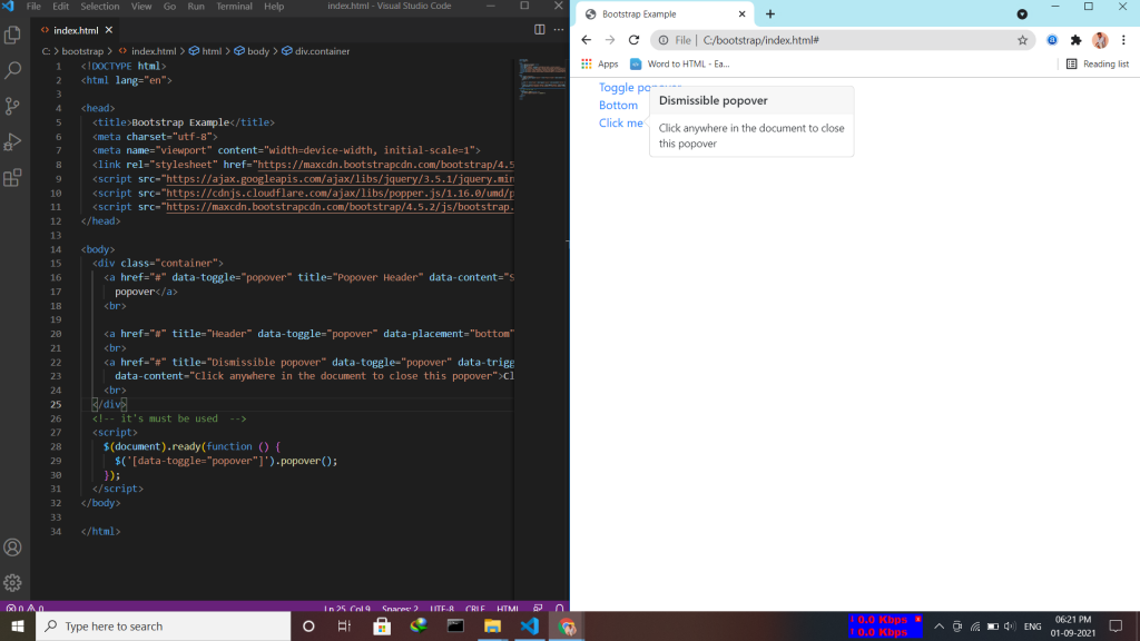
A popover is similar to the tooltip, offering an extended view complete with a heading. Popovers are generally used to display additional information about any element and are displayed on click of mouse pointer over that element. Note:- Popovers must be initialized with jQuery.

  • Enable Popovers everywhere by using the attribute data-placement=top|bottom|left|right
  • Dismiss on next click by using the attribute data-trigger=”focus”.
Tagged : / / / / / / / / / /