This property is used to specify the length of the item, relative to the rest of the flexible items inside the same container. If the element is not a flexible item, the flex property has no effect.
The flex property is a shorthand for the flex-grow, flex-shrink, and flex-basis properties.
Syntax: –
Selector { flex: flex-grow flex-shrink flex-basis}
Ex: –
div { flex: 2 3;}
FlexBox or Flexible Box–
What is it ?
–Its Layout mode a CSS 3 concept
Why we need it ?
–It helps to create responsive web pages
Flexbox Properties–
- flex-direction
- flex-wrap
- align-content
- flex-flow
- flow-grow
- flow-shrink
- flow-basis
- flex
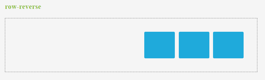
flex-direction–
This property is used to set the direction of flexible items. If the element is not a flexible item, the flex-direction property has no effect. We can set this property to row (default), row-reverse, column, column-reverse.
Ex: –
div { flex-direction: column-reverse; }
- row – This is used to display the flexible items horizontally as row
- row-reverse – This is used to display the flexible items same as row, but in reverse order
- column – This is used to display the flexible items vertically as column
- column-reverse – This is used to display the flexible items same as column, but in reverse order
flex-wrap–
This property is used to specify whether the flexible items should wrap or not. If the elements are not flexible items, the flex-wrap property has no effect. We can set this property to nowrap (default), wrap and wrap-reverse.
Ex: –
div { flex-wrap: wrap; }
- nowrap – It specifies that the flexible items will not wrap
- wrap – It specifies that the flexible items will wrap if necessary
- wrap-reverse – It specifies that the flexible items will wrap, if necessary, in reverse order
flex-flow–
It is a shorthand property for the flex-direction and the flex-wrap properties. If the elements are not flexible items, the flex-flow property has no effect.
Syntax: –
Selector { flex-flow: flex-direction flex-wrap;}
Ex: –
div { flex-flow: row-reverse wrap;}
- Flex-direction values:
- row (default)
- row-reverse
- Column
- column-reverse.
- Flex-wrap values:
- nowrap (default)
- wrap
- wrap-reverse
flex-grow–
This property is used to specify how much the item will grow relative to the rest of the flexible items inside the same container. If the element is not a flexible item, the flex-grow property has no effect. We can set this property to number (default 0).
Ex: –
div {flex-grow: 1;}
flex-shrink–
This property is used to specify how the item will shrink relative to the rest of the flexible items inside the same container. If the element is not a flexible item, the flex-shrink property has no effect. We can set this property to number (default 1).
Ex: –
div {flex-shrink: 2;}
flex-basis
This property is used to specify the initial length of a flexible item. If the element is not a flexible item, the flex-basis property has no effect. We can set this property to number and auto (default).
Ex:–
div {flex-basis: 3;}
- number – A length unit, or percentage, specifying the initial length of the flexible item(s)
- auto – The length is equal to the length of the flexible item. If the item has no length specified, the length will be according to its content