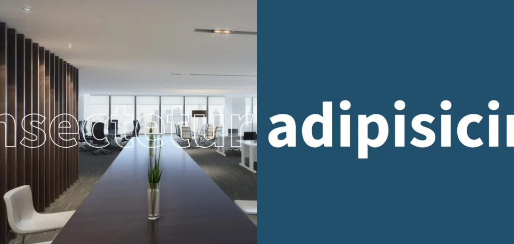
In this blog, I am creating Scrolling Text Animation Effects with HTML & CSS. So, let’s Create an index.html & style.css page so, below an index.html page content-
Below style.css file, in this file, i am using multiple CSS class & id which is used in index.html.
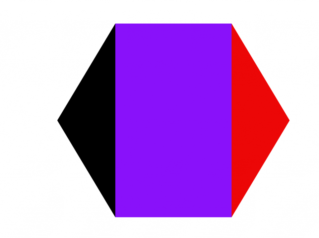
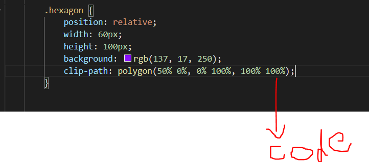
In this tutorial, I am using HTML & CSS and create a Hexagon shape in an easy way. So, before I am creating an HTML & CSS file with “.html” & “.css” extension. as below-
In this “index.html” page I am using a “class” with “hexagon” and after that hexagon class using below “style.css” page which is mention below-
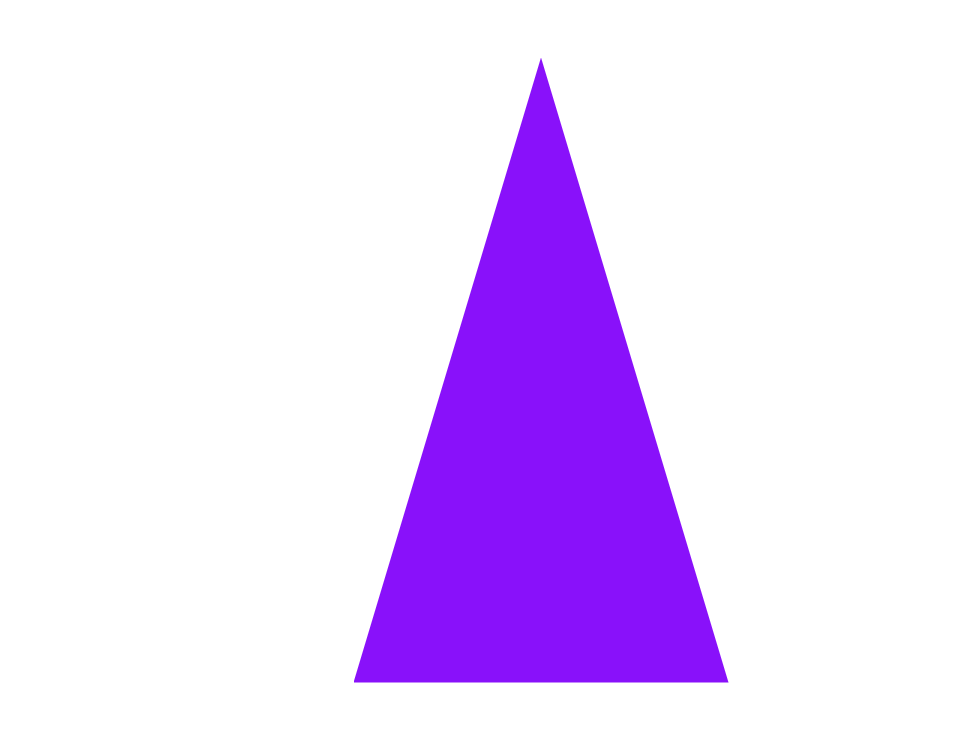
This is hexagon shape. Here, I am using three different color but if you want to change then you can change as your wish.
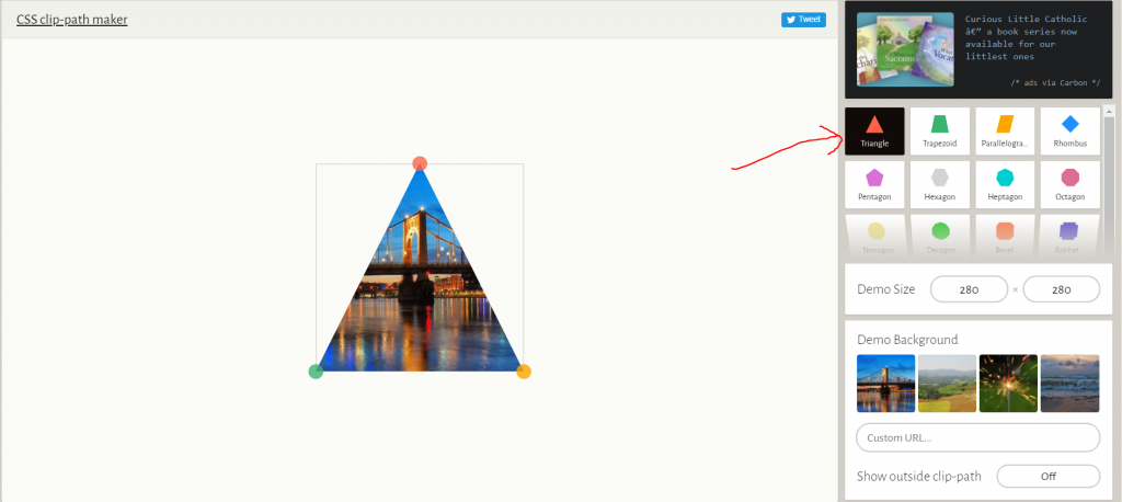
If you want to create a different shape then Click Here and create a different- different shap as you wish. as below step-
When you will be open link then shown below page with left side show shape list-
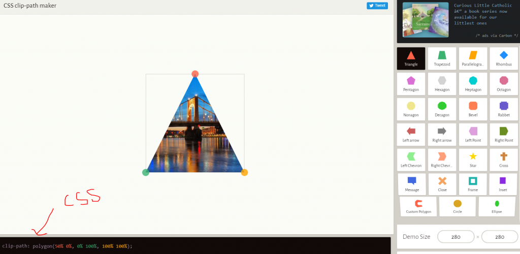
After that click any shape and shown below “css” code –
So, Copy this code and paste in your css section as below-After that create your shape below-
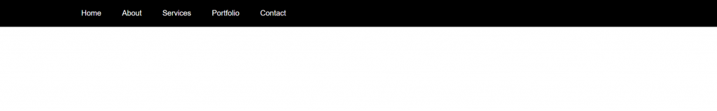
In this tutorial, I am using HTMO, CSS, and Javascript and create a Responsive Navigation Bar. So, first create page with “.html” extension and write code as below-
And Below CSS code which is using in this navigation bar-
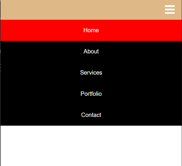
After that complete a Responsive Navigation bar as below –
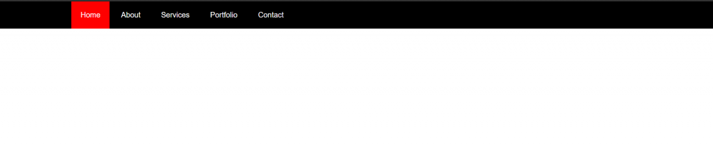
When using a cursor on navbar link then uses “:hover” css function In this Mobile showing as view responsive with “toggle” fa fa iconWhen Click “toggle” fa fa-icon then show this type of navigation bar.
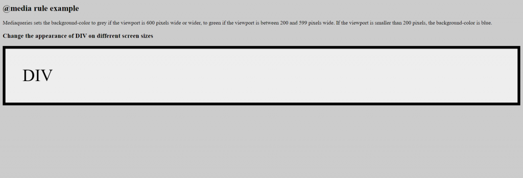
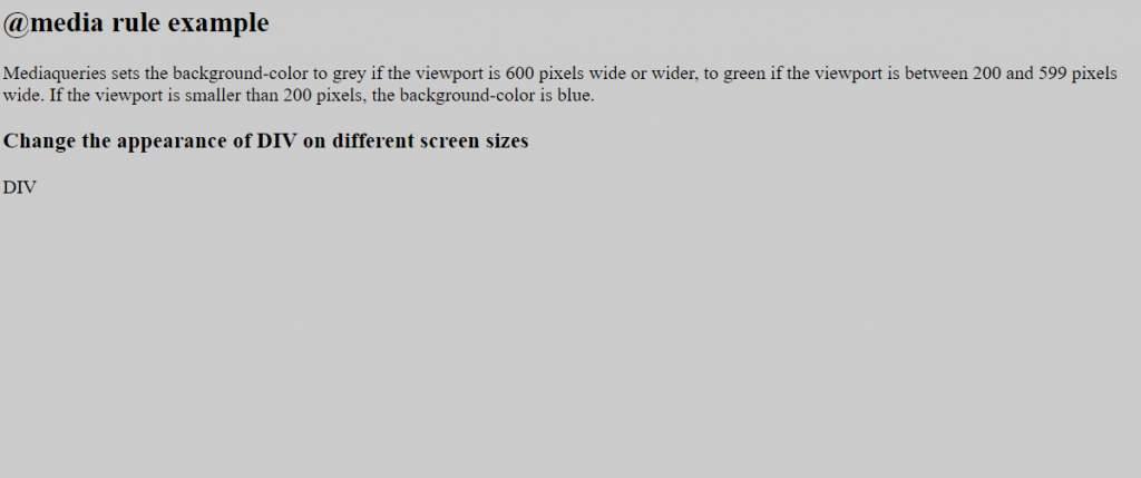
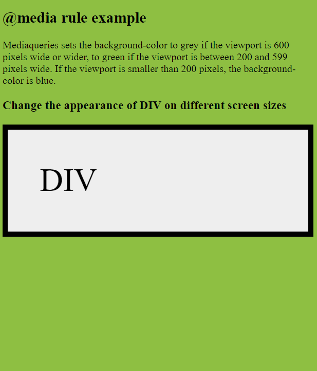
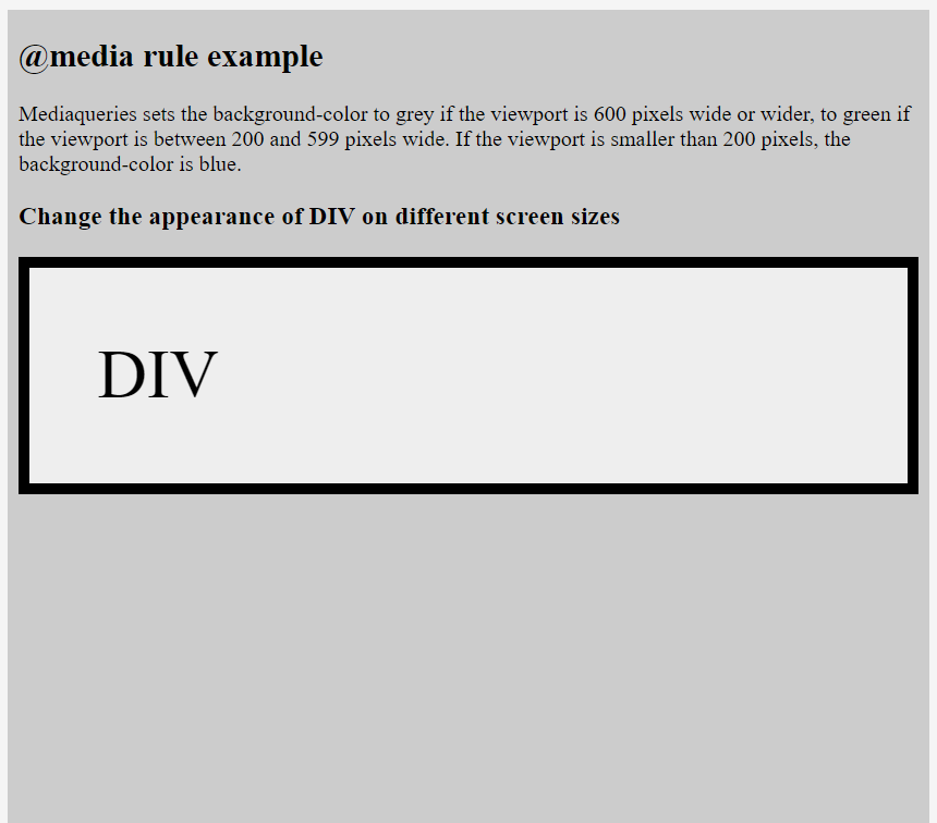
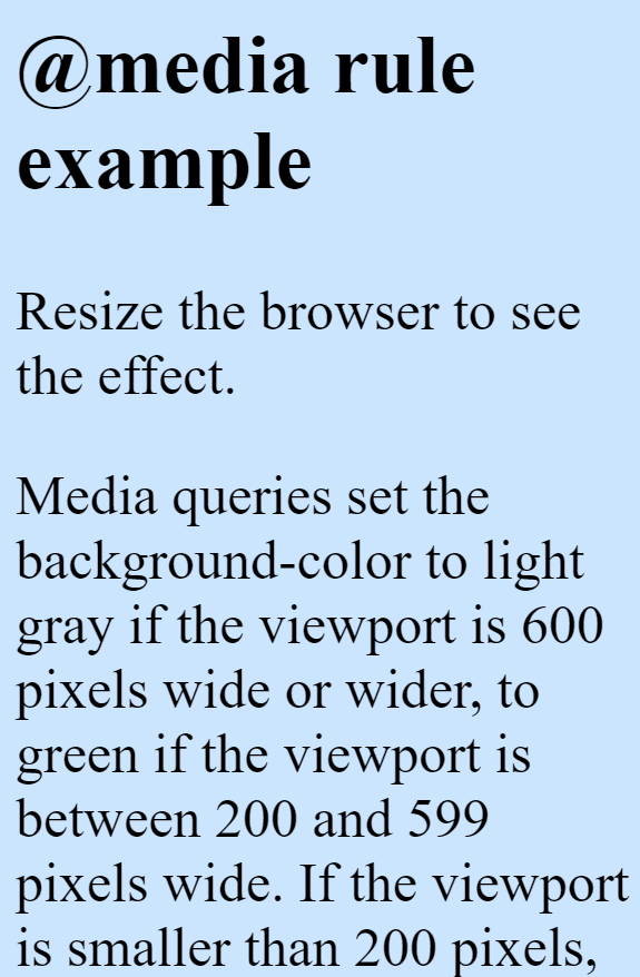
A media query consists of an optional media type and zero or more expressions that limit the style sheets’ scope by using media features, such as width, height, and color.
Syntax: –
@media not|only mediatype and (expressions/ media features) { CSS; }
Ex: –
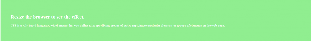
@media screen and (min-width: 480px) {
body {
background-color: lightgreen; }
}
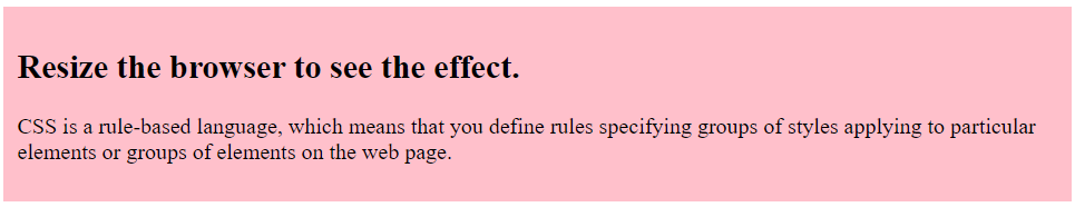
@media (min-width: 480px) {
body {
background-color: lightgreen; }
}
all – Used for all media type devices
print – Used for printers
screen – Used for computer screens, tablets, smart-phones etc.
speech – Used for screenreaders that “reads” the page out loud
If you use the not or only operators, you must specify an explicit media type.
And-
@media (min-width: 800px) { CSS }
@media (min-width: 800px) and (orientation: landscape) { CSS }
@media screen and (min-width: 800px) and (orientation: landscape) { CSS }
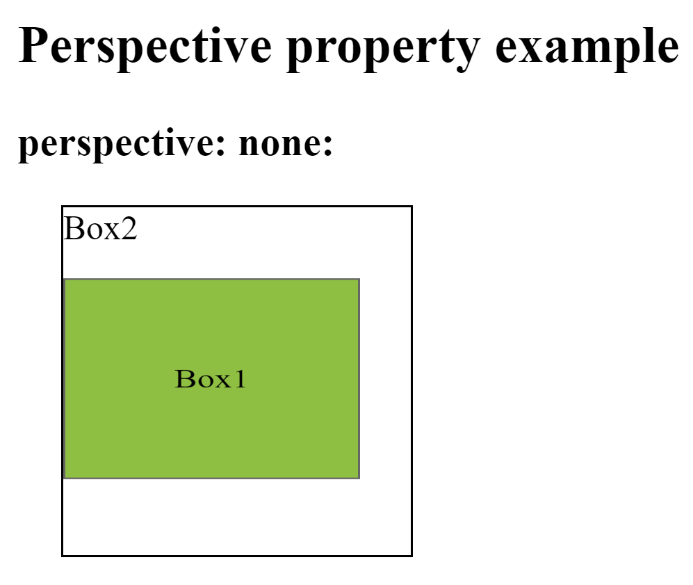
This property is used to define how many pixels a 3D element is placed from the view. This property allows you to change the perspective on how 3D elements are viewed. This will only effect on 3D transformed elements.
Whenever we define the perspective property for an element, it is the child elements that get the perspective view, not the element itself.
We can set this property to none (default) and length
Ex: –
div { perspective: 50px ; }
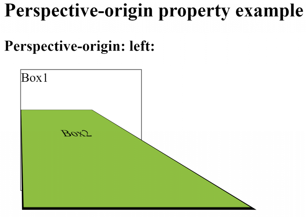
Perspective-origin–
This property is used to define where a 3D element is based in the x- and the y-axis. This property allows you to change the bottom position of 3D elements. This will only effect on 3D transformed elements. We can set this property to x (default 50%) and y axis (default 50%).
Whenever we define the perspective-origin property for an element, it is the child elements that are positioned, not the element itself.
Ex: –
div { perspective-origin: 20% 20% ; }
backface-visibility–
This property is used to define whether or not an element should be visible when not facing the screen. This property is useful when an element is rotated, and you do not want to see its backside. We can set this property to visible (default) and hidden.
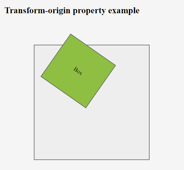
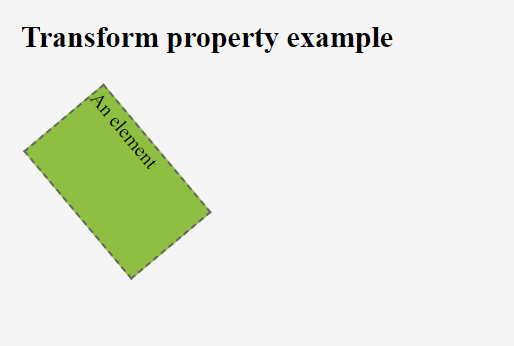
This property is used to change the position of transformed elements. This property must be used together with the transform property. We can set this property to x, y and z axis.
2D transformations can change the x and y axis of an element.
3D transformations can change the x, y and z axis of an element.
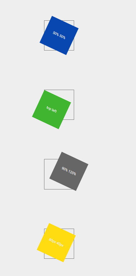
This is used to define where the view is placed at the x-axis.
left
center
right
length (px, cm, em, %)
y-axis-
This is used to define where the view is placed at the y-axis.
top
center
bottom
length (px, cm, em, %)
z-axis-
This is used to define where the view is placed at the z-axis.
length (px, cm, em, %)
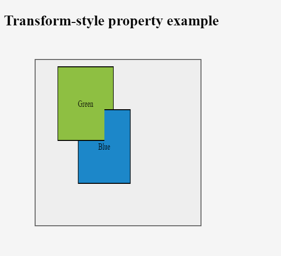
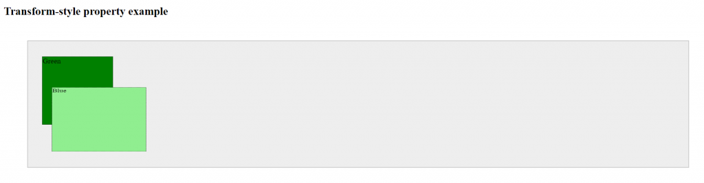
transform-style-
This property is used to specify how nested elements are rendered in 3D space. This property must be used together with the transform property. We can set this property to flat (default) and preserve-3d.
Ex: –
div { transform-style: preserve-3d ; }
Note – child elements will preserve its 3D position
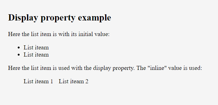
This property is used to define how an element should display. Every HTML element has a default display value depending on what type of element it is. The default display value for most elements is block or inline.
display properties use below –
inline
block
flex
inline-block
inline-flex
inline-table
list-item
run-in
table
table-row-group
table-caption
table-column-group
table-header-group
table-footer-group
table-cell
table-column
table-row none
Display–
inline – When we set this value, the element does not start on a new line and only takes up as much width as necessary (we can’t set width/height it won’t work)
block – When we set this value, element always starts on a new line and takes up the full width available (we can set width/height)
inline-block – It is combination of inline and block value. It doesn’t start on new line but we can set width and height.
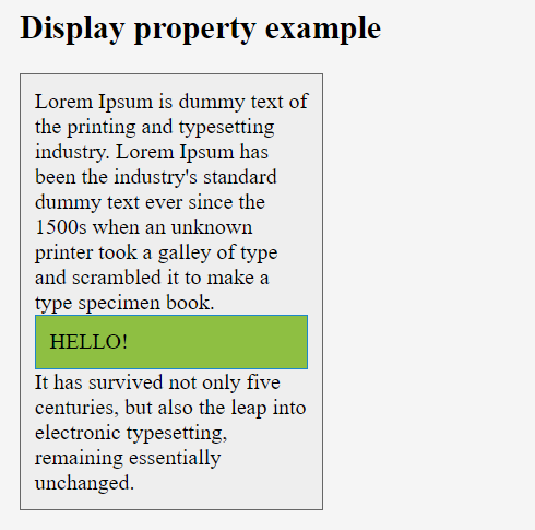
none – The element will not be displayed at all (has no effect on layout)
flex – Displays an element as a block-level flex container.
inline-flex – Displays an element as an inline-level flex container.
inline-table – The element is displayed as an inline-level table
run-in – Displays an element as either block or inline, depending on context
table – It works like a element
table-caption – It works like a element
table-header-group – It works like a element
table-footer-group – It works like a element
table-row-group – It works like a element
table-cell – It works like a element
table-row – It works like a element
list-item – It works like a element
justify-content–
This property is used to align the flexible container’s items when the items do not use all available space on the main-axis (horizontally). We can set this property to flex-start (default), flex-end, center, space-between, space-around.
Ex: –
div { justify-content: center; }
flex-start – This is used to position the item at the beginning of the container
flex-end – This is used to position the item at the end of the container
center – This is used to position the item at the center of the container
space-between – This is used to position the item with space between the lines
space-around – This is used to position the item with space before, between, and after the lines
align-items–
This property is used to specify the default alignment for items inside the container. This property can be override using align-self property for each item. We can set this property to stretch (default), center, flex-start, flex-end, baseline.
Ex: –
div { align-items: center; }
stretch – This is used to stretch the item to fit the container
center – This is used to position the item at the center of the container
flex-start – This is used to position the item at the beginning of the container
flex-end – This is used to position the item at the end of the container
baseline – This is used to position the item at the baseline of the container
align-content–
This property is used to modify the behavior of the flex-wrap property. It is similar to align-items, but instead of aligning flex items, it aligns flex lines. There must be multiple lines of items for this property to have any effect. We can set this property to stretch (default), center,flex-start, flex-end, space-between, space-around.
Ex: –
div { align-content: center; }
stretch – Lines stretch to take up the remaining space
center – Lines are packed toward the center of the flex container
flex-start – Lines are packed toward the start of the flex container
flex-end – Lines are packed toward the end of the flex container
space-between – Lines are evenly distributed in the flex container
space-around – Lines are evenly distributed in the flex container, with half-size spaces on either end
order–
This property is used to specify the order of a flexible item relative to the rest of the flexible items inside the same container. If the element is not a flexible item, the order property has no effect. We can set this property to number (default 0).
Ex: –
div {order: 1}
align-self–
This property is used to specify the alignment for the selected item inside the flexible container. The align-self property overrides the flexible container’s align-items property. We can set this property to auto (default), stretch, center, flex-start, flex-end, baseline.
Ex: –
div {align-self: center;}
auto – The element inherits its parent container’s align-items property, or “stretch” if it has no parent container
stretch – This is used to position the element to fit the container
center – This is used to position the element at the center of the container
flex-start – This is used to position the element at the beginning of the container
flex-end – This is used to position the element at the end of the container
baseline – This is used to position the element at the baseline of the container