Bootstrap provides two types of form layout:-
- Stacked form
- Inline form
Stacked form(full-width):-
Inline form:-
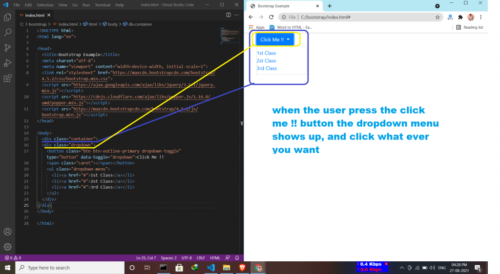
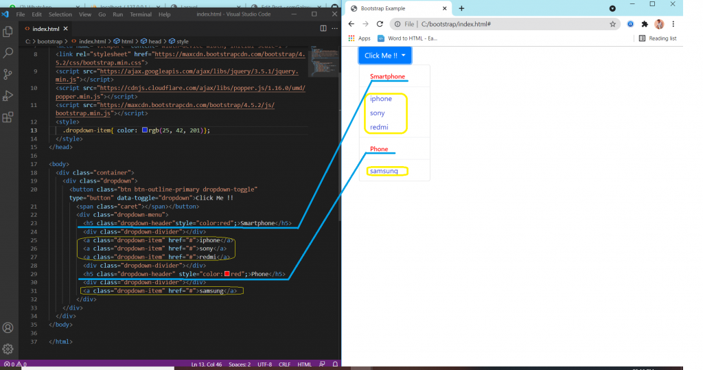
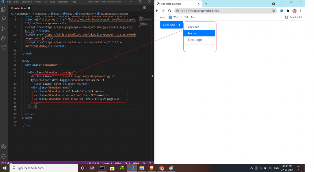
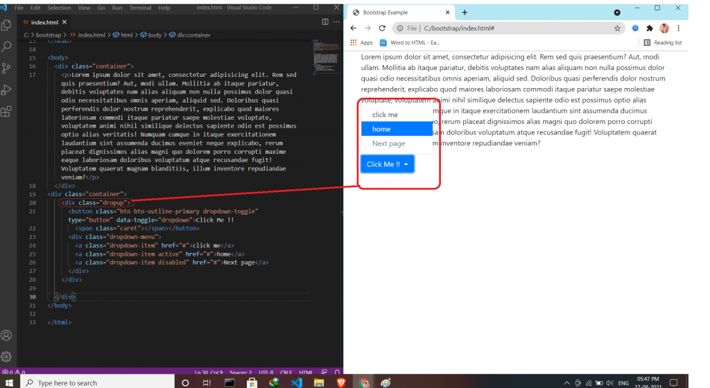
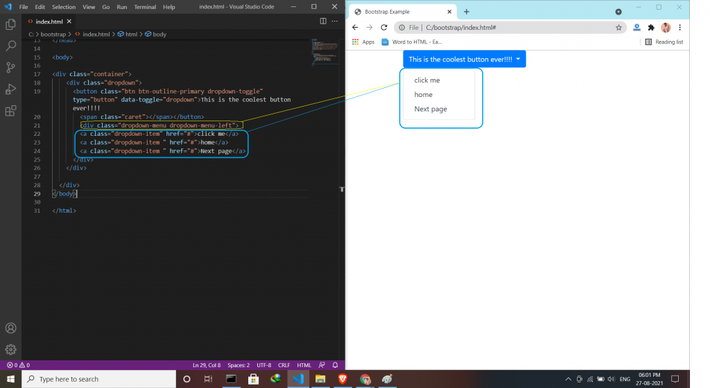
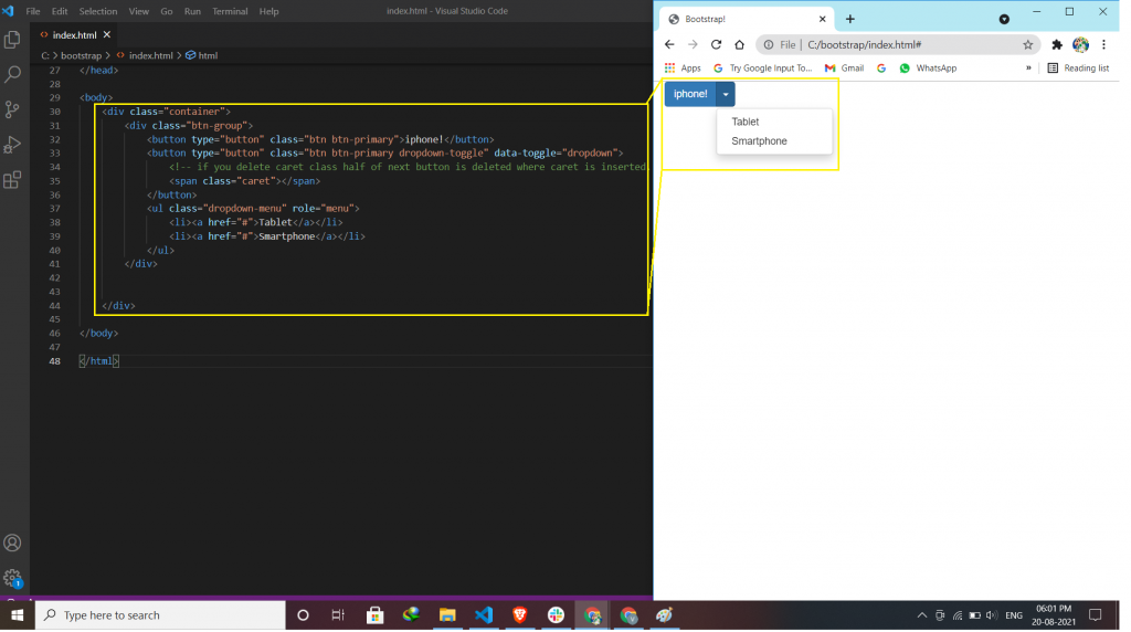
Dropdown menu is a toggleable menu that allows users to choose one value from a predefined list. Sometimes it helps the users to same time for finding some particular things.
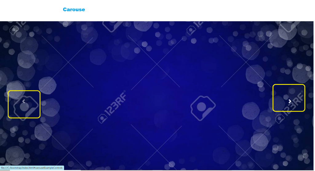
A slideshow component for cycling through elements—images or slides of text—like a carousel.
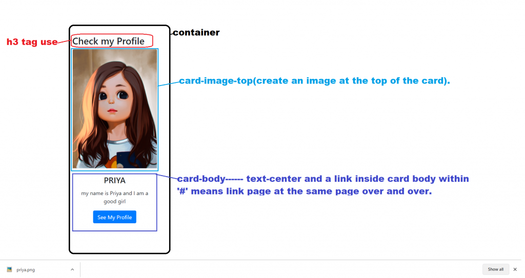
<img> to place the image at the top or at the bottom inside the card.
<div class="card">
  <div class="card-body">Basic card</div>
</div>
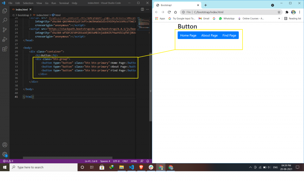
Bootstrap Button Groups:
Bootstrap allows you to group a series of buttons in a button group. Use a <div> element with class .btn-group to create a button group.
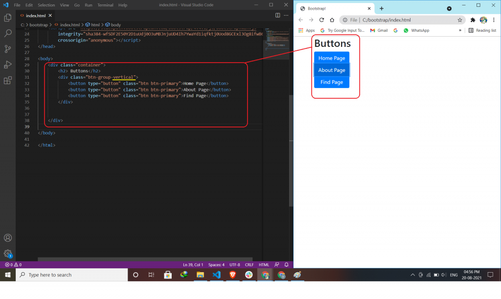
Use the class .btn-group-vertical to create a vertical button group.
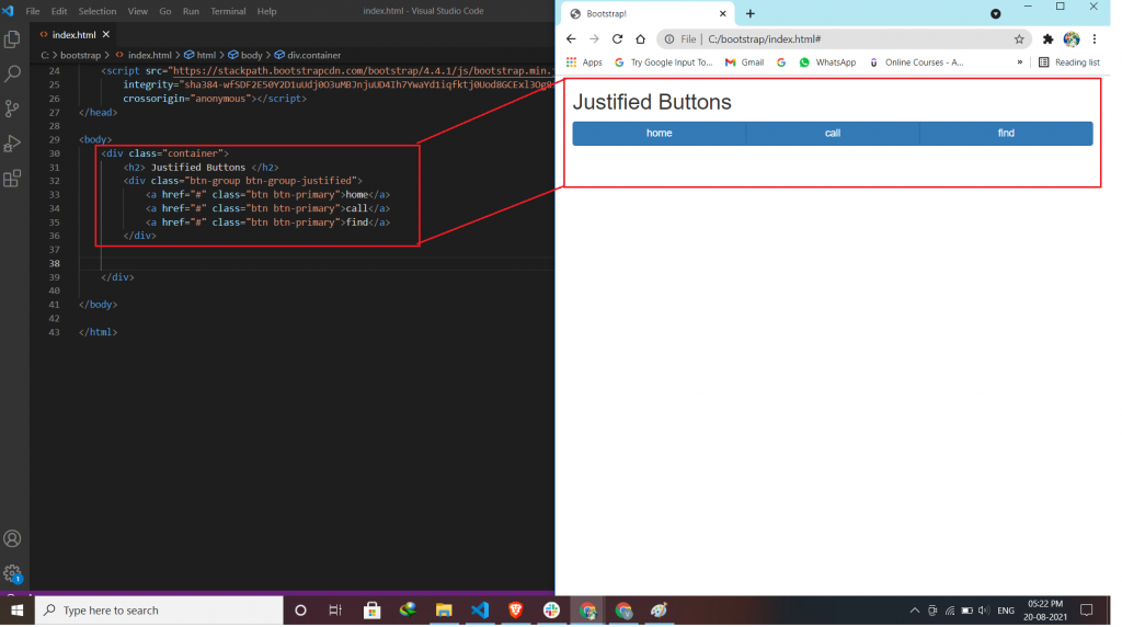
To span, the entire width of the screen, use the class .btn-group-justified.
Nest button groups to create dropdown menus.
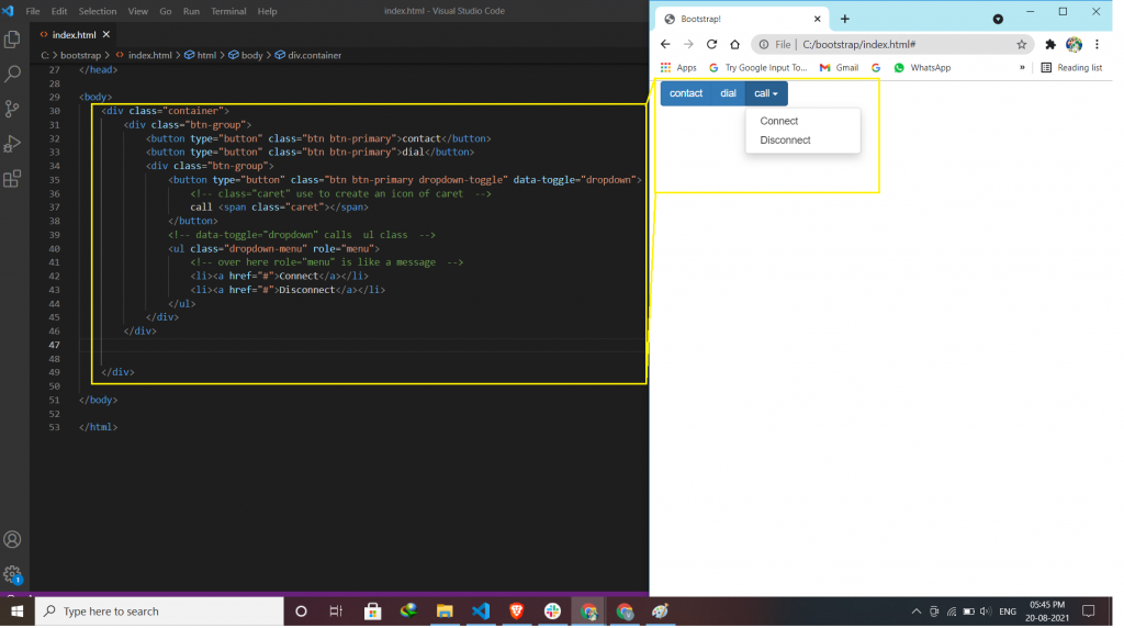
Split button dropdowns use the same general style as the dropdown button but add a primary action along with the dropdown. If you deleted the span parts then, the dropdown menu shows you half because you create a dropdown menu but not to call.
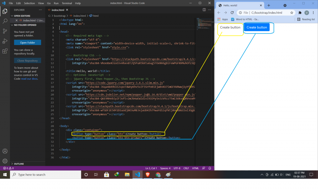
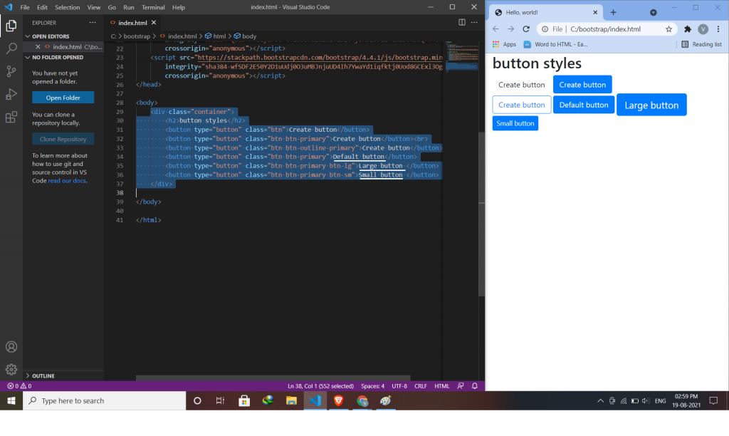
Bootstrap 4 provides users with different styles of buttons.
Use the background-color property to change the background color of a button.
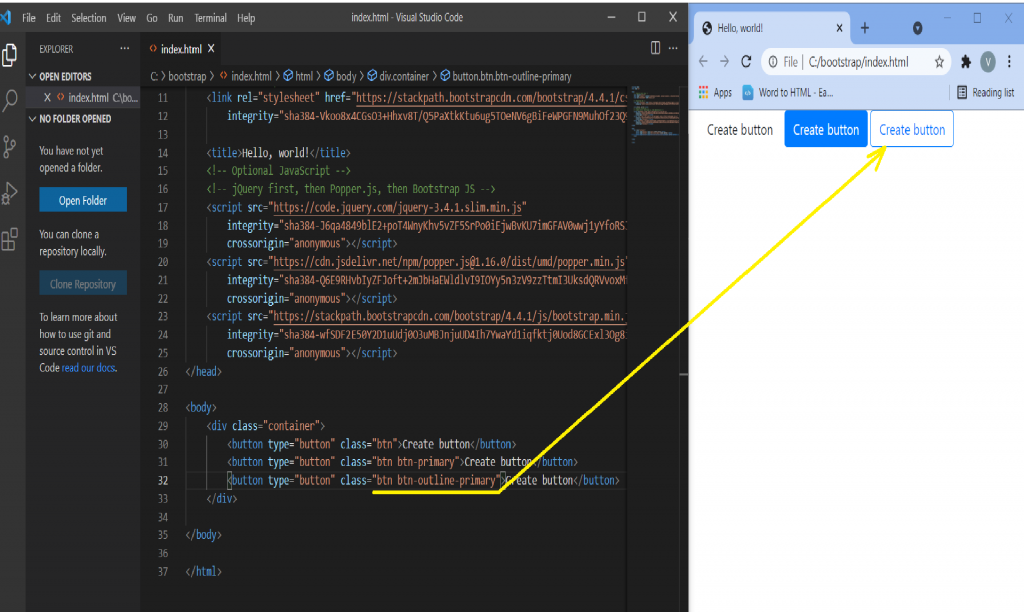
The button outline style removes all background images or colors from a button and gives it a lighter look.
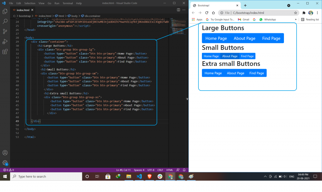
This will indicate to you the size of the button.
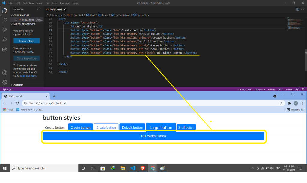
The .btn-block class is used to create a block-level button that spans the entire width of the parent elements.
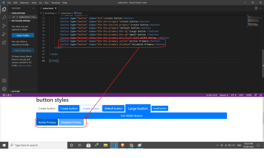
A button can be set to an active (clickable) or a disabled (unclickable) state.
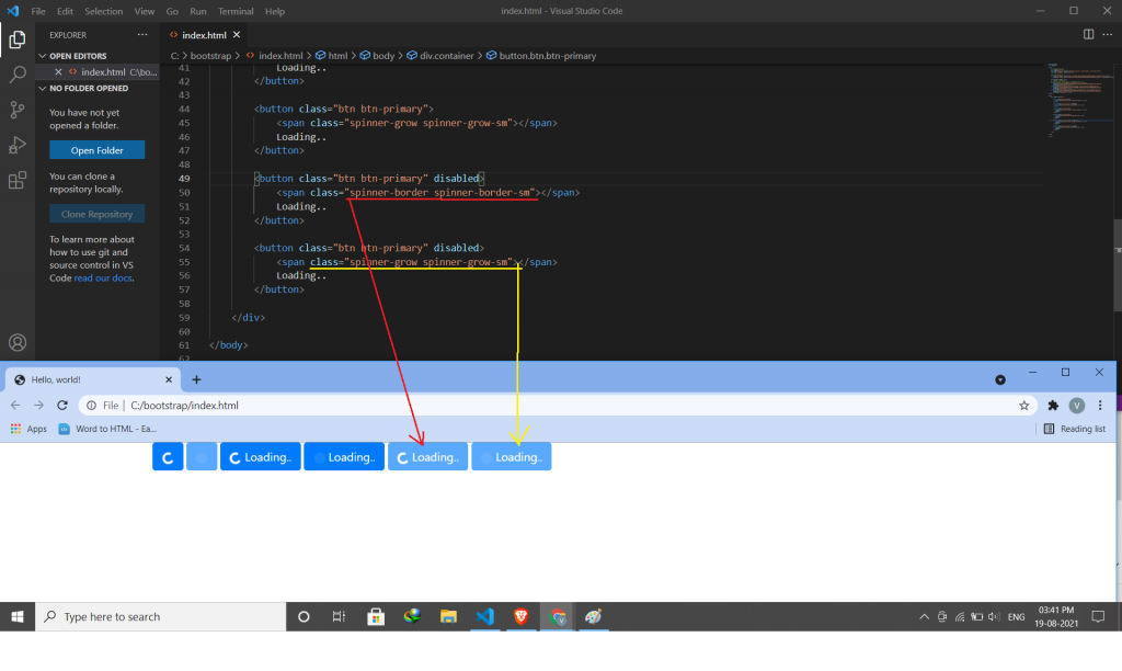
You can also add “spinners” to a button.
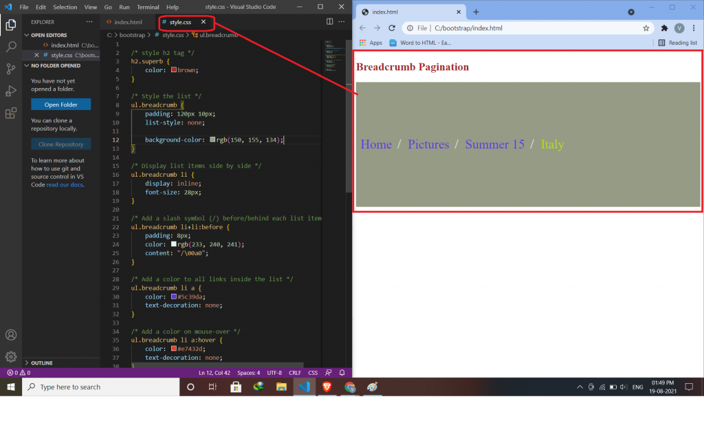
Breadcrumb navigation provides a link back to each previous page the user navigates through and shows the user’s current location on a website.
In HTML you have to create breadcrumb in internal CSS means inside the head tag.
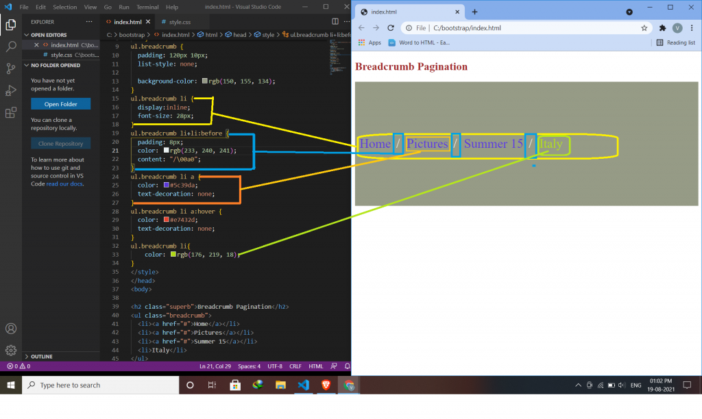
Putting all the style code inside CSS.
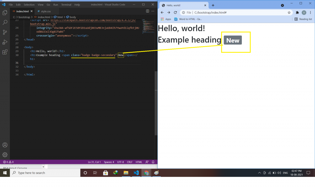
Badges are similar to labels; the primary difference is that the corners are more rounded. Badges are mainly used to highlight new or unread items. Example:-
<h1>Example heading <span class=" badge-secondary">New</span></h1>
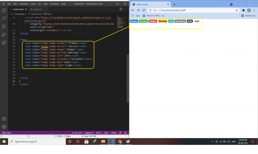
Contextual classes use to change the color of a badge. Example:-
<span class="badge badge-primary">Primary</span>
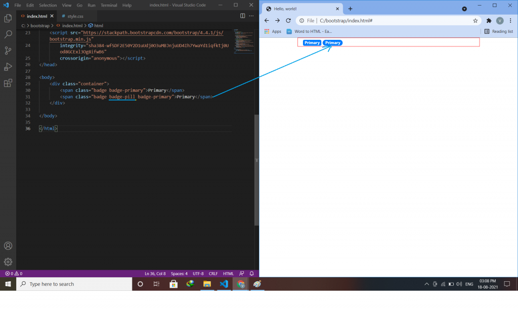
Use the .badge-pill class to make the badges more round. Example:-
<span class="badge badge-pill badge-primary">Primary</span>
An example of using a badge inside a button.
<button type="button" class="btn btn-primary">
  create button <span class="badge badge-light">1</span>
</button>
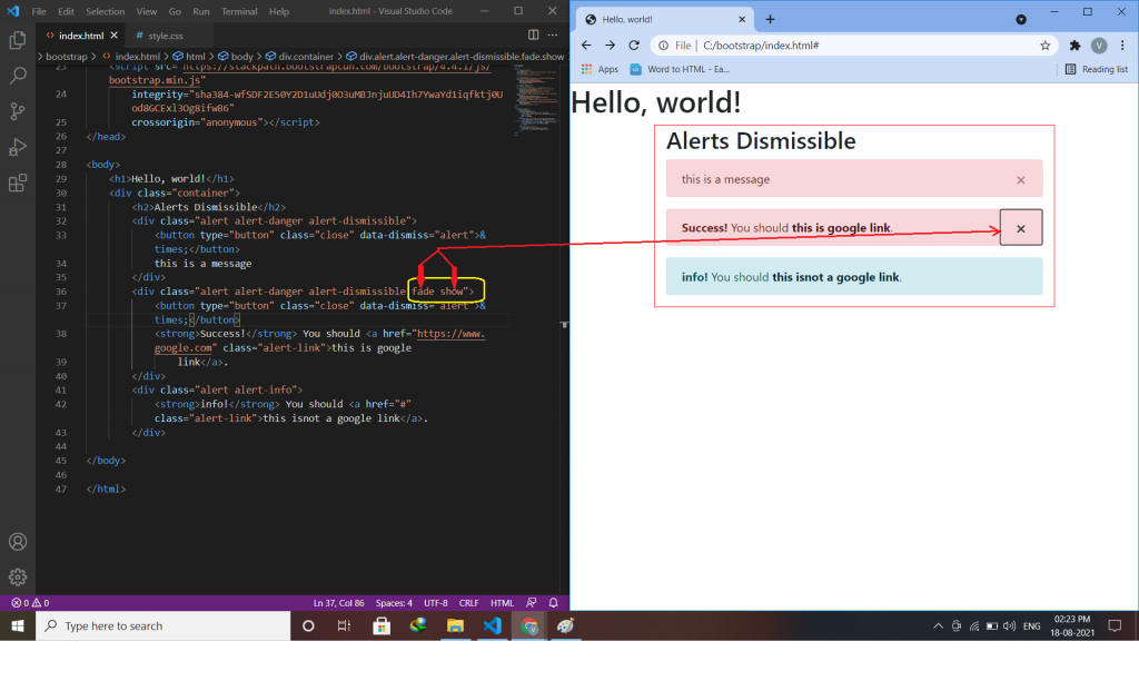
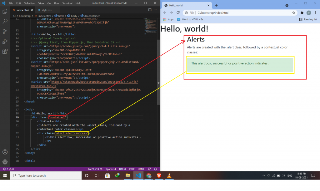
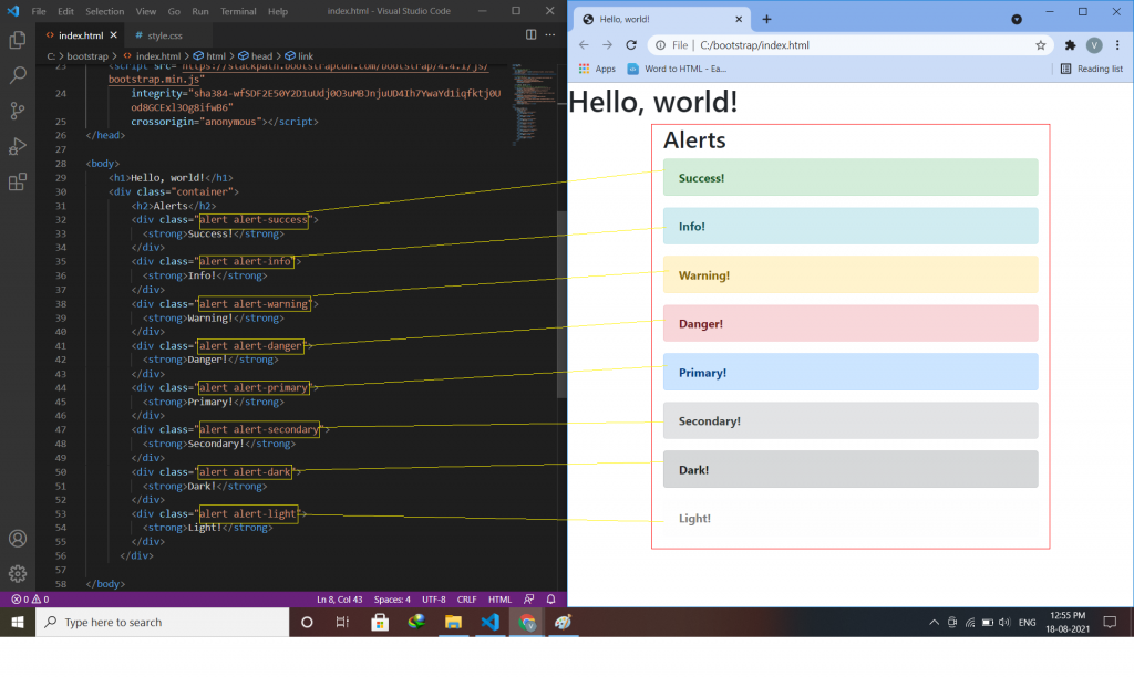
Alerts are created with the .alert class, followed by one of the contextual classes .alert-success, .alert-info, .alert-warning, .alert-danger, .alert-primary, .alert-secondary, .alert-light or .alert-dark.
<div class="alert alert -success">
<p> inside paragraph alert success component use </p>
</div>
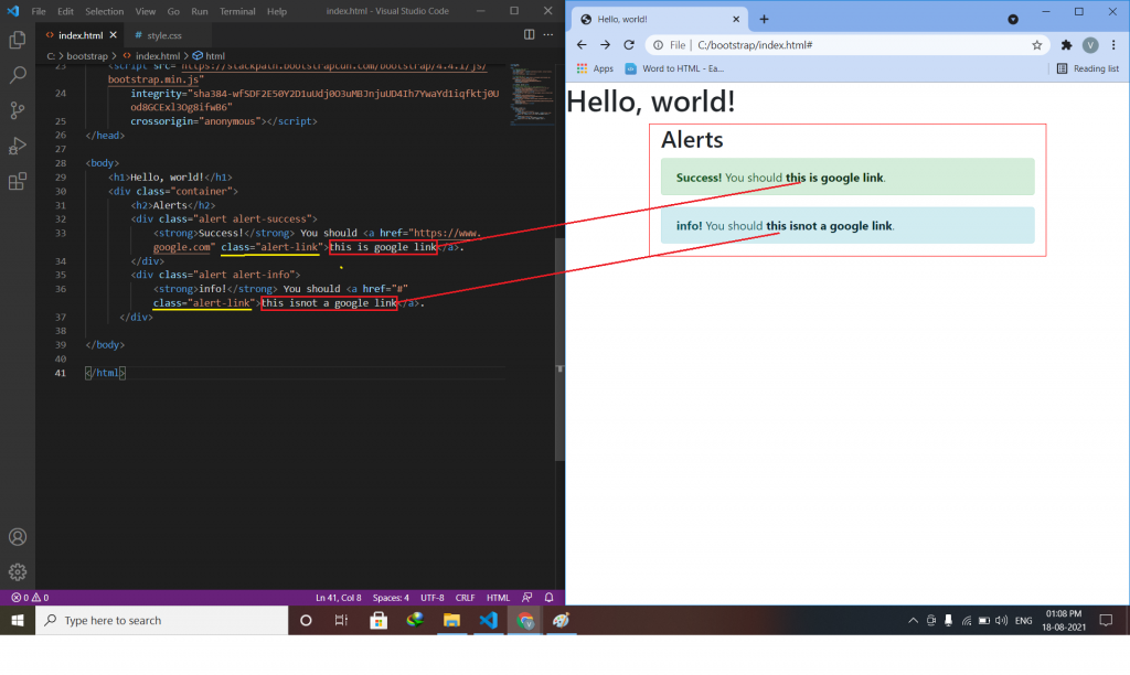
Add the alert-link class to any links inside the alert box to create “matching colored links”.
<div class="alert alert-success">
  Alert link use <a href="#" class="alert-link">this is a link</a>.
</div>
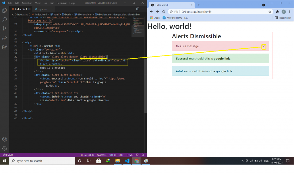
To close the alert message, add a .alert-dismissible class to the alert container. for creating alert messages we have to create a button or link, inside button or link adds class=”close” and data-dismiss=”alert”.
<div class="alert alert-success alert-dismissible">
<button type="button" class="close" data-dismiss="alert">×</button>
this is a message.
</div>
The .fade and .show classes add a fading effect when closing the alert message.
this class is use to delete anything(text,div,message-box).
<div class="alert alert-danger alert-dismissible fade show">