Bootstrap: Utilities “Clearfix”

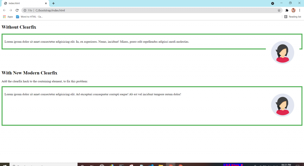
If an element is bigger than the element containing it, and it is floated, it will overflow outside of its container. Then we can add overflow: auto to the containing element to fix this problem.

.clearfix {
  overflow: auto;
}
Tagged : / / / / / / /

Bootstrap: Utilities “Borders”

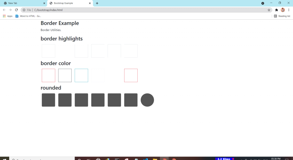
Bootstrap 4 has a lot of utility classes to quickly style elements. With no using CSS code.

Borders:-

This class adds a border all around the element.

  • Borders by using the border classes to add or remove borders from an elements.
  • Border Color by using border border-colorname to and color to the borders.
  • Border Radius by using rounded classes to rounded the corners.
Tagged : / / / / / / / /

Bootstrap:-Component “Toast”

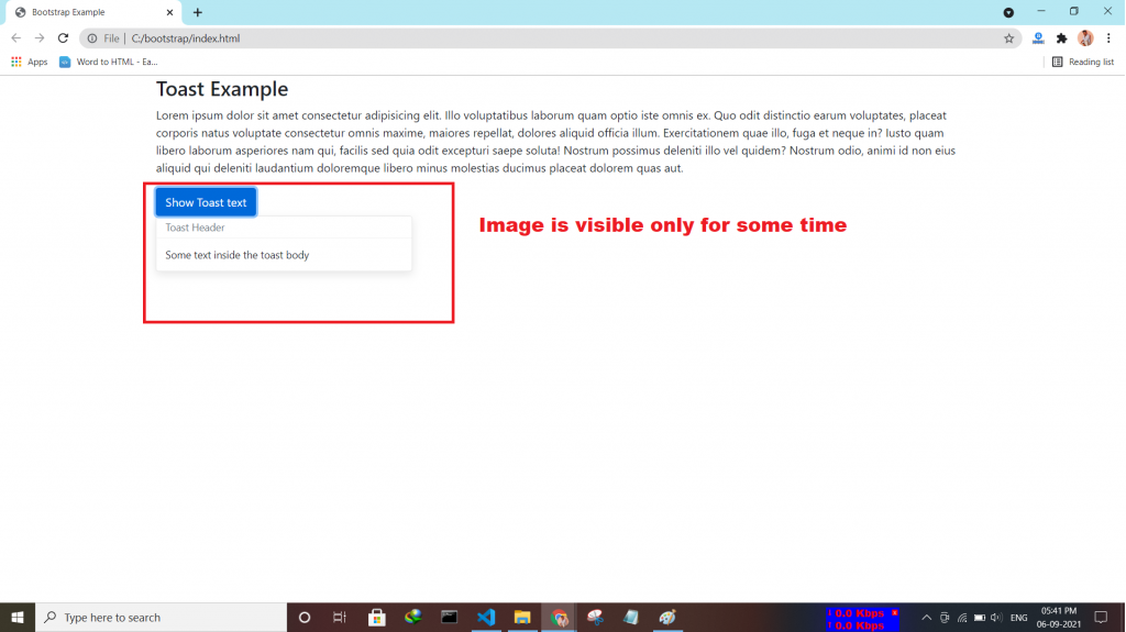
The toast component is used for showing a couple of seconds of a message when something happens. It works the same as an alert box.

How To Create a Toast:-

  • first use toast class
  • Then, add a toast-header class
  • And finally use toast-body class inside it type text declare.
  • Use the data-autohide=”false” attribute to show it by default toasts.
Tagged : / / / / / / / /

Bootstrap:-Component “Spinners”

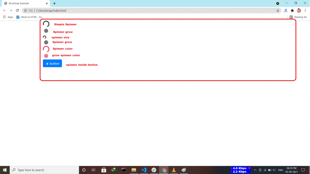
Bootstrap “spinners” is used to display the loading state in your projects.

How can a spinner be:-

  • Colored Spinners by using <div class=”spinner-border text-primary”></div>.
  • Growing Spinners by using <div class=”spinner-grow text-danger”></div>.
  • Spinner Size by using <div class=”spinner-border spinner-border-sm”></div>.
  • Spinner Buttons by using inside button tag <span class=”spinner-border spinner-border-sm”></span>.
Tagged : / / / / / / / / / /

Bootstrap:-Component “Scrollspy”

The Bootstrap 4 scrollspy is a navigation mechanism that automatically highlights the nav links based on the scroll position to indicate the visitor where they are currently on the page.

How to create Scrollspy:-

  • use nav component or list group.
  • Scrollspy requires position: relative; inside style section.
  • Add data-spy=”scroll” to the element that should be used as the scrollable area(inside body tag).
  • Add data-target with value id|class (.navbar). this is important to make sure that the navbar is connected with the scrollable area.
  • inside <div id=”name” > matches link with the nav item <a href=”#name”>.
  • Add data-offset =”30″ specifies the number of pixels to offset from top when calculating the position of scroll.
Tagged : / / / / / / / / /

Bootstrap:-Component “Popovers”

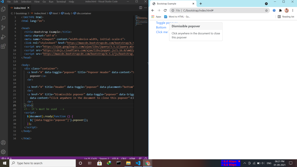
A popover is similar to the tooltip, offering an extended view complete with a heading. Popovers are generally used to display additional information about any element and are displayed on click of mouse pointer over that element. Note:- Popovers must be initialized with jQuery.

  • Enable Popovers everywhere by using the attribute data-placement=top|bottom|left|right
  • Dismiss on next click by using the attribute data-trigger=”focus”.
Tagged : / / / / / / / / / /

Bootstrap Component:- “Pagination”

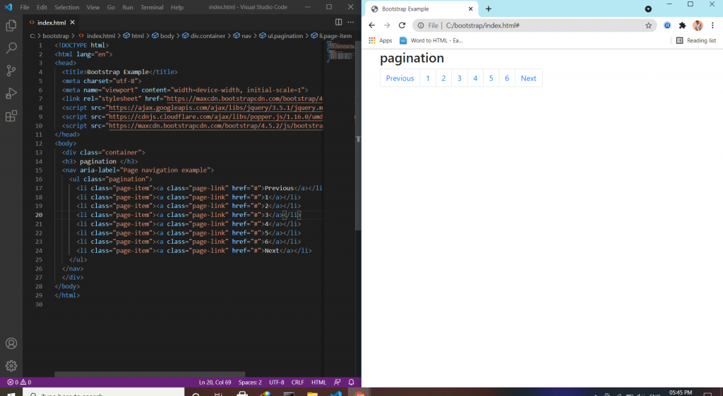
Pagination is a component in bootstrap that is used to enable navigation between pages in a website. It is a method of dividing web content into discrete pages, thus presenting content in a limited and digestible manner.

Pagination uses:-

  • Working with icons by using class=sr-only (previous/next) utility.
  • Disabled and active states by using class=disable/active to indicate the current page.
  • Sizing by using .pagination-lg|sm for additional sizes.
  • Alignment by .justify-content-center|end.
  • Breadcrumbs by using .breadcrumb and .breadcrumb-item classes.
Tagged : / / / / / / / / / / / / /

Bootstrap:-Component “Navigation bar”

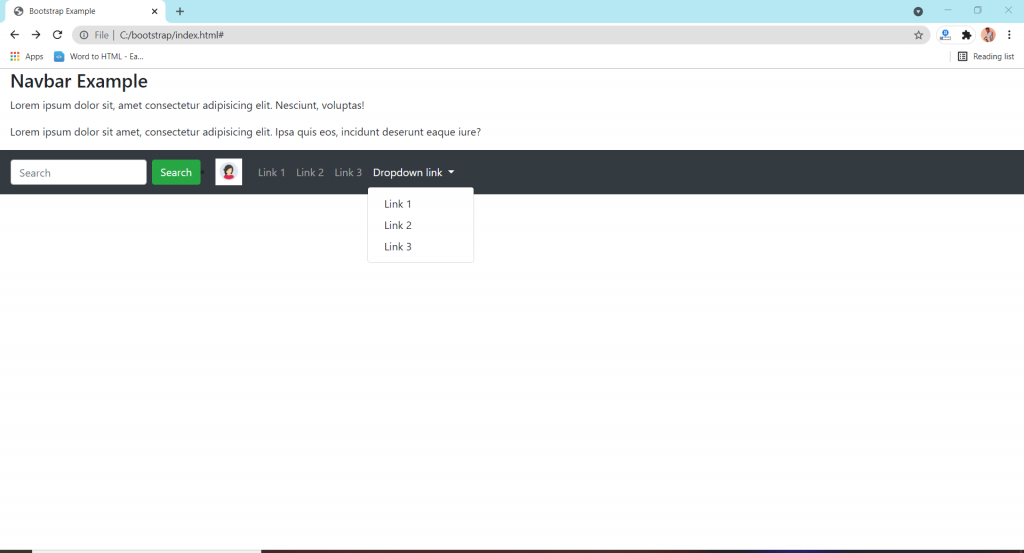
The navbar is one of the prominent features of Bootstrap sites. A navigation bar is a navigation header that is placed at the top of the page. the navigation bar can extend or collapse, depending on the screen size. A standard navigation bar is created with the .navbar class.

Format of nav bar:-

  • Vertical Navbar by using class=”navbar-nav”.
  • Centered Navbar by using .justify-content-center class to center the navigation bar.
  • Colored Navbar by using any of the .bg-color classes to change the background color of navbar.
  • Brand/Logo by using .navbar-brand class is used to highlight the brand/logo/project name of your page.
  • Collapsing The navbar  To create a collapsible navigation bar, use a button with class=”navbar-toggler”, data-toggle=”collapse” and data-target=”#thetarget”.
  • Navbar With Dropdown.
  • Navbar Froms and Buttons Add a <form> element with class=”form-inline” to group inputs and buttons side-by-side.
  • Nevbar Text use .navbar-text class to vertically align any elements inside the navbar that are not links.
  • Fixed Navbar by using .fixed-top or .fixed-bottom class to make the navbar fixed.
  • Sticky navbar use the .sticky-top class to make the navbar fixed/stay at the thop of the page.
Tagged : / / / / / / / / / / / / /

Bootstrap:-Component “model”


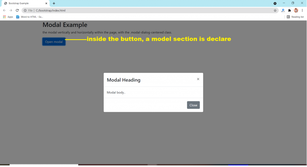
A modal window creates a mode that disables the main window but keeps it visible, with the modal window as a child window in front of it. … Users must interact with the modal window before they can return to the parent application. This avoids interrupting the workflow on the main window.

Simply define the Modal component as a dialog box/popup window that is displayed on top of the current page.

  • .fade class for add animation.
  • Model Size like model-sm, model-lg, model-xl.
  • Centered Model .model-dialog-centered class.
  • Scrolling Model use by adding .model-dialog-scrollable to .model-dialog in class.
Tagged : / / / / / / / / / / / /