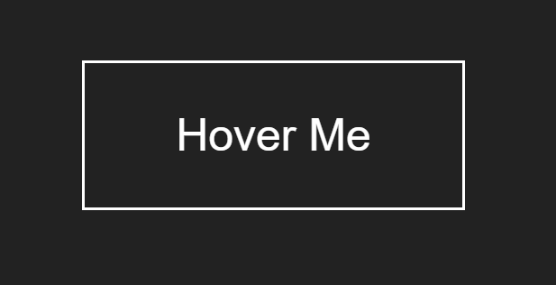
In this blog, I am creating a Icon Hover Effects with Transitions and Animations & awesome pulse effect using HTML & CSS. So, Let’s create an index.html & style.css below-


In this blog, I am creating a Icon Hover Effects with Transitions and Animations & awesome pulse effect using HTML & CSS. So, Let’s create an index.html & style.css below-
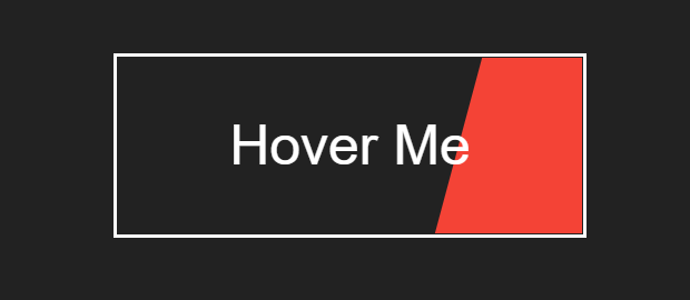
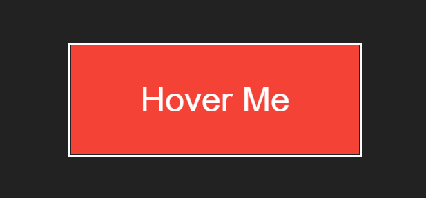
In this blog, I am creating a button-shaking hover effect animation & lighting text animation using HTML & CSS. So, Let’s create an index.html & style.css below-
Animated button with CSS animation after hover


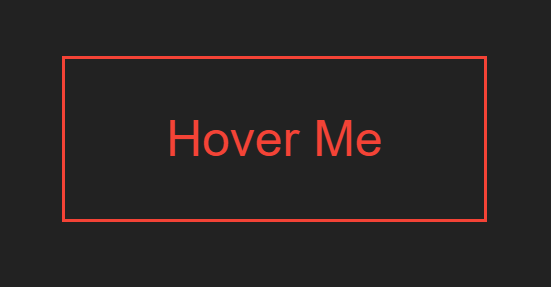
Button shaking hover effect with CSS animation after hover
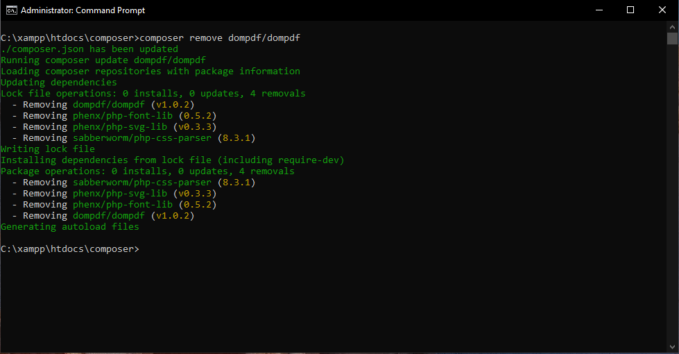
composer remove VenderName/PackageName – The remove command removes packages from the composer.json file from the current directory.
Syntax :- composer remove VenderName/PackageName
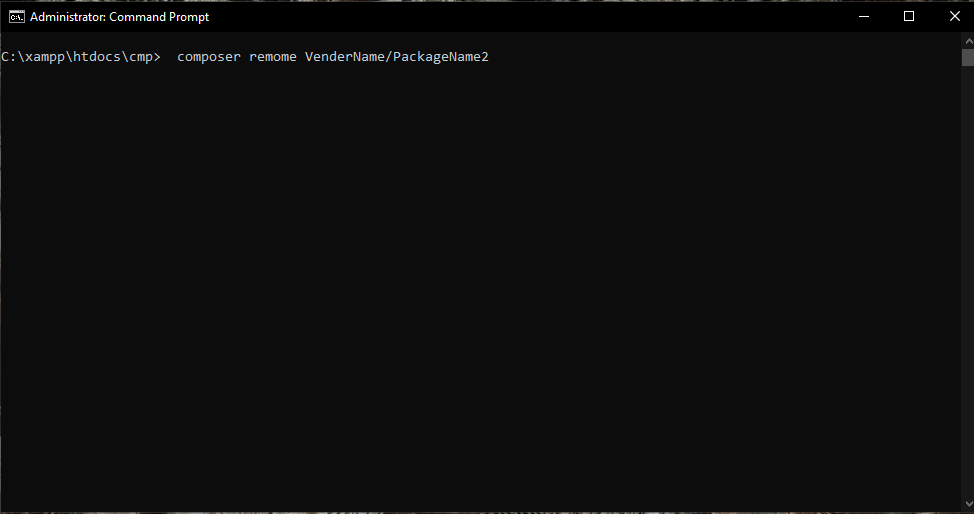
Syntax:- composer remome VenderName/PackageName1
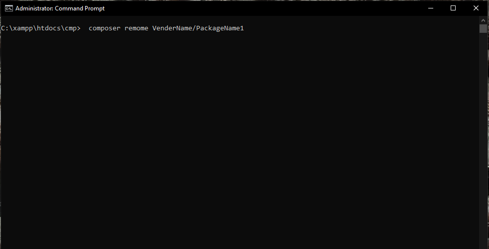
VenderName/PackageName2
If you want to remove more than one package then you have to run this command.
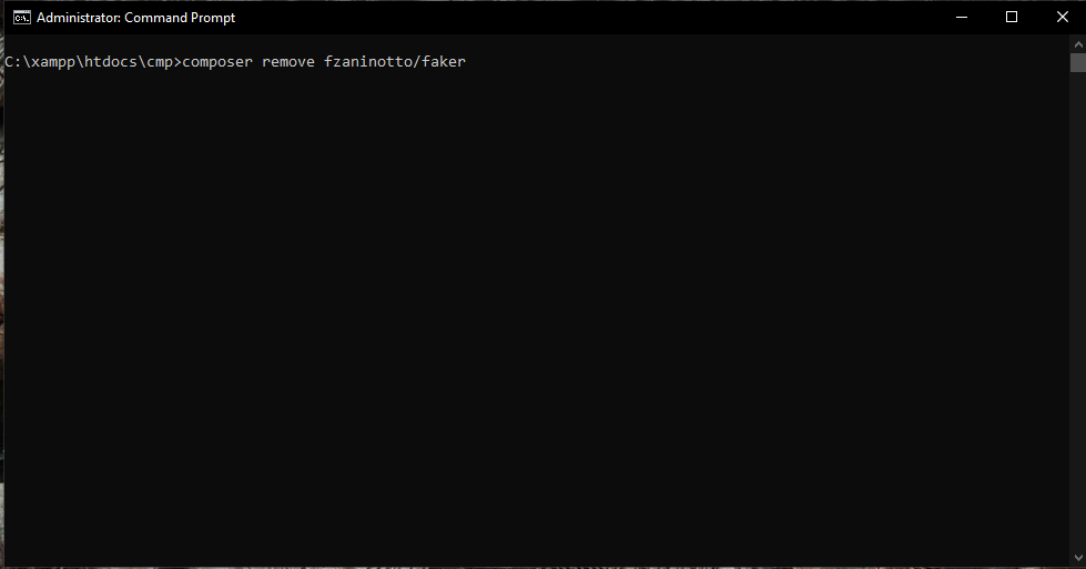
Ex:- composer remove fzaninotto/faker
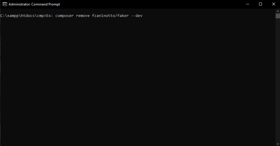
–dev: It remove packages form require-dev
This means, if it is in require-dev, then you have to remove it from there, then for this, you have to flag the dev.
Ex: composer remove fzaninotto/faker –dev
Azure DevOps has a great growth in coming times and promising future. The practise of DevOps is increasing day by day in IT domain. The demand for the Azure DevOps is well shown in the salary structure in India for them. This particular blog is all about the future of Azure DevOps in different areas of the IT industry and opportunities you have.
Azure DevOps is a modern DevOps tool which is used to developing, testing and deploying modern apps through optimized cycle to provide a quality delivery of applications to users. It provides so many of tool which can helpful in tracking software building progress and also helpful for taking decision to deliver great software to the end users. The main thing is Azure DevOps services are not dependent on cloud platform.
Who is an Azure DevOps Engineer?
An Azure DevOps engineer responsible for processes, tools, and introduces methodologies to balance requirement during the period of the software development, from coding and deployment, to maintenance and updates. As we know development teams and IT operations teams have different skills and different goals at the time of working.
They help you by streamline product delivery by optimizing practices, improving communications and collaboration, and also creating automation.
What are the roles and responsibilities of Azure DevOps?
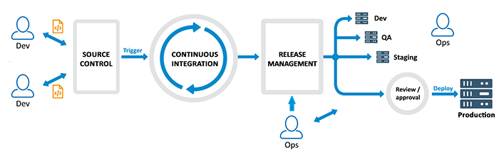
DevOps Engineer are someone who work with developers or IT team to oversee the releases of code. Azure DevOps Engineer is someone who understand the Software Development Lifecycle and also familiar with various automation tools for developing digital pipelines known as CI/ CD pipelines.
Responsibilities of an Azure DevOps Engineer
Management
Design and Development
Collaboration and Support
Knowledge
Versatile Duties
Roles of Azure DevOps Engineer
Designing DevOps Strategy—
Implementing DevOps Development Processes—
Implementing Continuous Integration—
Implementing Continuous Delivery—
Implementing Dependency Management—
Implementing Application Infrastructure—
Implementing Continuous Feedback—
Conclusion
So many big fortune companies along with many start-ups or small businesses are required with an Azure DevOps Engineer who is certified. Not to worry about the job you get or salary offer to you after the completion as a certified Azure DevOps Engineer, just focus on enhancing your real-time experience if you planned to be a part of any big renowned organizations and dream job with the salary you wished for.
As an Azure DevOps engineer, the national average salary is $105,114.
If you want to know more about the world of DevOps and planning to be an Azure DevOps Engineer, then I would like to suggest you DevOpsSchool, one the top institute for Mater in Azure DevOps Certification and training program (AZ-400). We provide you the best instructors who are highly qualified professionals, have more than 10 years of working and teaching experience.
If hope you find this blog helpful and informative about Azure DevOps.
Thank you!!
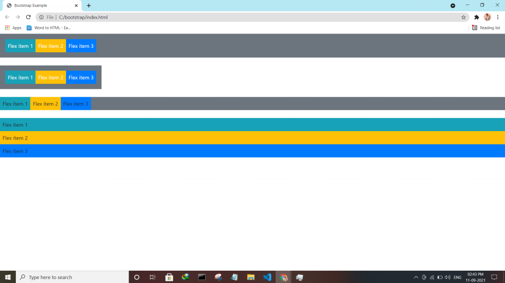
Bootstrap utilities Flex utility can be used to manage the layout, alignment, grid columns, navigation, and other components of the page.
All flex classes come with additional responsive classes, which makes it easy to set a specific flex class on specific screen size.
The * the symbol can be replaced with sm, md, lg or xl, which represents small, medium, large or xlarge screens.
| Class | Description |
| .d-*-flex | Creates a flexbox container for different screens |
| .d-*-inline-flex | Creates an inline flexbox container for different screens |
| .flex-*-row | Display flex items horizontally on different screens |
| .flex-*-row-reverse | Display flex items horizontally, and right-aligned, on different screens |
| .flex-*-column | Display flex items vertically on different screens |
| .flex-*-column-reverse | Display flex items vertically, with reversed order, on different screens screens |
| .justify-content-*-start | Display flex items from the start (left-aligned) on different screens |
| .justify-content-*-end | Display flex items at the end (right-aligned) on different screens |
| .justify-content-*-center | Display flex items in the center of a flex container on different screens |
| .justify-content-*-between | Display flex items in “between” on different screens |
| .justify-content-*-around | Display flex items “around” on different screens |
| .flex-*-fill | Force flex items into equal widths on different screens |
| .flex-*-grow-0 | Don’t make the items grow on different screens |
| .flex-*-grow-1 | Make items grow on different screens |
| .flex-*-shrink-0 | Don’t make the items shrink on different screens |
| .flex-*-shrink-1 | Make items shrink on different screens |
| .order-*-0-12 | Change the order from 0 to 12 on small screens |
| .flex-*-nowrap | Don’t wrap items on different screens |
| .flex-*-wrap | Wrap items on different screens |
| .flex-*-wrap-reverse | Reverse the wrapping of items on different screens |
| .align-content-*-start | Align gathered items from the start on different screens |
| .align-content-*-end | Align gathered items at the end on different screens |
| .align-content-*-center | Align gathered items in the center on different screens |
| .align-content-*-around | Align gathered items “around” on different screens |
| .align-content-*-stretch | Stretch gathered items on different screens |
| .align-items-*-start | Align single rows of items from the start on different screens |
| .align-items-*-end | Align single rows of items at the end on different screens |
| .align-items-*-center | Align single rows of items in the center on different screens |
| .align-items-*-baseline | Align single rows of items on the baseline on different screens |
| .align-items-*-stretch | Stretch single rows of items on different screens |
| .align-self-*-start | Align a flex item from the start on different screens |
| .align-self-*-end | Align a flex item at the end on different screens |
| .align-self-*-center | Align a flex item in the center on different screens |
| .align-self-*-baseline | Align a flex item on the baseline on different screens |
| .align-self-*-stretch | Stretch a flex item on different screens |
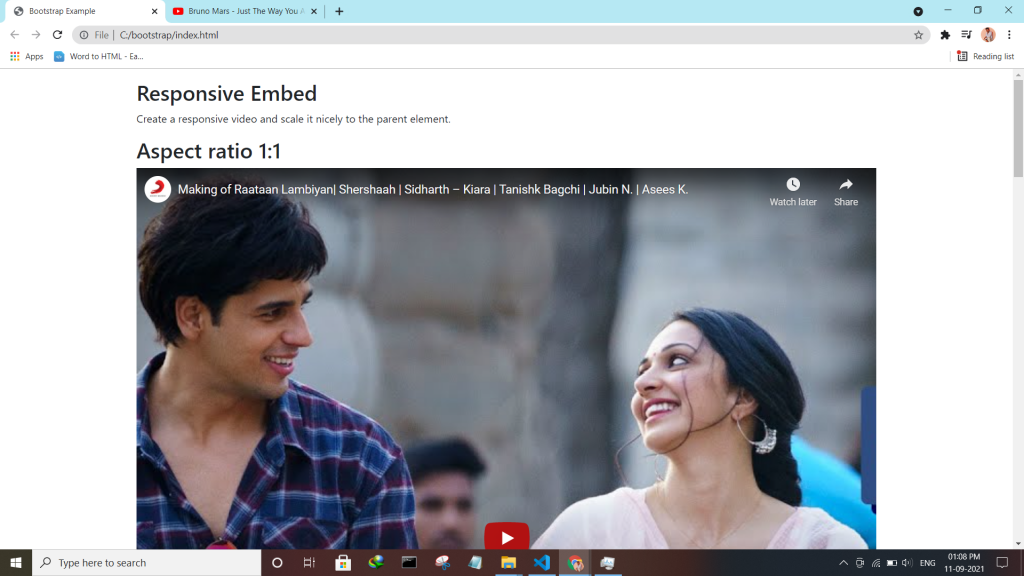
Bootstrap embeds is a utility that helps you insert video or slideshow in the page keeping width of the parent and scales on any device.
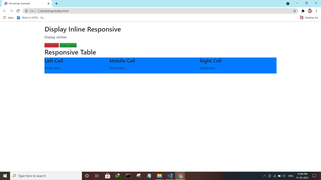
Bootstrap utility display changes the value of the property with our responsive display utility classes. We purposely support only a subset of all possible values for display. Classes can be combined for various effects as you need.
| Screen Size | Class |
| Hidden an element | .d-none |
| Hides an element on a specific screen size | .d-*-none |
| Hidden only on xs | .d-none .d-sm-block |
| Hidden only on sm | .d-sm-none .d-md-block |
| Hidden only on md | .d-md-none .d-lg-block |
| Hidden only on lg | .d-lg-none .d-xl-block |
| An element inline | .d-inline |
| An element inline on a specific screen size | .d-*-inline |
| An element inline-block | .d-inline-block |
| An element inline-block on a specific screen size | .d-*-inline-block |
| An Element display as a table | .d-table |
| An element display as a table on a specific screen size | .d-*-table |
| An element display as a table cell | .d-table-cell |
| An element display as a table cell on a specific screen size | .d-*-table-cell |
| An element display as a table row | .d-table-row |
| An element display as a table row on a specific screen size | .d-*-table-row |
| Creates a flexbox container and transforms direct children into flex items | .d-flex |
| Creates a flexbox container on a specific screen size | .d-*-flex |
| Creates an inline flexbox container | .d-inline-flex |
| Creates an inline flexbox container on a specific screen size | .d-*-inline-flex |
<div class="container mt-4">
  <h2>Display Inline Block</h2>
  <p>Use the d-inline-block class.</p>
  <div class="d-inline-block">Inline block DIV.</div>
  <div class="d-inline-block">Inline block DIV.</div>
</div>
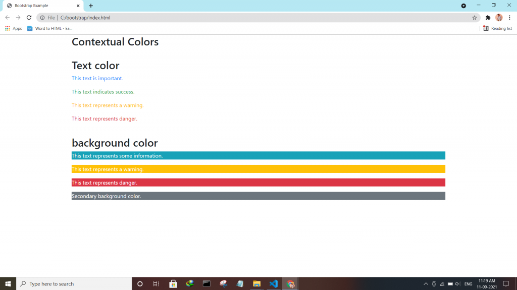
Check the enhanced Bootstrap 4 Text colors — Convey meaning through color with a handful of color utility classes.
:- .text-muted, .text-primary, .text-success, .text-info, .text-warning, .text-danger, .text-secondary, .text-white, .text-dark, .text-body (default body color/often black) and .text-light.
:- .bg-primary, .bg-success, .bg-info, .bg-warning, .bg-danger, .bg-secondary, .bg-dark and .bg-light.