bootstrap provides responsive float classes, that make an element float based on the viewport size (sm|md|lg|xl).
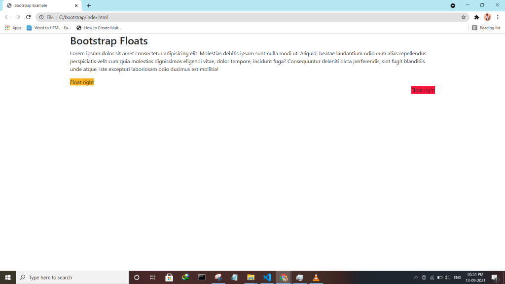
bootstrap provides responsive float classes, that make an element float based on the viewport size (sm|md|lg|xl).
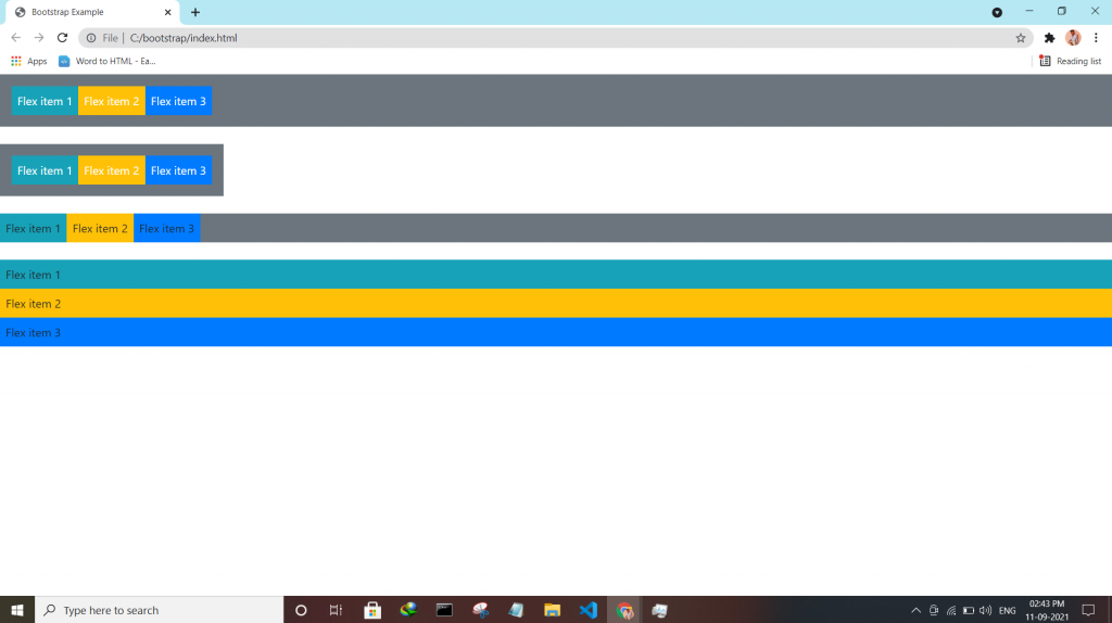
Bootstrap utilities Flex utility can be used to manage the layout, alignment, grid columns, navigation, and other components of the page.
All flex classes come with additional responsive classes, which makes it easy to set a specific flex class on specific screen size.
The * the symbol can be replaced with sm, md, lg or xl, which represents small, medium, large or xlarge screens.
| Class | Description |
| .d-*-flex | Creates a flexbox container for different screens |
| .d-*-inline-flex | Creates an inline flexbox container for different screens |
| .flex-*-row | Display flex items horizontally on different screens |
| .flex-*-row-reverse | Display flex items horizontally, and right-aligned, on different screens |
| .flex-*-column | Display flex items vertically on different screens |
| .flex-*-column-reverse | Display flex items vertically, with reversed order, on different screens screens |
| .justify-content-*-start | Display flex items from the start (left-aligned) on different screens |
| .justify-content-*-end | Display flex items at the end (right-aligned) on different screens |
| .justify-content-*-center | Display flex items in the center of a flex container on different screens |
| .justify-content-*-between | Display flex items in “between” on different screens |
| .justify-content-*-around | Display flex items “around” on different screens |
| .flex-*-fill | Force flex items into equal widths on different screens |
| .flex-*-grow-0 | Don’t make the items grow on different screens |
| .flex-*-grow-1 | Make items grow on different screens |
| .flex-*-shrink-0 | Don’t make the items shrink on different screens |
| .flex-*-shrink-1 | Make items shrink on different screens |
| .order-*-0-12 | Change the order from 0 to 12 on small screens |
| .flex-*-nowrap | Don’t wrap items on different screens |
| .flex-*-wrap | Wrap items on different screens |
| .flex-*-wrap-reverse | Reverse the wrapping of items on different screens |
| .align-content-*-start | Align gathered items from the start on different screens |
| .align-content-*-end | Align gathered items at the end on different screens |
| .align-content-*-center | Align gathered items in the center on different screens |
| .align-content-*-around | Align gathered items “around” on different screens |
| .align-content-*-stretch | Stretch gathered items on different screens |
| .align-items-*-start | Align single rows of items from the start on different screens |
| .align-items-*-end | Align single rows of items at the end on different screens |
| .align-items-*-center | Align single rows of items in the center on different screens |
| .align-items-*-baseline | Align single rows of items on the baseline on different screens |
| .align-items-*-stretch | Stretch single rows of items on different screens |
| .align-self-*-start | Align a flex item from the start on different screens |
| .align-self-*-end | Align a flex item at the end on different screens |
| .align-self-*-center | Align a flex item in the center on different screens |
| .align-self-*-baseline | Align a flex item on the baseline on different screens |
| .align-self-*-stretch | Stretch a flex item on different screens |
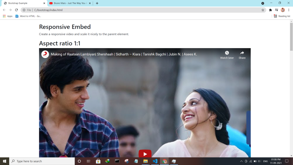
Bootstrap embeds is a utility that helps you insert video or slideshow in the page keeping width of the parent and scales on any device.
Bootstrap utility display changes the value of the property with our responsive display utility classes. We purposely support only a subset of all possible values for display. Classes can be combined for various effects as you need.
| Screen Size | Class |
| Hidden an element | .d-none |
| Hides an element on a specific screen size | .d-*-none |
| Hidden only on xs | .d-none .d-sm-block |
| Hidden only on sm | .d-sm-none .d-md-block |
| Hidden only on md | .d-md-none .d-lg-block |
| Hidden only on lg | .d-lg-none .d-xl-block |
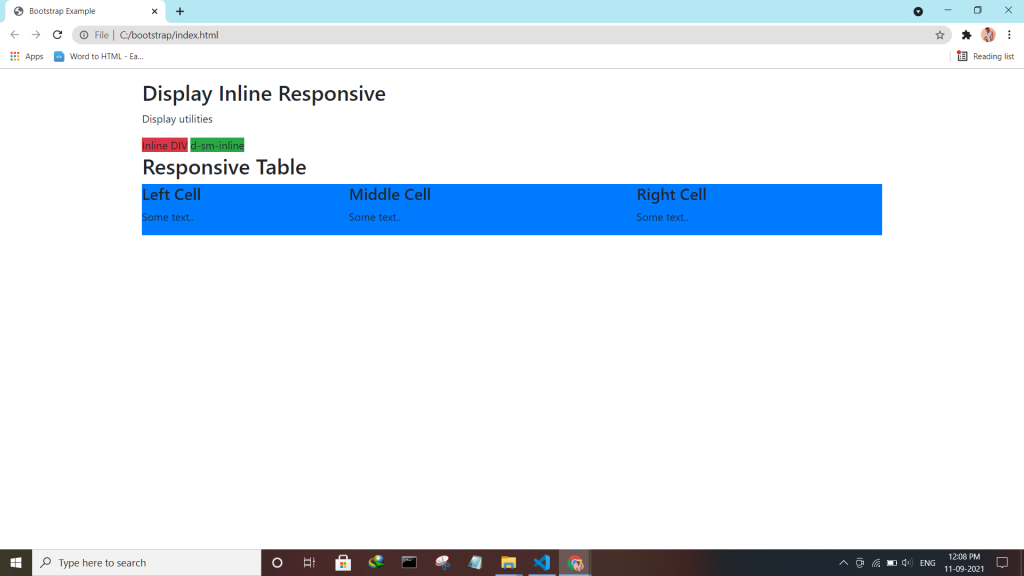
| An element inline | .d-inline |
| An element inline on a specific screen size | .d-*-inline |
| An element inline-block | .d-inline-block |
| An element inline-block on a specific screen size | .d-*-inline-block |
| An Element display as a table | .d-table |
| An element display as a table on a specific screen size | .d-*-table |
| An element display as a table cell | .d-table-cell |
| An element display as a table cell on a specific screen size | .d-*-table-cell |
| An element display as a table row | .d-table-row |
| An element display as a table row on a specific screen size | .d-*-table-row |
| Creates a flexbox container and transforms direct children into flex items | .d-flex |
| Creates a flexbox container on a specific screen size | .d-*-flex |
| Creates an inline flexbox container | .d-inline-flex |
| Creates an inline flexbox container on a specific screen size | .d-*-inline-flex |
<div class="container mt-4">
  <h2>Display Inline Block</h2>
  <p>Use the d-inline-block class.</p>
  <div class="d-inline-block">Inline block DIV.</div>
  <div class="d-inline-block">Inline block DIV.</div>
</div>
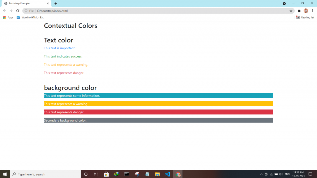
Check the enhanced Bootstrap 4 Text colors — Convey meaning through color with a handful of color utility classes.
:- .text-muted, .text-primary, .text-success, .text-info, .text-warning, .text-danger, .text-secondary, .text-white, .text-dark, .text-body (default body color/often black) and .text-light.
:- .bg-primary, .bg-success, .bg-info, .bg-warning, .bg-danger, .bg-secondary, .bg-dark and .bg-light.
Bootstrap 4 has a lot of utility/helper classes to quickly style elements without using any CSS code. Use the .close class to style a close icon.
<div class="clearfix">
<button type="button" class="close">×</button>
</div>
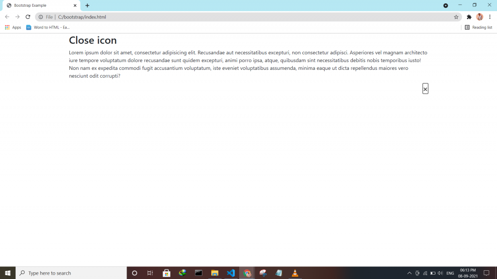
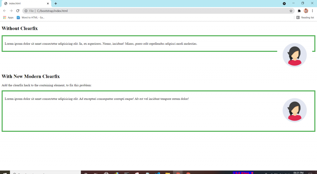
If an element is bigger than the element containing it, and it is floated, it will overflow outside of its container. Then we can add overflow: auto to the containing element to fix this problem.
.clearfix {
  overflow: auto;
}
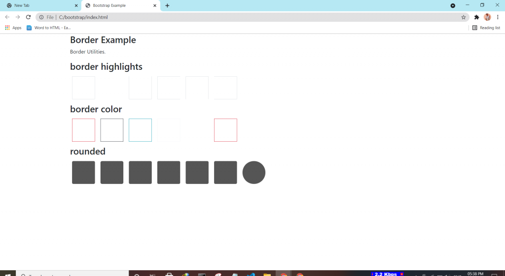
Bootstrap 4 has a lot of utility classes to quickly style elements. With no using CSS code.
This class adds a border all around the element.
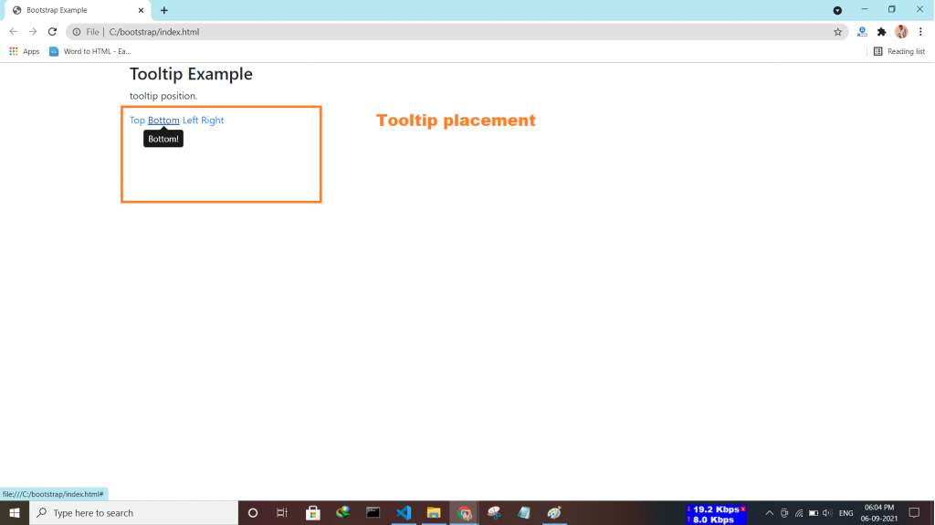
Tooltip is a component that is used for displaying small pop-up messages in a small box that appears when the user moves the mouse pointer over an element.
<script>
$(document).ready(function(){
  $('[data-toggle="tooltip"]').tooltip();
});
</script>