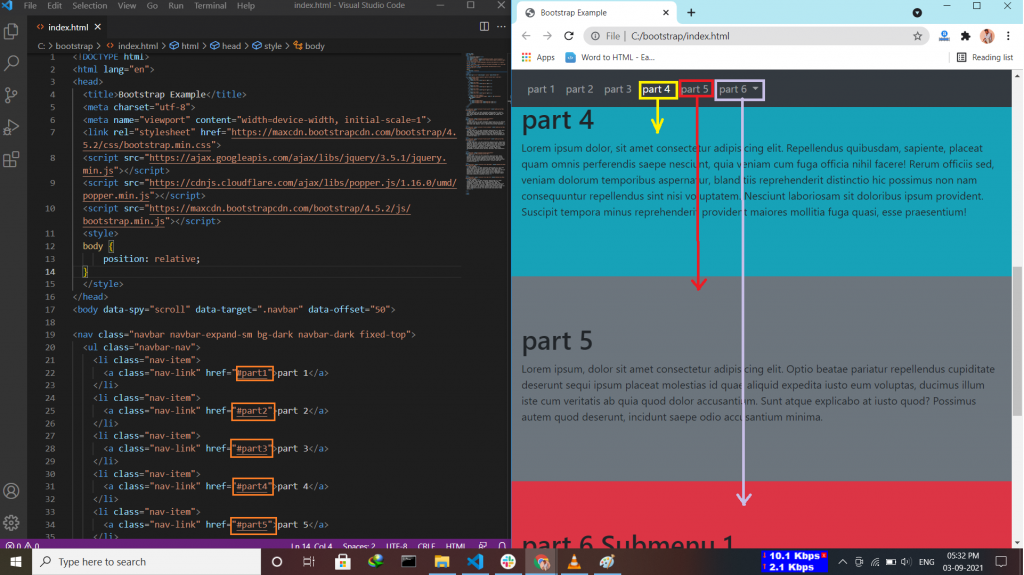
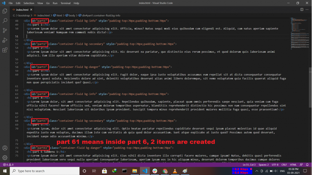
The Bootstrap 4 scrollspy is a navigation mechanism that automatically highlights the nav links based on the scroll position to indicate the visitor where they are currently on the page.
Progress Bar in Bootstrap 4 is mainly used to indicate to the user, how much progress of the process is done. progress bars featuring support for stacked bars, animated backgrounds, and text labels. Use utility classes for the background (bg-success, bg- info, bg-light, bg-dark, bg-danger, bg-warning) for creating a progress bar with a different color.
Where to use Progress Bar:-
Progress Bar With Label by placing text within the .progress-bar.
Progress Bar With Height.
Colored Progress Bar by using .progress-bar-sucess|info|warning|danger.
Striped Progress Bar by using .progress-bar-striped class.
Animated Progress Bar by using .active class.
Stacked Progress Bars by using <div class=”progress”>.
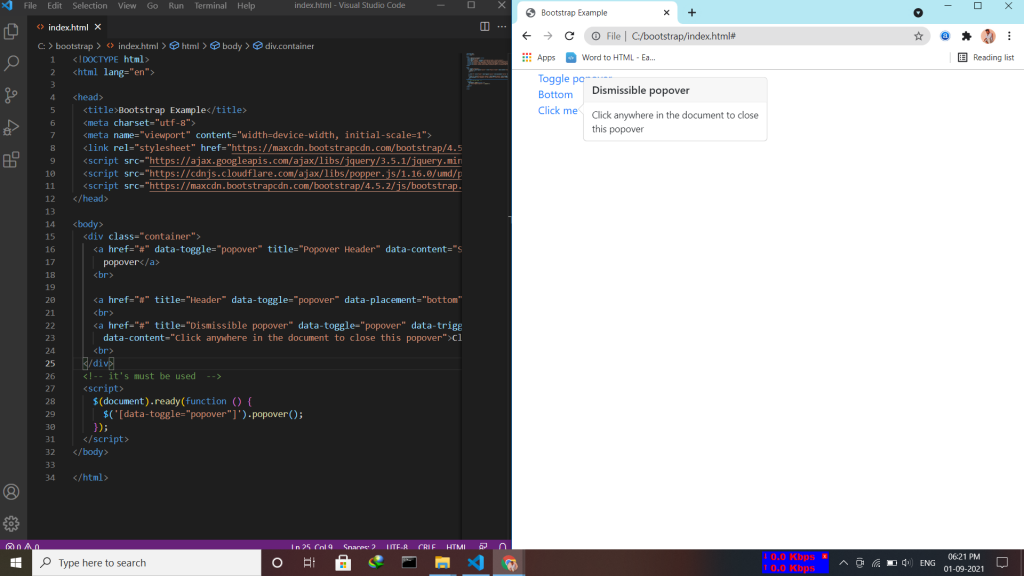
A popover is similar to the tooltip, offering an extended view complete with a heading. Popovers are generally used to display additional information about any element and are displayed on click of mouse pointer over that element. Note:- Popovers must be initialized with jQuery.
Enable Popovers everywhere by using the attribute data-placement=top|bottom|left|right
Dismiss on next click by using the attribute data-trigger=”focus”.
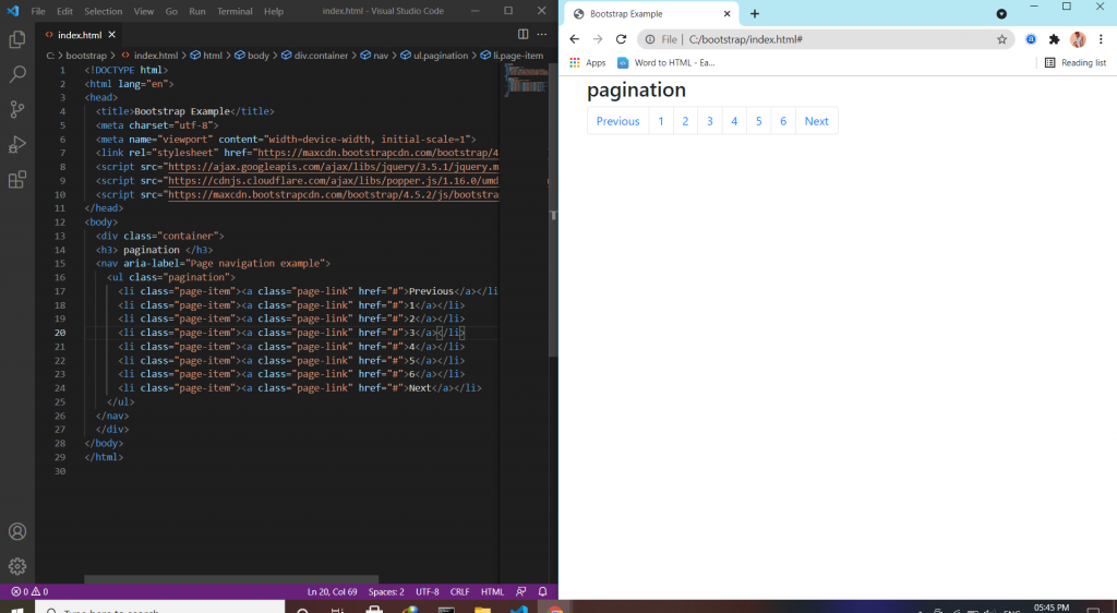
Pagination is a component in bootstrap that is used to enable navigation between pages in a website. It is a method of dividing web content into discrete pages, thus presenting content in a limited and digestible manner.
Pagination uses:-
Working with icons by using class=sr-only (previous/next) utility.
Disabled and active states by using class=disable/active to indicate the current page.
Sizing by using .pagination-lg|sm for additional sizes.
Alignment by .justify-content-center|end.
Breadcrumbs by using .breadcrumb and .breadcrumb-item classes.
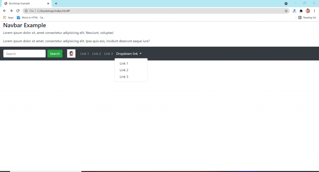
The navbar is one of the prominent features of Bootstrap sites. A navigation bar is a navigation header that is placed at the top of the page. the navigation bar can extend or collapse, depending on the screen size. A standard navigation bar is created with the .navbar class.
Format of nav bar:-
Vertical Navbar by using class=”navbar-nav”.
Centered Navbar by using .justify-content-center class to center the navigation bar.
Colored Navbar by using any of the .bg-color classes to change the background color of navbar.
Brand/Logo by using .navbar-brand class is used to highlight the brand/logo/project name of your page.
Collapsing The navbar To create a collapsible navigation bar, use a button with class=”navbar-toggler”, data-toggle=”collapse” and data-target=”#thetarget”.
Navbar With Dropdown.
Navbar Froms and Buttons Add a <form> element with class=”form-inline” to group inputs and buttons side-by-side.
Nevbar Text use .navbar-text class to vertically align any elements inside the navbar that are not links.
Fixed Navbar by using .fixed-top or .fixed-bottom class to make the navbar fixed.
Sticky navbar use the .sticky-top class to make the navbar fixed/stay at the thop of the page.
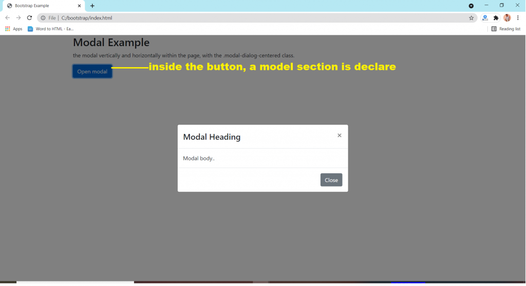
A modal window creates a mode that disables the main window but keeps it visible, with the modal window as a child window in front of it. … Users must interact with the modal window before they can return to the parent application. This avoids interrupting the workflow on the main window.
Simply define the Modal component as a dialog box/popup window that is displayed on top of the current page.
.fade class for add animation.
Model Size like model-sm, model-lg, model-xl.
Centered Model .model-dialog-centered class.
Scrolling Model use by adding .model-dialog-scrollable to .model-dialog in class.
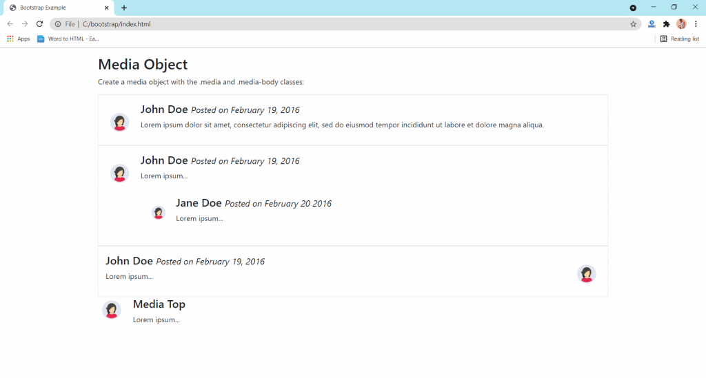
Bootstrap provides an easy way to align media objects (like images or videos) together with content. Media objects are often used to display blog comments, tweets, and so on.
Basic media Object :- class=media class to a container element and place media content inside a child container with class=media-body.
Nested Media Object :- Media object can also be nested(media object inside media).
Right-Aligned Media Image :- to right-aligned media image class=media-body.
Top, Middle or Bottom Alignment :- Use the flex utilities, class=align-self-(start/center/end) classes to place the media object on the top, middle or at the bottom.
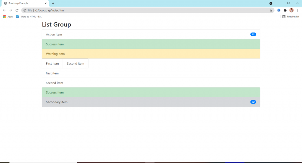
List groups are a flexible and powerful component for displaying a series of content.
features:-
Basic items simply making for list.
Active items used for showing it’s an active mode.
Disabled items used for just reading that message.
Links and buttons are used to create actionable list group items with hover.
Flush / Remove Borders are used to remove some borders and rounded corners to render list group items edge-to-edge in a parent container (card).
Horizontal to change the layout of list group items from vertical to horizontal across all breakpoints.
Contextual classes to style list items with a stateful backgrond and color.
With badges to show unread counts, activity .
Custom content by the help of flexbox utilities.
JavaScript behavior to create tabbable panes of local content.
Using data attributes use for activate a list group navigation without writing any javaScript by simply specifying data-toggle=”list” or on an element.