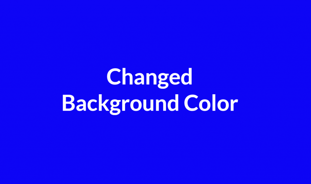
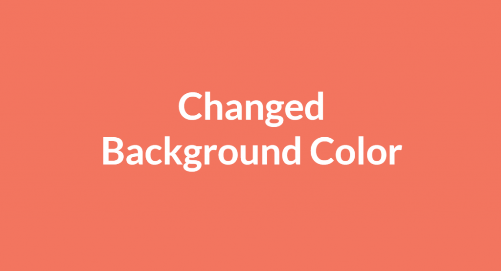
In this blog, I am creating simple Images, Slider Show, & Changing background color with animations using HTML & CSS. So, Let’s create an index.html & style.css below-
Tag: color
How to create Image Hover Effects with Color in a row using HTML & CSS?
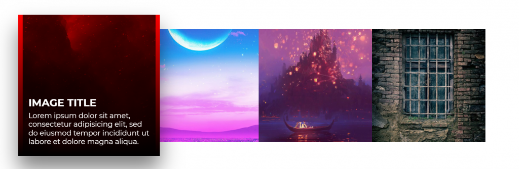
In this blog, I am creating Image Hover Effects with Color in a row using HTML & CSS. So, Let’s create an “index.html” & “style.css” below index.html code-
In this index.html container with four box classes & each box class with images & content class & multiple div which is define style.css page-
When you implement from this index.html & style.css page then showing below row-
How to create Creative Cube Hover Effects With Changing Color Animation in CSS?
In this tutorial, I am going to create creative Cube Hover Effects With Changing Color Animation in CSS. So, Before creates an “index.html” & “style.css”. Below index.html code-
In this index.html I am using cube shape with help of CSS and create multiple classes which is define below style.css code-
In this style.css page define all classes which is used in index.html and after that show below page with hover effects-
How to use different types of Media Features in CSS?
- any-hover – Does any available input mechanism allow the user to hover over elements? (added in Media Queries Level 4)
- any-pointer – Is any available input mechanism a pointing device, and if so, how accurate is it? (added in Media Queries Level 4)
- aspect-ratio – The ratio between the width and the height of the viewport
- color – The number of bits per color component for the output device
- color-index – The number of colors the device can display
- grid – Whether the device is a grid or bitmap
- height – The viewport height
- hover – Does the primary input mechanism allow the user to hover over elements? (added in Media Queries Level 4)
- inverted-colors – Is the browser or underlying OS inverting colors? (added in Media Queries Level 4)
- light-level – Current ambient light level (added in Media Queries Level 4)
- max-aspect-ratio – The maximum ratio between the width and the height of the display area
- max-color – The maximum number of bits per color component for the output device
- max-color-index – The maximum number of colors the device can display
- max-device-aspect-ratio – The maximum ratio between the width and the height of the device
- max-device-height – The maximum height of the device, such as a computer screen
- max-device-width – The maximum width of the device, such as a computer screen
- max-height – The
- max-monochrome – The maximum number of bits per “color” on a monochrome (greyscale) device
- max-resolution – The maximum resolution of the device, using dpi or dpcmmaximum height of the display area, such as a browser window
- scan – The scanning process of the output device
- scripting – Is scripting (e.g. JavaScript) available? (added in Media Queries Level 4)
- max-width – The maximum width of the display area, such as a browser window
- min-aspect-ratio – The minimum ratio between the width and the height of the display area
- min-color – The minimum number of bits per color component for the output device
- min-color-index – The minimum number of colors the device can display
- min-device-aspect-ratio – The minimum ratio between the width and the height of the device
- min-device-width – The minimum width of the device, such as a computer screen
- min-device-height – The minimum height of the device, such as a computer screen
- min-height – The minimum height of the display area, such as a browser window
- min-monochrome – The minimum number of bits per “color” on a monochrome (greyscale) device
- min-resolution – The minimum resolution of the device, using dpi or dpcm
- min-width – The minimum width of the display area, such as a browser window
- monochrome – The number of bits per “color” on a monochrome (greyscale) device
- update-frequency – How quickly can the output device modify the appearance of the content (added in Media Queries Level 4)
- width – The viewport width
- orientation – The orientation of the viewport (landscape or portrait mode)
- overflow-block – How does the output device handle content that overflows the viewport along the block axis (added in Media Queries Level 4)
- overflow-inline – Can content that overflows the viewport along the inline axis be scrolled (added in Media Queries Level 4)
- pointer – Is the primary input mechanism a pointing device, and if so, how accurate is it? (added in Media Queries Level 4)
- resolution – The resolution of the output device, using dpi or dpcm
How to set Table width, height, color & padding using CSS?
Empty-cells
This property is used to set whether or not to display borders and background on empty cells in a table. It will work only if the border-collapse is set to separate. We can set this property to show (default) or hide.
Ex:-
table { table-layout: fixed; }
How to set Table width and Height?
We use width and height property to set table width and height.
We can also set table heading (th) width and height.
table { width: 100% ;}
th { height: 10px; }
How to set Table Padding?
This property is used to control the space between the border and the content in a table, this is used on <td> and <th> elements.
th, td { padding: 10px; }
How to set Table color?
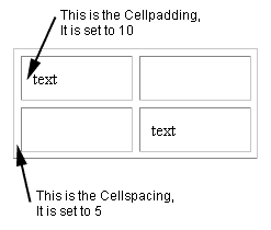
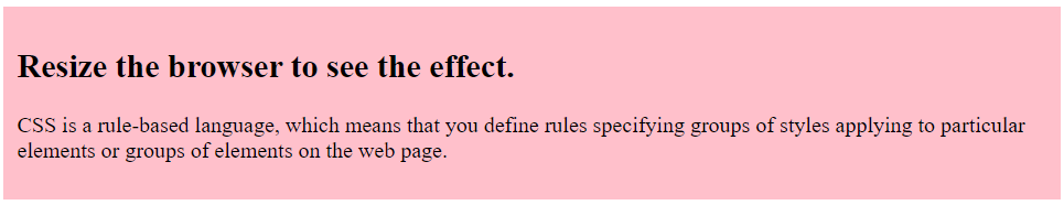
table {background-color: pink;}