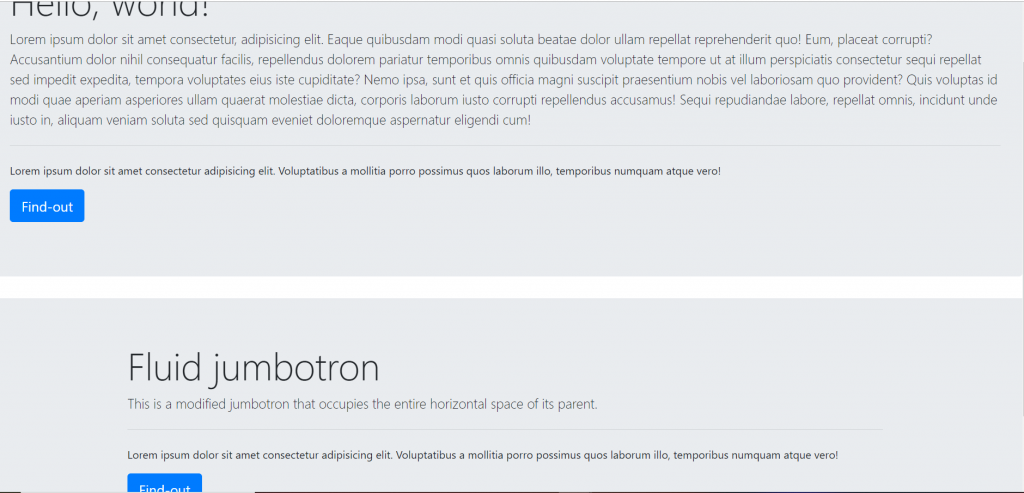
A jumbotron indicates a big box for calling extra attention to some special content or information. A jumbotron is displayed as a grey box with rounded corners. It also enlarges the font sizes of the text inside it. Tip: Inside a jumbotron, you can put nearly any valid HTML, including other Bootstrap elements/classes. class jumbotron and class jumbotron-fluid are used.
Category: Bootstrap
Bootstrap:-Component “Input group”
Input group:-
Easily extend form controls by adding text, buttons, or button groups on either side of textual inputs, custom selects, and custom file inputs.
Functions:-
- Sizing classes to the .input-group itself and contains within will automatically resize for each element.
- Checkboxes and radios options within an input group’s addon instead of text.
- Multiple inputs are only available for input gropus with a single inpute.
- Multiple addons are supported and can be mixed with checkbox and radio input versions and many more others things as well.
- Button addons are supported and can be mixed with multiple buttons and input text.
- Buttons with dropdowns are needed within a single line inpute.
- Segmented buttons means button and then inside button a dropdown menu and text area there.
- Customer forms button area and an option area.
- Customer file input are most important for uploading a file or image etc.
Bootstrap:-Component “Forms”
Bootstrap provides two types of form layout:-
- Stacked form
- Inline form
Stacked form(full-width):-
Inline form:-
Bootstrap:-Component “Dropdowns”
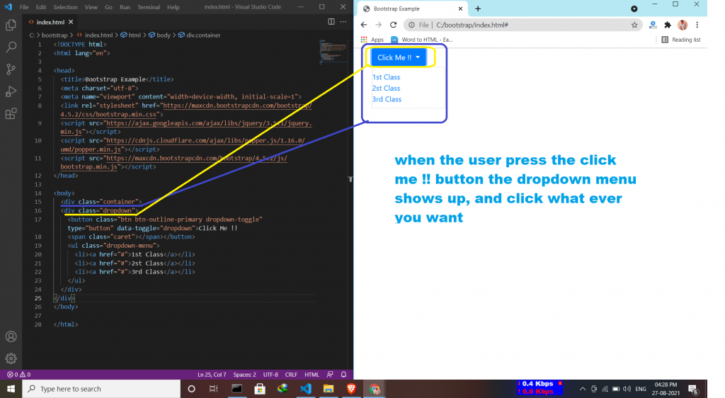
Dropdown menu is a toggleable menu that allows users to choose one value from a predefined list. Sometimes it helps the users to same time for finding some particular things.
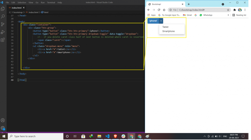
For creating a dropdown menu
- The class dropdown indicates a dropdown menu.
- To open the dropdown menu, use a button or a link with a class of .dropdown-toggle and the data-toggle=”dropdown” attribute.
- arrow icon () used inside button .caret class in span tag.
- And then .dropdown-menu class inside <ul> or <ol> element to actually build the dropdown menu.
Styles for using the dropdown to look fabulous:-
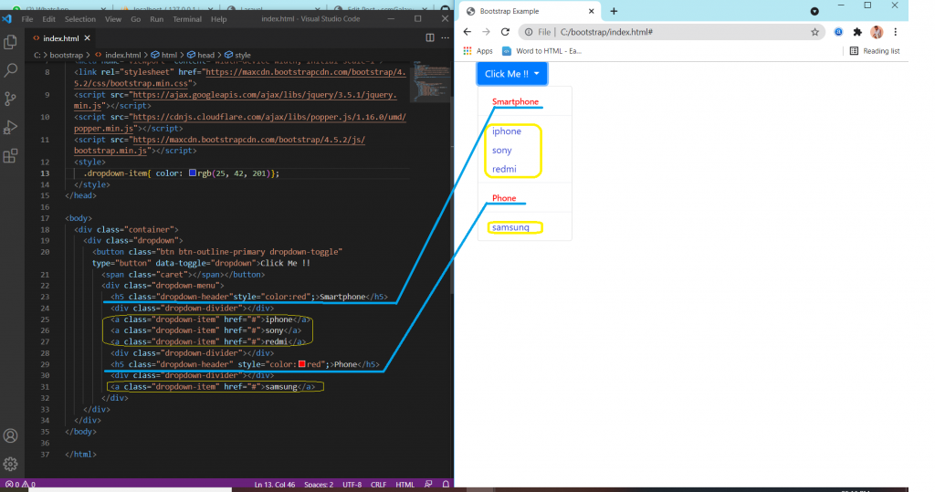
- Dropdown Divider (This class is used to separate links inside the dropdown menu with a thin horizontal borde)
- Dropdown Header (This class is used to add headers inside the dropdown menu)
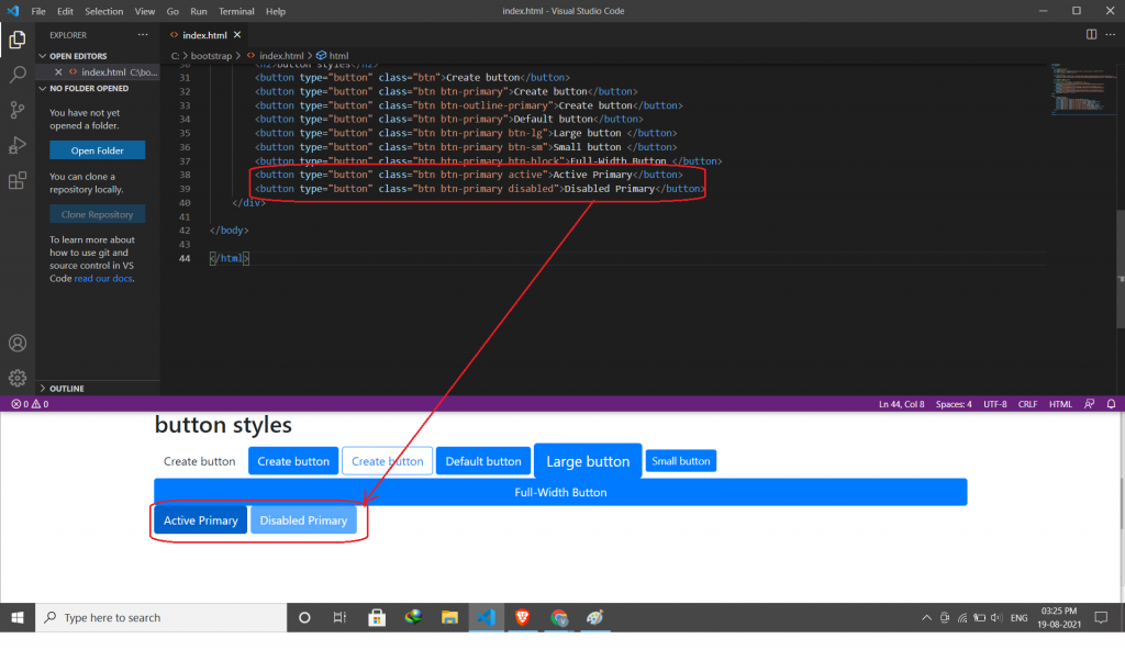
- Disable and Active items (This class is used to Highlight a specific dropdown item)
- Dropdown Position (This class is used to adjust the dropdown on the left or right side)
- Dropup (This class is used to the dropdown menu to expand upward direction)
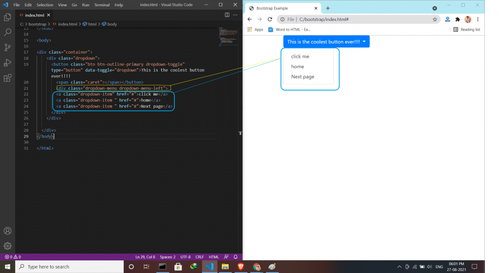
- Dropdown Menu Right/left (This class is used to adjust the menu whether its place is right or left )
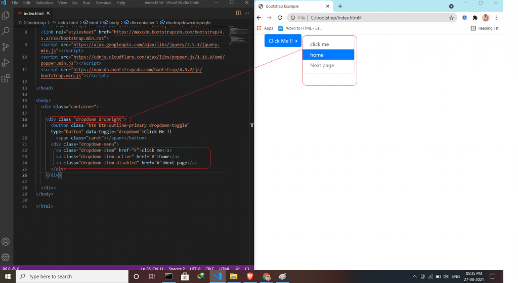
The simple way to create a dropdown
Divider & header use:-
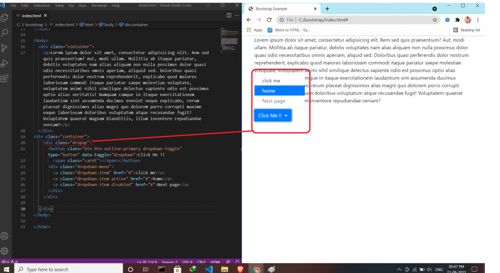
Disable and Active items & Dropdown Position use:-
Dropup
Dropdown Menu Right use:-
Bootstrap:-Component “Collapse”
Bootstrap:-Component “Carouse”
A slideshow component for cycling through elements—images or slides of text—like a carousel.
Bootstrap: Component “Card”
Cards:
- A card in Bootstrap 4 is a bordered box with some padding around its content.
- It includes options for headers, footers, content, colors, etc.
- A basic card is created with the .card class.
- The .card-header class adds a heading to the card and the .card-footer class adds a footer to the card.
- add a background color the card, use contextual classes. ( .bg-primary, .bg-success……).
- Add .card-img-top or .card-img-bottom to an
<
img> to place the image at the top or at the bottom inside the card. - Add the .stretched-link class to a link inside the card.
- .card-img-overlay to add text on top of the image.
- The .card-columns class creates a masonry-like grid of cards.
- .card-deck class creates a grid of cards that are of equal height and width.
- The cards are displayed vertically on small screens (less than 576px).
- The .card-group class is similar to .card-deck. The only difference is that the .card-group class removes left and right margins between each card.
Syntax:-
<div class="card">
<div class="card-body">Basic card</div>
</div>
Creat a profile:
Bootstrap: Component”Button group”
Bootstrap Button Groups:
- Button Groups.
- Vertical Button Groups.
- Justified Button Groups.
- Nesting Button Groups & Dropdown Menus.
- Split Button Dropdowns.
Button Groups:
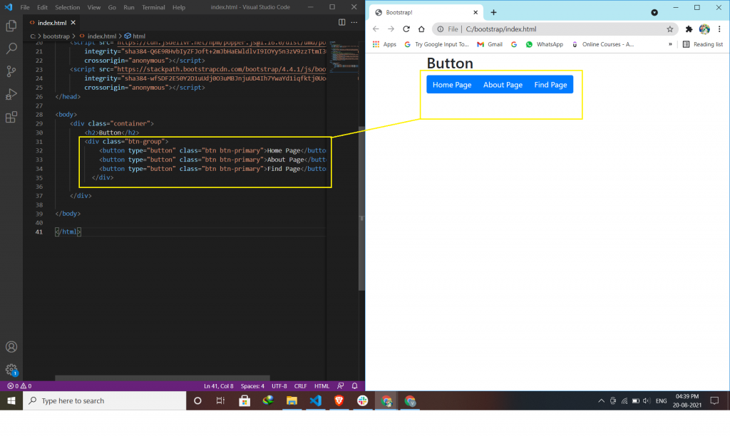
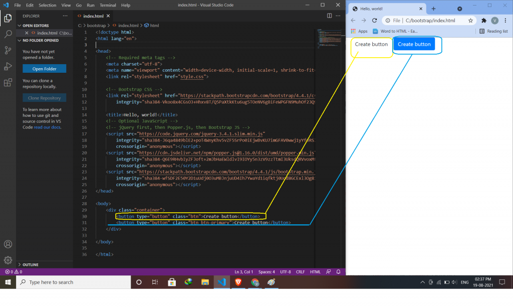
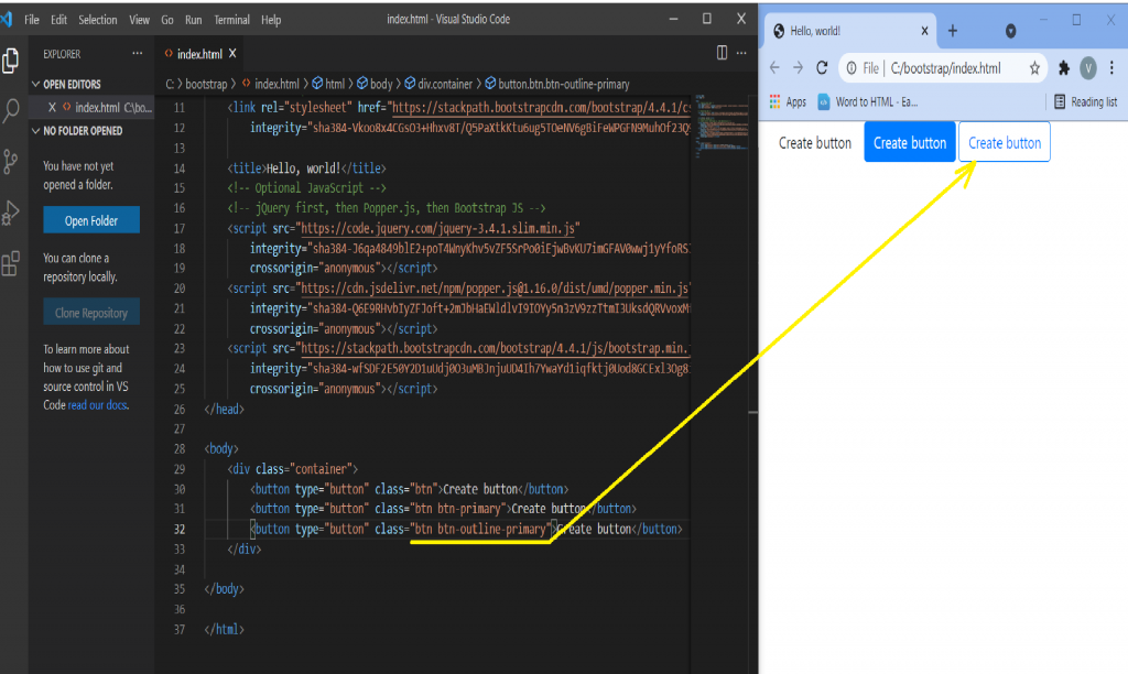
Bootstrap allows you to group a series of buttons in a button group. Use a <div> element with class .btn-group to create a button group.
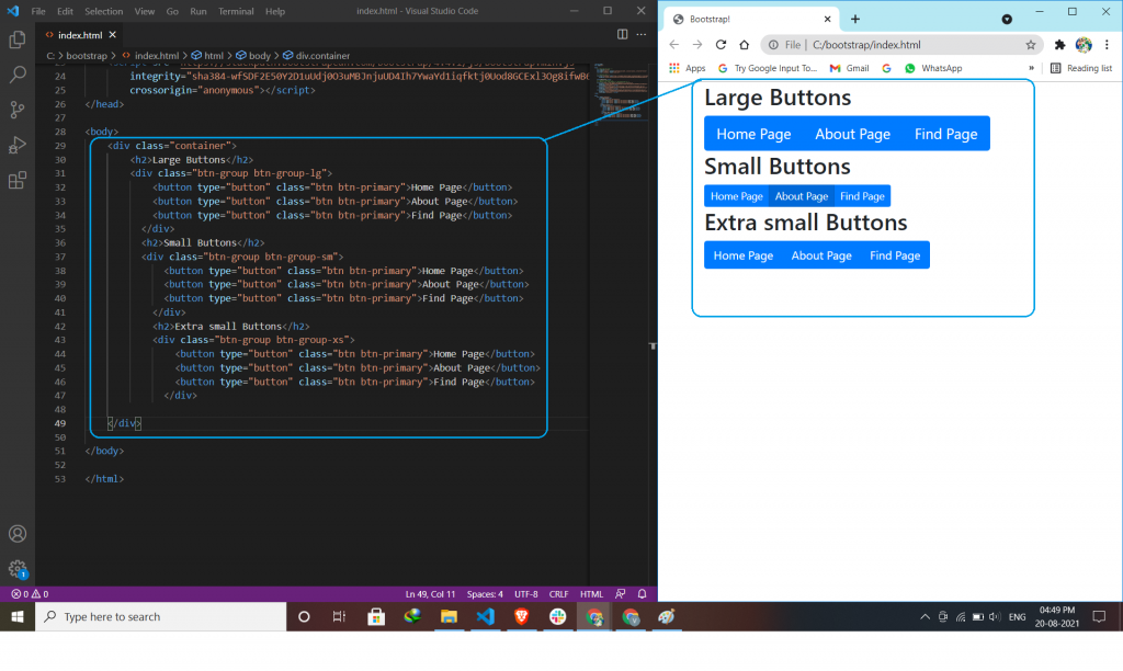
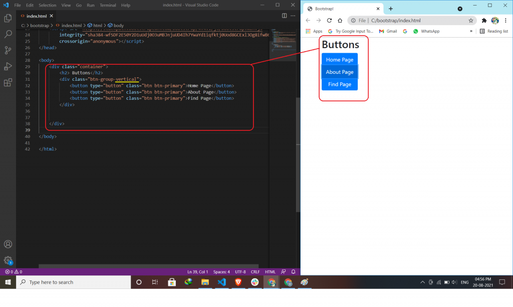
Vertical Button Groups:
Use the class .btn-group-vertical to create a vertical button group.
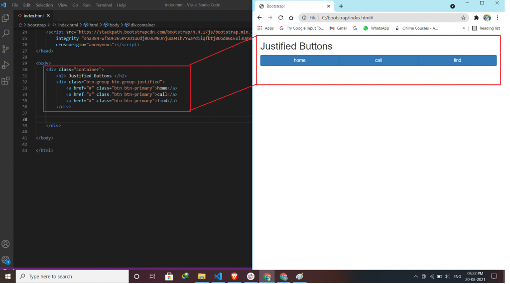
Justified Button Groups:
To span, the entire width of the screen, use the class .btn-group-justified.
Nesting Button Groups & Dropdown Menus:
Nest button groups to create dropdown menus.
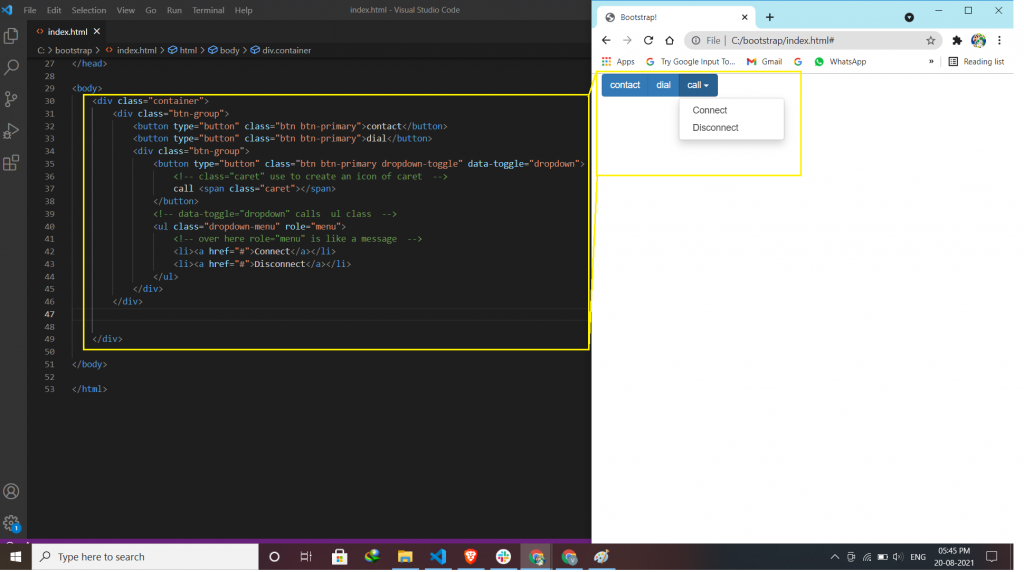
Split Button Dropdowns:
Split button dropdowns use the same general style as the dropdown button but add a primary action along with the dropdown. If you deleted the span parts then, the dropdown menu shows you half because you create a dropdown menu but not to call.
Bootstrap: Component”Buttons”
Bootstrap 4 provides users with different styles of buttons.
- Button Color.
- Button Outline.
- Button Size.
- Block level Buttons.
- Active/Disabled Buttons.
- Spinner Buttons.
Button color:
Use the background-color property to change the background color of a button.
Button Outline:
The button outline style removes all background images or colors from a button and gives it a lighter look.
Button Sizes:
This will indicate to you the size of the button.
- Default
- Large (btn-lg)
- Small (btn-sm)
Block Level Buttons:
The .btn-block class is used to create a block-level button that spans the entire width of the parent elements.
Active/Disabled Buttons:
A button can be set to an active (clickable) or a disabled (unclickable) state.
Spinner Buttons:
You can also add “spinners” to a button.
Bootstrap: Component “Breadcrumb”
Breadcrumb navigation provides a link back to each previous page the user navigates through and shows the user’s current location on a website.
How to create a breadcrumb navigation
1.Add in HTML.
2.Add in CSS.
Add in HTML:-
In HTML you have to create breadcrumb in internal CSS means inside the head tag.
Add in CSS:-
Putting all the style code inside CSS.