| Class | Description |
| .d-*-flex | Creates a flexbox container for different screens |
| .d-*-inline-flex | Creates an inline flexbox container for different screens |
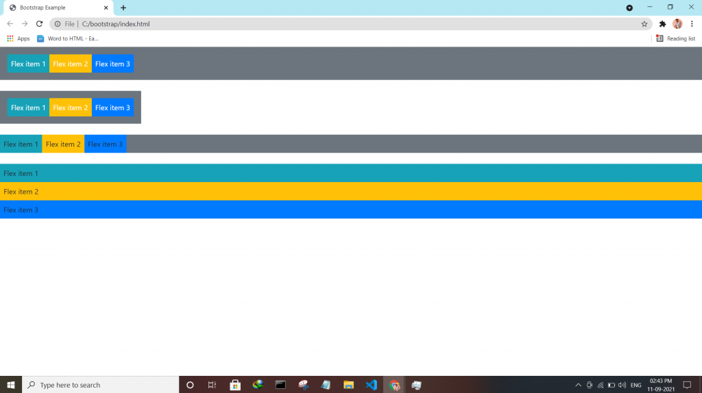
| .flex-*-row | Display flex items horizontally on different screens |
| .flex-*-row-reverse | Display flex items horizontally, and right-aligned, on different screens |
| .flex-*-column | Display flex items vertically on different screens |
| .flex-*-column-reverse | Display flex items vertically, with reversed order, on different screens screens |
| .justify-content-*-start | Display flex items from the start (left-aligned) on different screens |
| .justify-content-*-end | Display flex items at the end (right-aligned) on different screens |
| .justify-content-*-center | Display flex items in the center of a flex container on different screens |
| .justify-content-*-between | Display flex items in “between” on different screens |
| .justify-content-*-around | Display flex items “around” on different screens |
| .flex-*-fill | Force flex items into equal widths on different screens |
| .flex-*-grow-0 | Don’t make the items grow on different screens |
| .flex-*-grow-1 | Make items grow on different screens |
| .flex-*-shrink-0 | Don’t make the items shrink on different screens |
| .flex-*-shrink-1 | Make items shrink on different screens |
| .order-*-0-12 | Change the order from 0 to 12 on small screens |
| .flex-*-nowrap | Don’t wrap items on different screens |
| .flex-*-wrap | Wrap items on different screens |
| .flex-*-wrap-reverse | Reverse the wrapping of items on different screens |
| .align-content-*-start | Align gathered items from the start on different screens |
| .align-content-*-end | Align gathered items at the end on different screens |
| .align-content-*-center | Align gathered items in the center on different screens |
| .align-content-*-around | Align gathered items “around” on different screens |
| .align-content-*-stretch | Stretch gathered items on different screens |
| .align-items-*-start | Align single rows of items from the start on different screens |
| .align-items-*-end | Align single rows of items at the end on different screens |
| .align-items-*-center | Align single rows of items in the center on different screens |
| .align-items-*-baseline | Align single rows of items on the baseline on different screens |
| .align-items-*-stretch | Stretch single rows of items on different screens |
| .align-self-*-start | Align a flex item from the start on different screens |
| .align-self-*-end | Align a flex item at the end on different screens |
| .align-self-*-center | Align a flex item in the center on different screens |
| .align-self-*-baseline | Align a flex item on the baseline on different screens |
| .align-self-*-stretch | Stretch a flex item on different screens |