In this tutorial, I am using HTML & CSS and create a Hexagon shape in an easy way. So, before I am creating an HTML & CSS file with “.html” & “.css” extension. as below-
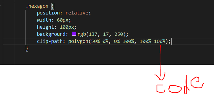
In this “index.html” page I am using a “class” with “hexagon” and after that hexagon class using below “style.css” page which is mention below-
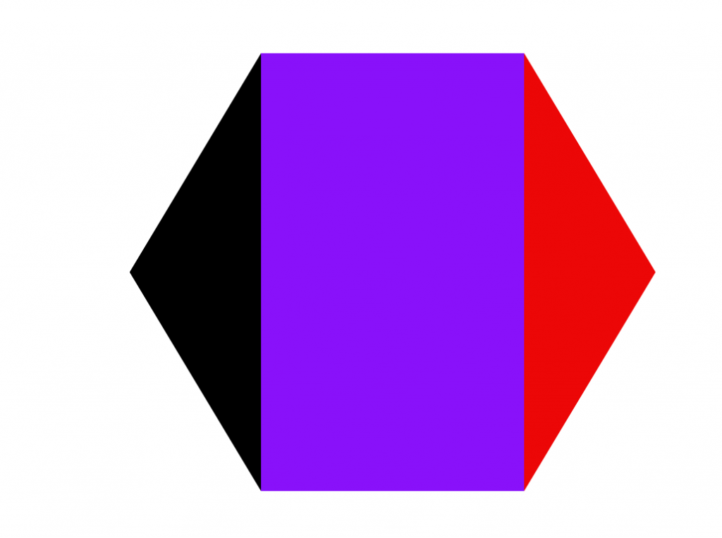
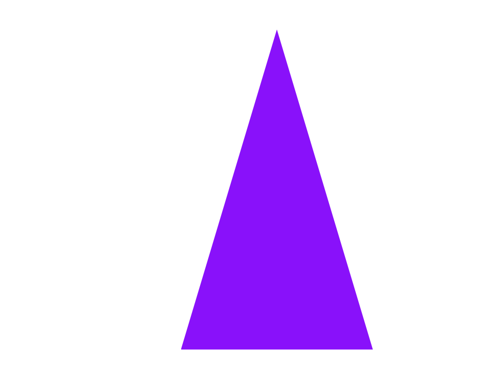
This is hexagon shape. Here, I am using three different color but if you want to change then you can change as your wish.
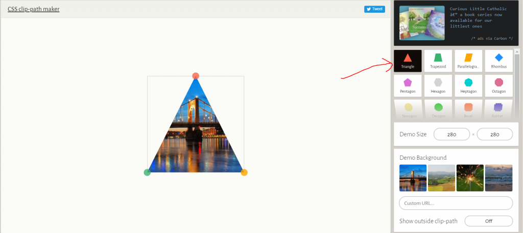
If you want to create a different shape then Click Here and create a different- different shap as you wish. as below step-
When you will be open link then shown below page with left side show shape list-
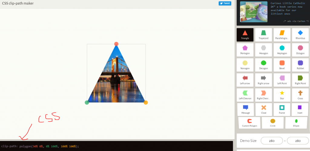
After that click any shape and shown below “css” code –
So, Copy this code and paste in your css section as below-After that create your shape below-
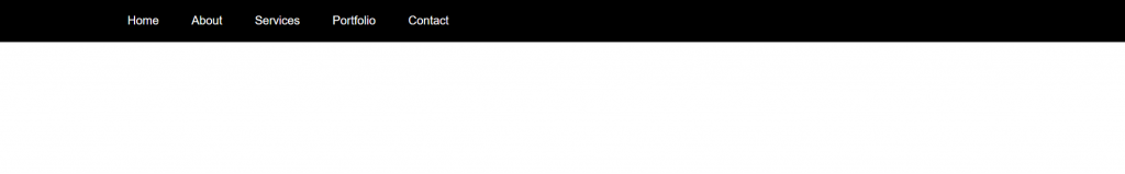
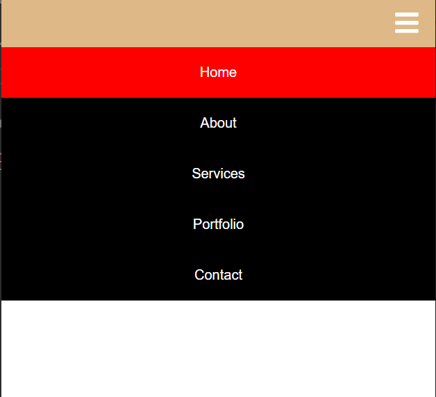
In this tutorial, I am using HTMO, CSS, and Javascript and create a Responsive Navigation Bar. So, first create page with “.html” extension and write code as below-
And Below CSS code which is using in this navigation bar-
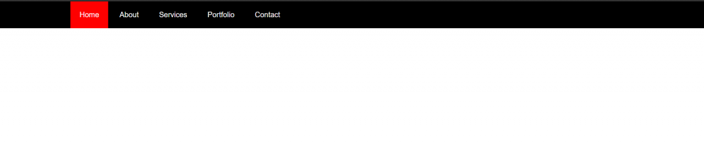
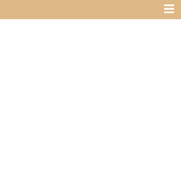
After that complete a Responsive Navigation bar as below –
When using a cursor on navbar link then uses “:hover” css function In this Mobile showing as view responsive with “toggle” fa fa iconWhen Click “toggle” fa fa-icon then show this type of navigation bar.
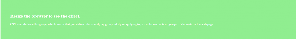
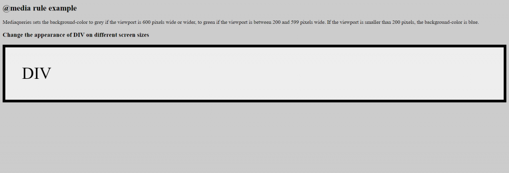
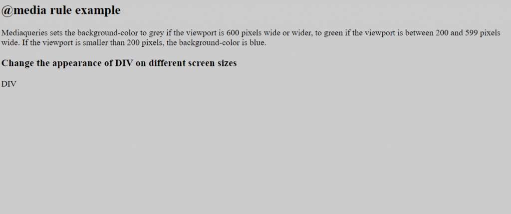
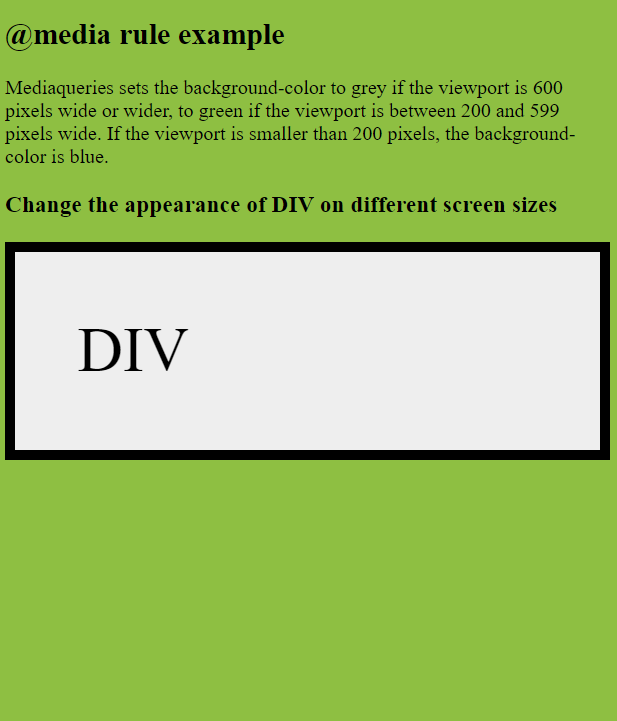
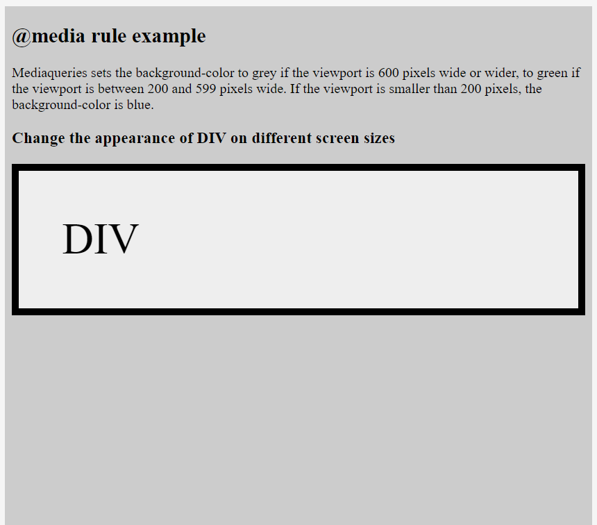
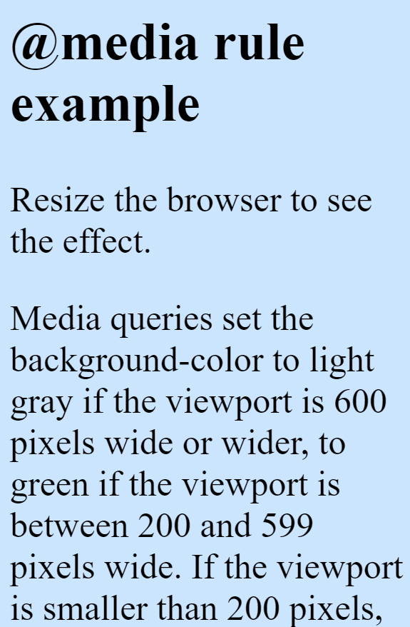
A media query consists of an optional media type and zero or more expressions that limit the style sheets’ scope by using media features, such as width, height, and color.
Syntax: –
@media not|only mediatype and (expressions/ media features) { CSS; }
Ex: –
@media screen and (min-width: 480px) {
body {
background-color: lightgreen; }
}
@media (min-width: 480px) {
body {
background-color: lightgreen; }
}
all – Used for all media type devices
print – Used for printers
screen – Used for computer screens, tablets, smart-phones etc.
speech – Used for screenreaders that “reads” the page out loud
If you use the not or only operators, you must specify an explicit media type.
And-
@media (min-width: 800px) { CSS }
@media (min-width: 800px) and (orientation: landscape) { CSS }
@media screen and (min-width: 800px) and (orientation: landscape) { CSS }
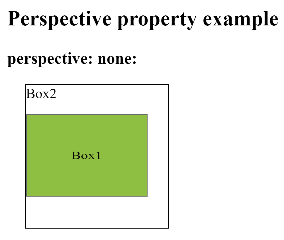
This property is used to define how many pixels a 3D element is placed from the view. This property allows you to change the perspective on how 3D elements are viewed. This will only effect on 3D transformed elements.
Whenever we define the perspective property for an element, it is the child elements that get the perspective view, not the element itself.
We can set this property to none (default) and length
Ex: –
div { perspective: 50px ; }
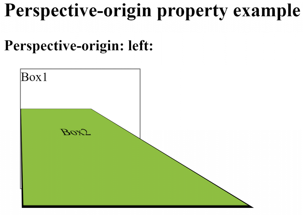
Perspective-origin–
This property is used to define where a 3D element is based in the x- and the y-axis. This property allows you to change the bottom position of 3D elements. This will only effect on 3D transformed elements. We can set this property to x (default 50%) and y axis (default 50%).
Whenever we define the perspective-origin property for an element, it is the child elements that are positioned, not the element itself.
Ex: –
div { perspective-origin: 20% 20% ; }
backface-visibility–
This property is used to define whether or not an element should be visible when not facing the screen. This property is useful when an element is rotated, and you do not want to see its backside. We can set this property to visible (default) and hidden.
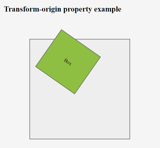
This property is used to change the position of transformed elements. This property must be used together with the transform property. We can set this property to x, y and z axis.
2D transformations can change the x and y axis of an element.
3D transformations can change the x, y and z axis of an element.
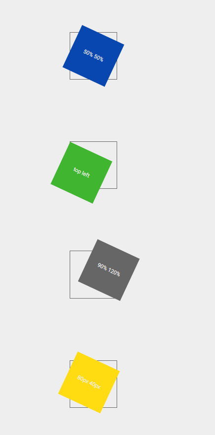
This is used to define where the view is placed at the x-axis.
left
center
right
length (px, cm, em, %)
y-axis-
This is used to define where the view is placed at the y-axis.
top
center
bottom
length (px, cm, em, %)
z-axis-
This is used to define where the view is placed at the z-axis.
length (px, cm, em, %)
transform-style-
This property is used to specify how nested elements are rendered in 3D space. This property must be used together with the transform property. We can set this property to flat (default) and preserve-3d.
Ex: –
div { transform-style: preserve-3d ; }
Note – child elements will preserve its 3D position
JavaScript provides access to the forms within an HTML document through the Form object known as HTMLFormElement in the DOM. Which is a child of the Document Object.
Properties
Properties
Value
Description
accept-charset
UTF-8
Specifies the charset used in the submitted form (default: the page charset).
action
URL
Contains a URL that defines where to send the data after submitting the form
autocomplete
On (default) Off
Determines that the browser retains the history of previous values.
enctype
specifies how the browser encodes the data before it sends it to the server. (default: is url-encoded).
encoding
Holds the value of the enctype attribute, which usually contains either application/x-www-form-urlencoded value or the multipart/form-data value (in the case of file upload)
elements[ ]
An array of DOM elements that correspond to the interactive form fields within the form
Properties
Properties
Value
Description
length
The number of a form field with a given form tag. Should bt the same as elements.length
method
GET (default) POST
Specifies how to send the form data to a web server. The data can be sent as URL variables, by using the get method or as HTTP post, by using the post method
name
name
Specifies a name used to identify the form
novalidate
novalidate
Specifies that the browser should not validate the form.
target
_self (default) _blank _parent _top framename
Specifies the target of the address in the action attribute
Methods
Method
Description
checkValidity ( )
Returns a true or false value indicating whether or not all the fields in the form are in a valid state.
reset ( )
Returns all form fields to their initial state.
submit ( )
Submits the form to the URL specified in the form’s action attribute
Header – It specifies a header for a document or section.
Nav – It defines navigation links.
Section – It defines a section in a document.
Article – It defines an article. For example a blog post or forum post etc.
Aside – It can define content aside from the page content like a sidebar.
Details – It is used to defines additional details that the user can view or hide. It has one attribute-value pair which is open = “open” and that means by default the data will be visible for users/viewers. By default it has False value so the details will be hidden.
Summary – It is used to defines a visible heading for a <details> element.
Footer – It specifies a footer for a document or section.
Meter Tag
It defines a scalar measurement within a known range or a fraction value. This is also known as a gauge. It should not be used to indicate the progress bar. If the browser doesn’t support the meter tag then it will show text written between the opening meter tag and the closing meter tag.
Specifies the current value of the meter. This must be between the min and max values.
form
Form_id
It associates the <meter> with a <form>
high
Number
It specifies the range that is considered to be a high value. This must be less than the max value.
low
Number
It specifies the range that is considered to be a low value. This must be greater than min value.
max
Number
It specifies the max value of the range.
min
Number
It specifies min value of the range.
optimum
Number
It specifies what value is the optimal value for the meter.
Mark – This tag is used to highlight text or part of the text. Ex: – <p>This is <mark>Geekyshows</mark></p>
Dialog – This tag defines a dialog box or window. It can be used to create popup dialogs. It has one attribute-value pair which is open = “open” and that means by default the data will be visible for users/viewers. By default it has False value so the data will be hidden. Ex: – <dialog>Click Here</dialog>
Main – This tag specifies the main content of a document. The content inside the <main> element should be unique to the document. It should not contain any content that is repeated across documents such as sidebars, navigation links, copyright information, site logos, and search forms. There must not be more than one <main> element in a document. The <main> element must NOT be a descendant of an <article>, <aside>, <footer>, <header>, or <nav> element. Ex: – <main><article>This is art</article></main>
wbr – The <wbr> (Word Break Opportunity) element specifies a position within text where the browser may optionally break a line if necessary. Ex: – <p>Hello worldddddddddddddddddd<wbr>welcome</wbr></p>
Figure – The <figure> tag specifies self-contained content, like illustrations, diagrams, photos, code listings, etc. Ex: – <figure> <img src=“image.jpg“ width=”304″ height=”228″> </figure>
figcaption – The <figcaption> tag defines a caption for a <figure> element. The <figcaption> element can be placed as the first or last child of the <figure> element. Ex: –
Progress – The <progress> element represents the completion progress of a task. It has two attributes max which Specifies how much work the task requires in total and value which Specifies how much of the task has been completed. It must be a valid floating point number between 0 and max, or between 0 and 1 if the max attribute is not present. Ex: – <progress id=”bar” value=”0″ max=”100″> </progress>
The id attribute specifies a unique id for an HTML element. The value must be unique within the HTML document.
The id attribute is mostly used to point to a style in a style sheet, and by JavaScript (via the HTML DOM) to manipulate the element with the specific id. The id attribute can be used on any HTML element.
Rules
Must begin with a letter A-Z or a-z.
A class name cannot start with a number.
Must not contain any space characters.
Can be followed by: letters (A-Za-z), digits (0-9), hyphens (“-“), and underscores (“_”).
In HTML, all values are case-insensitive.
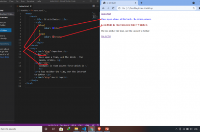
<html>
	<head>
		<title> id attribute</title>
		<style>
			#top{
				color: blue;
			}
			#imp{
				color: brown;
			}
		</style>
	</head>
	<body>
		<a href="#imp">Important</a>
		<p id="top">
			Once upon a time, all the birds - the swans, cranes, </p>
		<h3 id="imp">
			Goodwill is that unseen force which is </h3>
		<p>He has neither the time, nor the interest to bother </p>
		<a href="#top">Go to Top</a>
	</body>
</html>
The HTML class attribute makes it possible to define equal styles for elements with the same class name. The class attribute specifies one or more class names for an element. The class attribute is mostly used to point to a class in a style sheet. However, it can also be used by JavaScript (via the HTML DOM) to make changes to HTML elements with a specified class.
In HTML5, the class attribute can be used on any HTML element.
Rules
Must begin with a letter A-Z or a-z.
A class name cannot start with a number.
Must not contain any space characters.
Can be followed by: letters (A-Za-z), digits (0-9), hyphens (“-“), and underscores (“_”).
In HTML, all values are case-insensitive.
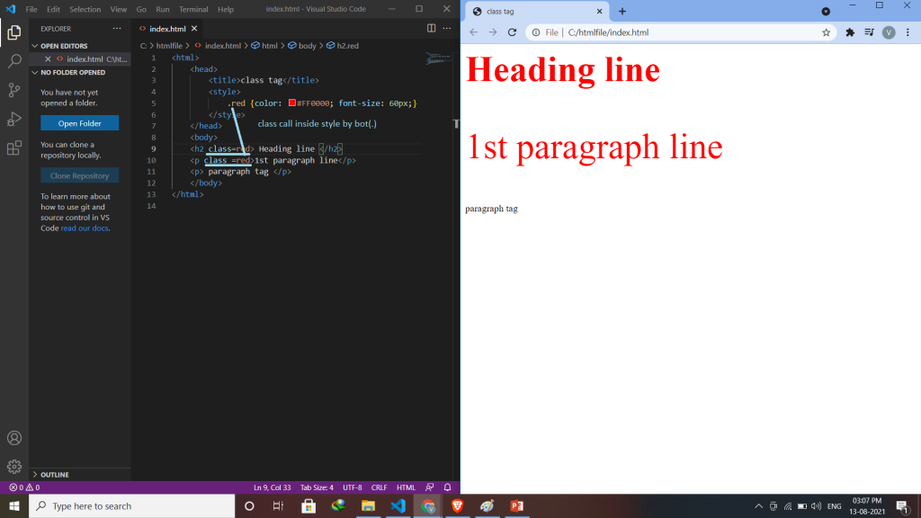
<html>
	<head>
		<title>class tag</title>
		<style>
			.red {color: #FF0000; font-size: 60px;}
		</style>
	</head>
	<body>
	<h2 class=red> Heading line </h2>
	<p class =red>1st paragraph line</p>
	<p> paragraph tag </p>
	</body>
</html>
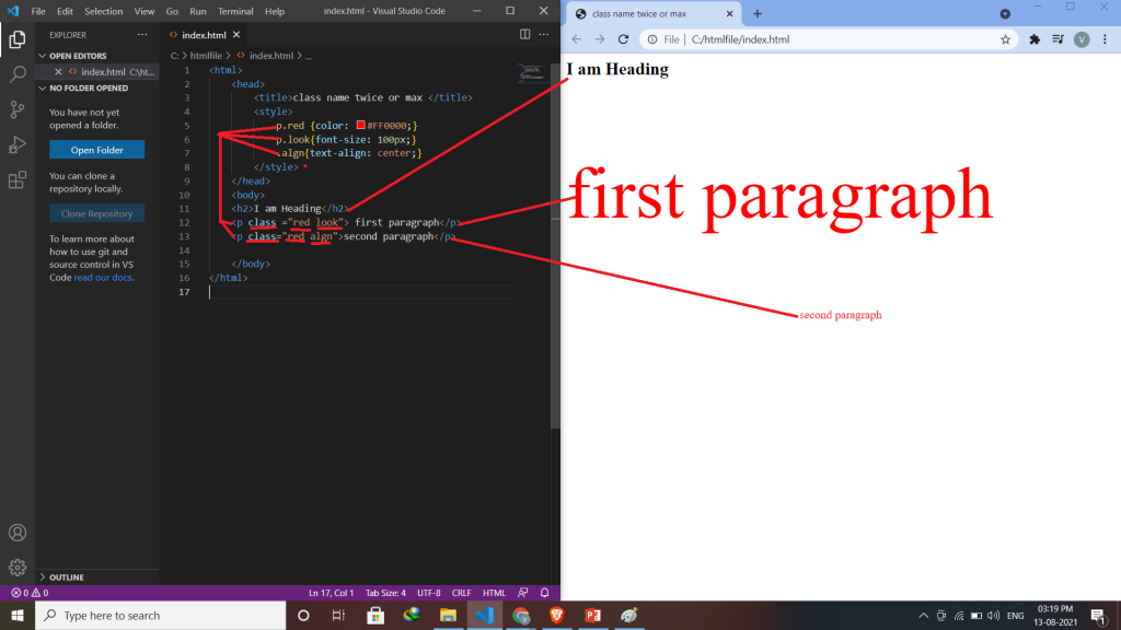
More than one class name
To specify multiple classes, separate the class names with a space. This allows you to combine several CSS classes for one HTML element. Syntax:- class=“class_name1 class_name2 class_nameN” Ex:- <p class =“red look”>I am first paragraph</p>
<html>
	<head>
		<title>class name twice or max </title>
		<style>
			p.red {color: #FF0000;}
			p.look{font-size: 100px;}
			.algn{text-align: center;}
		</style>
	</head>
	<body>
	<h2>I am Heading</h2>
	<p class ="red look"> first paragraph</p>
	<p class="red algn">second paragraph</p>

	</body>
</html>